You’ve probably seen a pie chart before–they’re the charts that look like a pizza. Sometimes they’re also referred to as “pie graphs” or “circle graphs.”
Check out our video to learn more:
Characteristics of a pie chart
This type of graph is good for comparing one type of variable in a data set.
Each value in the data set is expressed as a percentage and makes up a portion (or slice) of the graph.
When all of the slices are included, or 100% of the data, they form a 360° circle.
How to make a pie chart
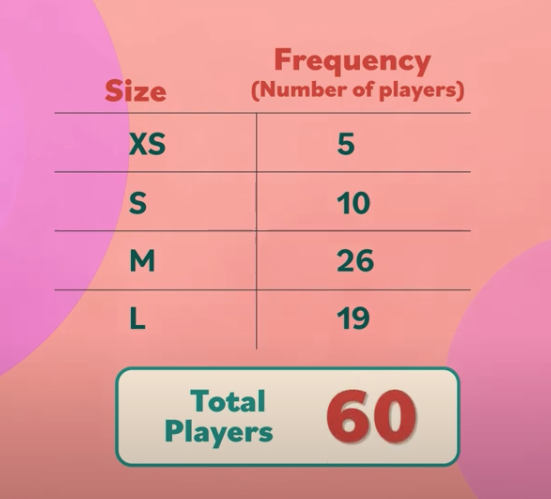
At a school, the girls’ basketball teams are having jackets made for the regional championship. The head coach wants to create a pie chart that shows which jacket sizes they’ll need.
Step 1: First, she organizes the data into a table. In Column 1, she records the sizes: extra small, small, medium, and large.
In Column 2, she writes down the frequency, or the number of players who wear each size: 5 athletes wear an extra small, 10 prefer small, 26 for medium, and 19 for large.
Adding up these numbers gives us the total number of players: 60.
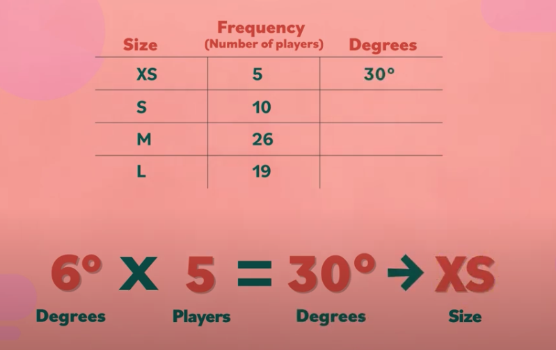
Step 2: She needs to figure out how many degrees each size will make up in the circle of the pie chart.
We know that a circle has 360°. If 360 is divided by the total number of players, 60, this tells us that one athlete = 6°.
If we multiply 6 degrees by the number of players wearing each size, this tells us how big each section of the pie chart should be. For example, 6 × 5 = 30, so the extra small section should be 30° in the circle.
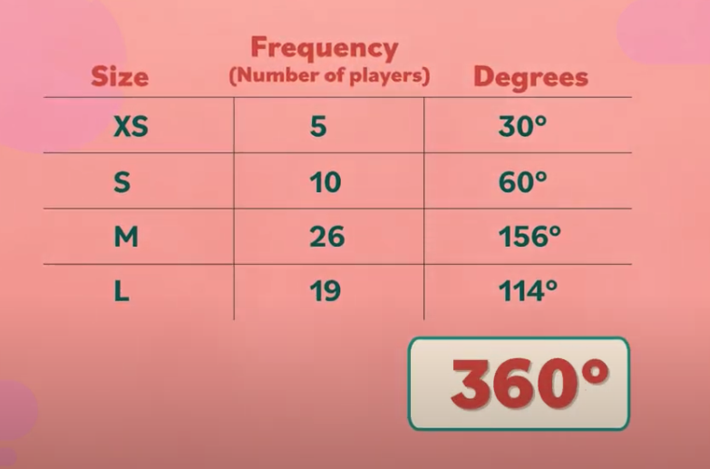
6 × 10 = 60° for size small,
6 × 26 = 156° for size medium,
and 6 × 19 = 114° for size large.
To double-check her division, the coach adds up the numbers in Column 3. This equals 360°, which means that her calculations are correct.
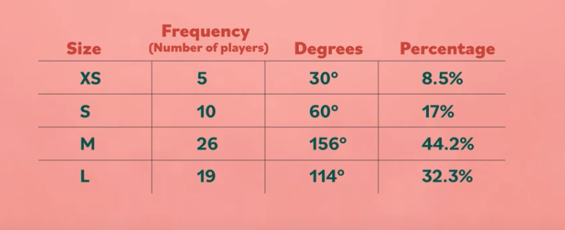
Step 3: Finally, she adds Column 4, which will show the percent of each size.
If 100% represents the total and this is divided among 60 players, this means that one athlete = 1.7% of the team (approximately).
So let’s multiply 1.7 by the number of players wearing each size to determine the percentages.
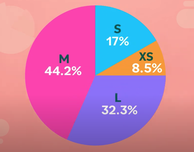
1.7 × 5 = 8.5% for size extra small,
1.7 × 10 = 17% for size small,
1.7 × 26 = 44.2% for size medium,
and 1.7 × 19 = 32.3% for size large.
Since 1.7% was an estimate, it’s okay if the sum of Column 4 goes a little over 100%.
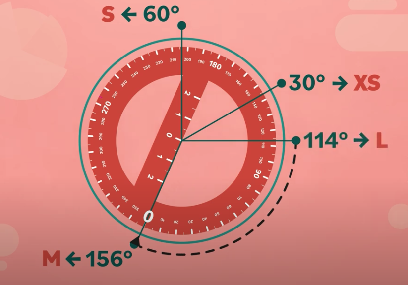
Step 4: Now that the table’s complete, the coach begins making her pie chart. She traces her protractor to draw a circle.
Step 5: Then she measures a 30° angle for size extra small. Next up is 60° for size small, 156° for size medium, and 114° for size large.
Then she adds the percentage to each slice of the pie, making the chart easier to read.
In the next lesson, we’ll show you how to make a line graph.