
Statistics: Basic Concepts -
Bar Charts

Statistics: Basic Concepts
Bar Charts

search
menu
/en/statistics-basic-concepts/frequency-tables/content/
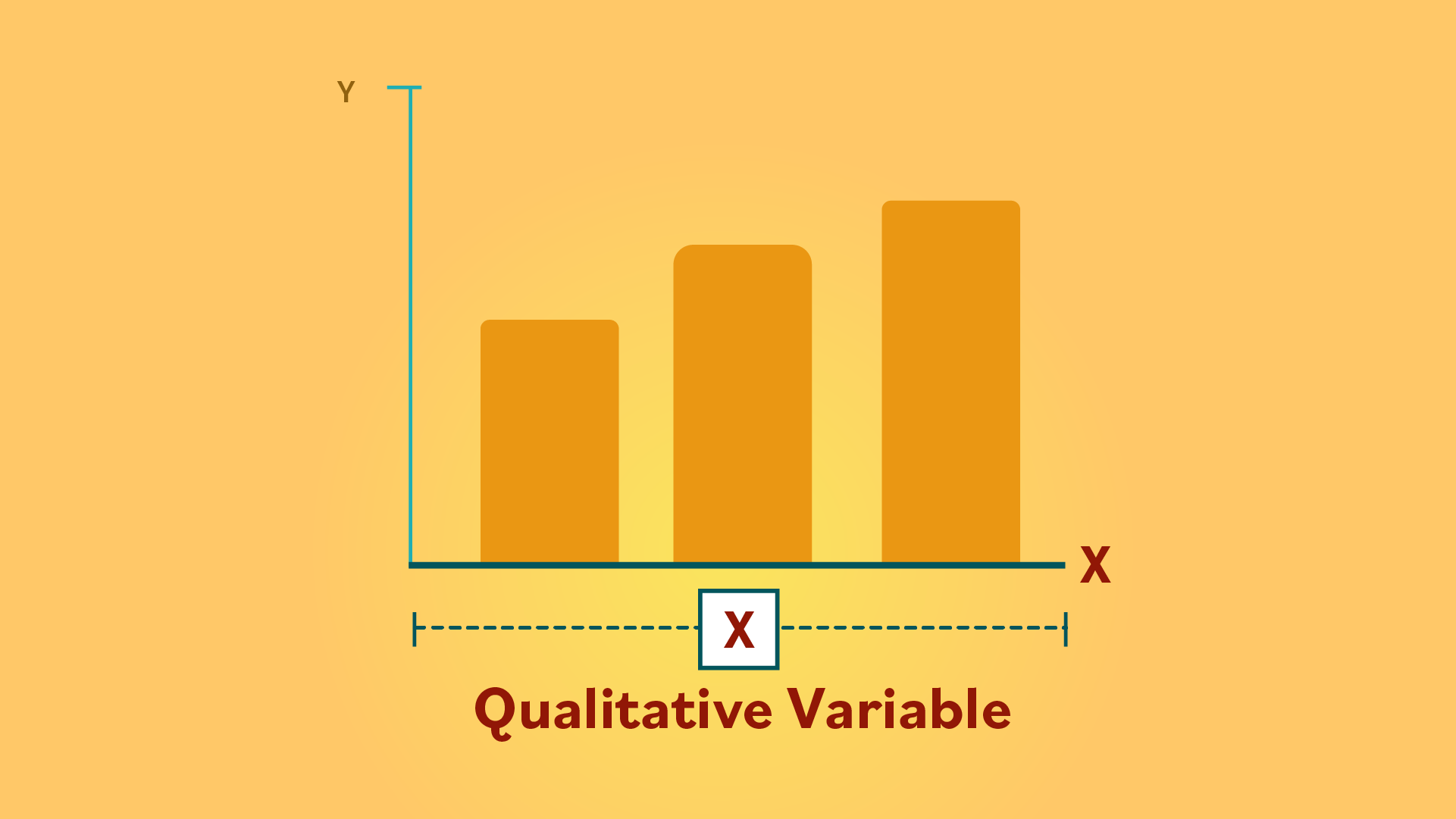
A bar chart is a graph used to summarize a data set that may include qualitative and quantitative variables.
Check out this video in order to see how to make this type of diagram:
Characteristics of a bar chart
These graphs consist of bars or columns of varying heights, which can be horizontal or vertical. In this example, we’ll be describing a bar chart with vertical bars.
There is a horizontal or x-axis, where one type of variable is located–usually qualitative.
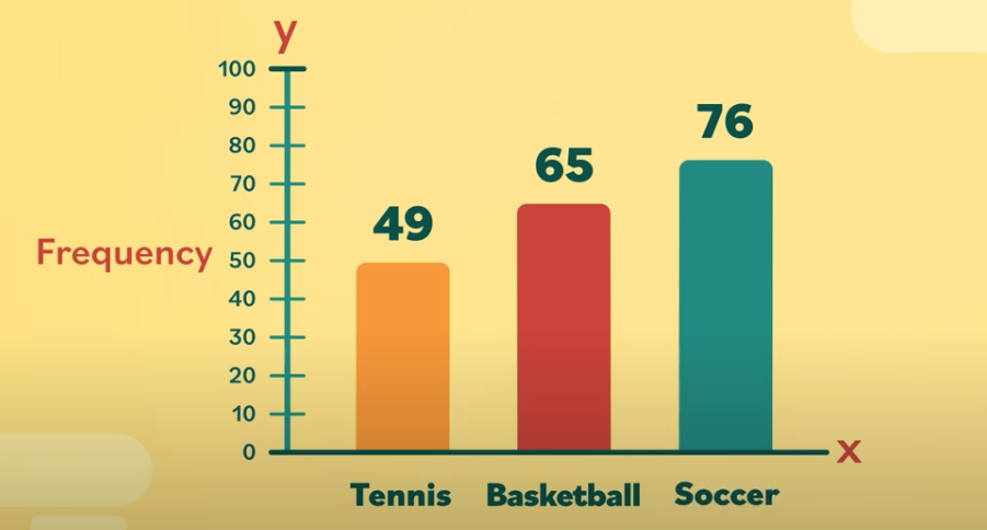
Then there’s the vertical or y-axis, which lists numbers that determine the heights on the bars. The numbers on the y-axis are known as the frequency.
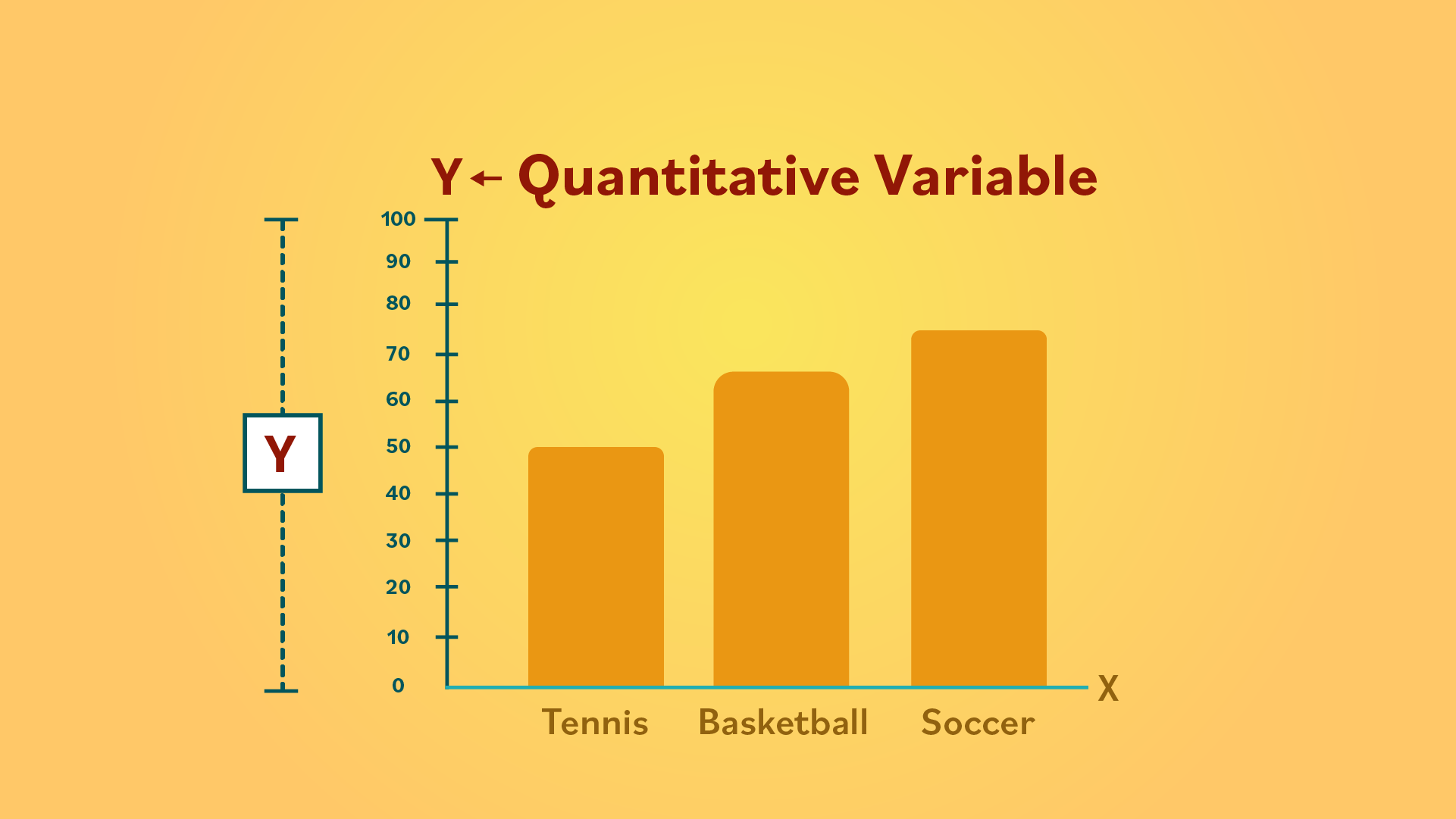
If you’re making your own bar chart, make sure the width of the bars and the space between each one is the same. That way the graph looks neat and organized, and you can compare the values of each bar (or category).
Creating a bar chart
Let’s say you wanted to see which sports student athletes play at school. In this example, we’re just including three sports to keep it simple–basketball, soccer, and tennis.
One variable is sports, and the other variable is the number of students.
In the next few lessons, we’ll talk about other types of graphs that can help you to present data in a visual way.
/en/statistics-basic-concepts/pie-charts/content/