
Statistics: Basic Concepts -
Line Graphs

Statistics: Basic Concepts
Line Graphs

search
menu
/en/statistics-basic-concepts/pie-charts/content/
So far we’ve talked about bar charts, which are made up of bars, and pie charts, which are made up of slices or sections to represent data. There is also another type of graph called a line graph, which is made up of a series of points.
These points can be joined to form a complete line, showing how one variable changes over time. The points are “plotted” on a graph which has an x-axis and a y-axis, not unlike a bar chart.
The x-axis and y-axis represent different variables. Oftentimes the “independent variable” goes on the x-axis, and the “dependent variable” goes on the y-axis.
An independent variable is often something constant, like time, and the dependent variable is the variable that keeps changing, in relation to the other variable.
Quick Example: Maybe you want to measure how many centimeters your plant grows each month. Time is the independent variable, so months would go on the x-axis. Since the plant keeps getting taller, its height in centimeters would go on the y-axis.

Let’s use another example to make a line graph…
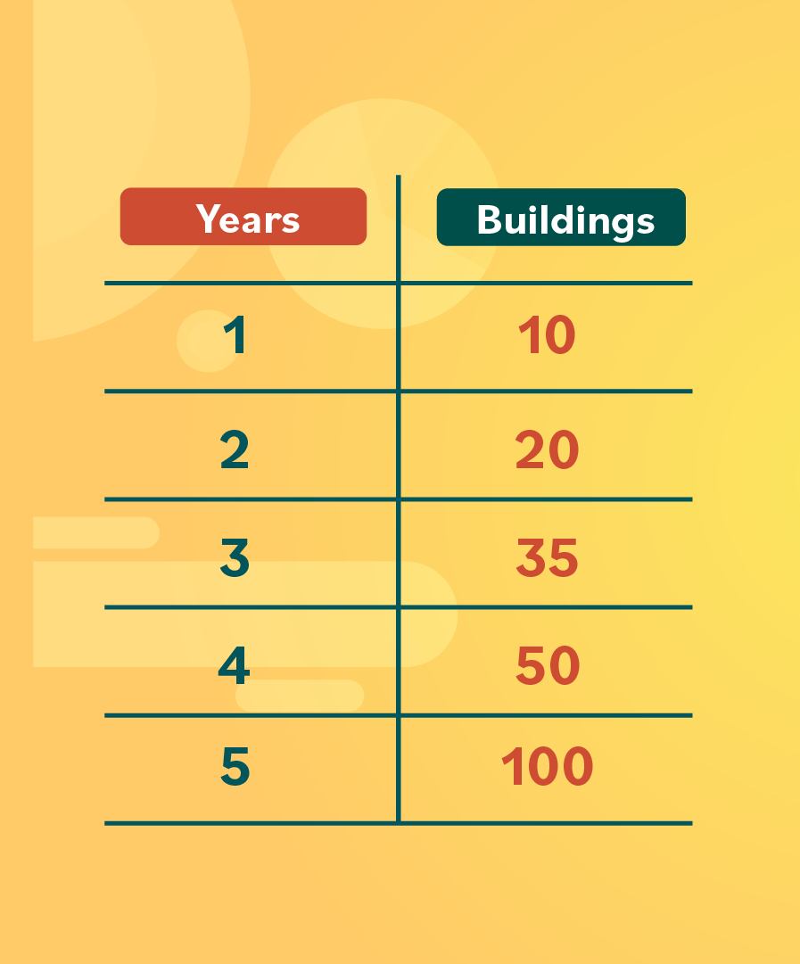
City planners want to see how much a small city has grown in the last five years. This is their data set:
In the first year, 10 buildings were built. After two years, there were a total of 20 buildings. In three years: 35 buildings, four years: 50 buildings, and five years: 100 buildings in total.

Next up, we’ll learn about another type of graph called a histogram.
/en/statistics-basic-concepts/histograms/content/