/en/statistics-basic-concepts/line-graphs/content/
Histograms
What is a histogram?
A histogram is a graph that uses bars to show the distribution of a data set. Unlike a bar chart, which has a qualitative variable on the x-axis, a histogram can help you to visualize numerical or quantitative data and identify any patterns.
A qualitative variable is a category that can only be expressed in words. But if you have quantitative variables on both the x- and y-axis–and there’s no space in between the bars–then you’re probably looking at a histogram.
Making a histogram
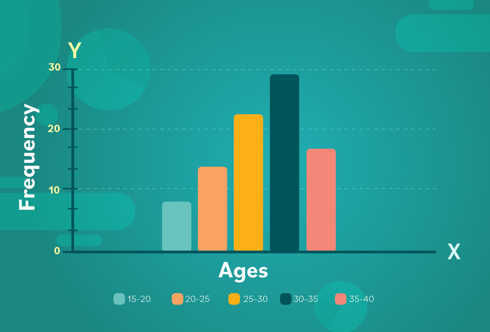
Consider this example: a conductor of an orchestra wants to make a graph which reflects the age range of his band members. They range in age from 15 to 40 years old.
- Step 1: He decides to break this age range into individual categories with increments of 5: 15-20 years old, 20-25 years old, 25-30 years old, 30-35 years old, and 35-40 years old. (If someone is in between ranges, like 20 years old, he will round up so that they’re counted only once in the older category).
- Step 2: On the x-axis he puts each of the age-range categories listed above. In a histogram, these categories are often referred to as “bins.” (Sometimes you’ll also hear the terms "classes" or "buckets," too; these all refer to categories). Remember that a constant, independent variable usually goes on the x-axis.
- Step 3: On the y-axis he lists the frequency, or how many people fall into each category. The y-axis usually includes the dependent variable, or the number that varies/changes.
- Step 4: Here is the data set he wants to illustrate in his histogram: 15-20 years old = 8 members, 20-25 years old = 14 members, 25-30 years old = 23 members, 30-35 years old = 29 members, and 35-40 years old = 16 members.
- Step 5: The height of each bar depends on the frequency. For example, we can see that the number of 30- to 35-year-olds is 29; this is the highest frequency. The histogram should look something like this:
Keep in mind that if you have any qualitative variables (that can only be expressed in words), it’s best to use a bar chart or pie chart instead.
Characteristics of a histogram
If you're making your own histogram, here are three things to remember:
- A histogram is made up of bars, which are (generally) the same width and close together.
- There should be quantitative variables on both the x- and y-axis. A constant variable that doesn’t change should go on the x-axis, and frequency (which can change) should be listed on the y-axis.
- The variable on the x-axis can be made up of bins, like in our example. It’s important to know that it can also be made up of fixed values, like 1, 15, and 30.
In the next lesson, we’ll turn this histogram into a frequency polygon.
/en/statistics-basic-concepts/frequency-polygons/content/


