Lesson 9: Frequency Polygons
/en/statistics-basic-concepts/histograms/content/
Frequency polygons
What is a frequency polygon?
A frequency polygon shows the overall distribution of a data set. It looks a little bit like a line graph–but the points on the graph can be plotted using data from a histogram or a frequency table.
Frequency polygons are especially useful for comparing two data sets. In our example, we’ll use the histogram from the last lesson in order to make our frequency polygon.
How to create a frequency polygon
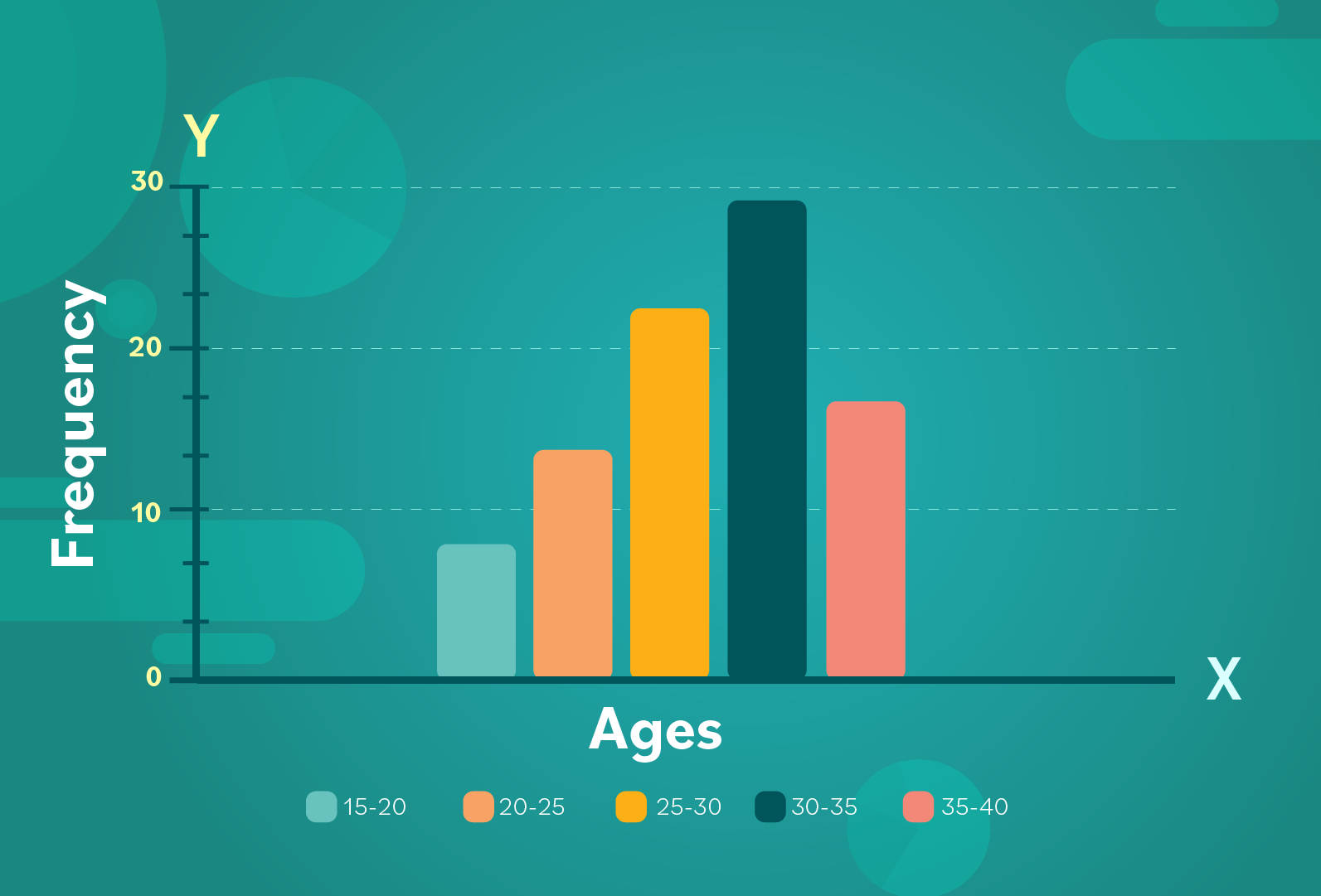
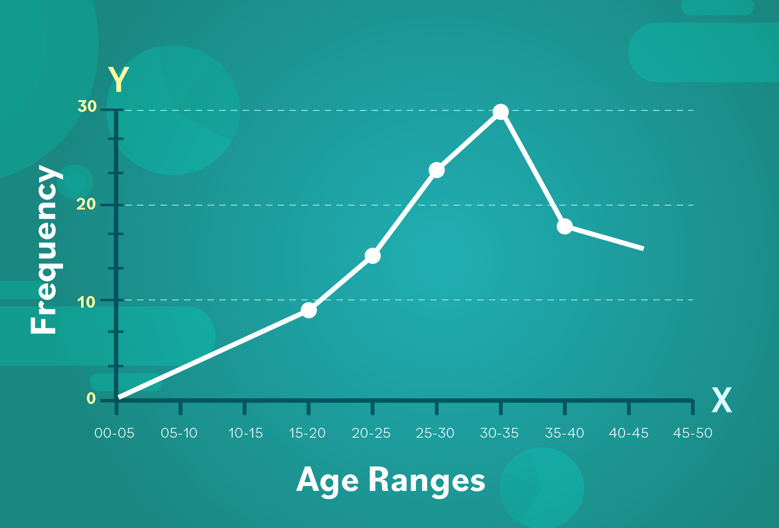
Here is our histogram from the previous lesson, which shows the age range of members of the orchestra:
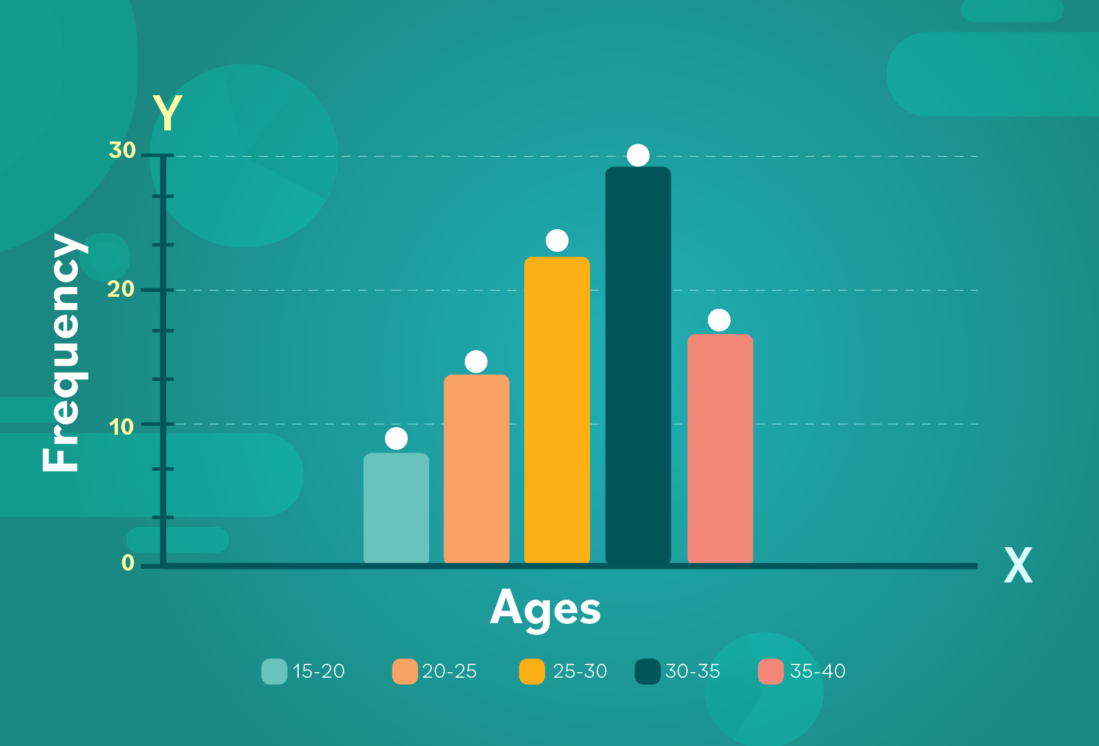
- Step 1: Imagine that at the top of each bar, there is a dot located right in the middle. These dots are called midpoints. (They are also sometimes referred to as “class marks.” This is because categories/bins are sometimes called classes).
Each midpoint marked on the graph represents the frequency of each bin or age range.
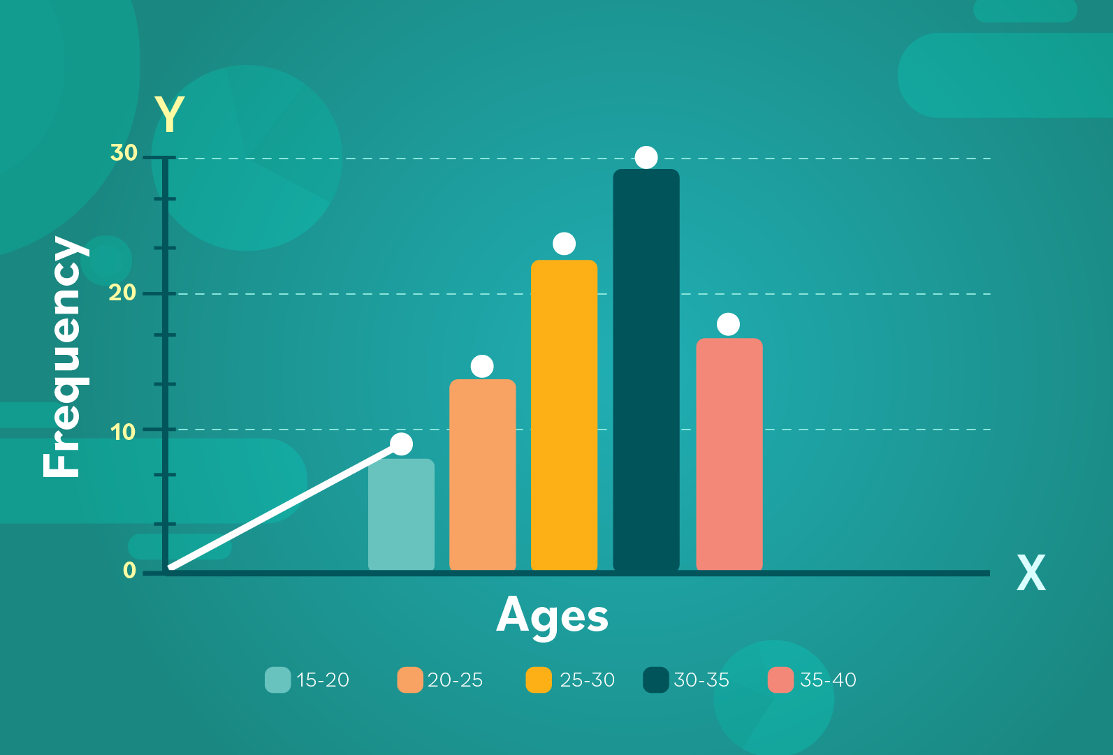
- Step 2: Once the midpoints have been plotted, the first line segment should connect zero to the first midpoint.
- Step 3: After that, we’ll connect the first midpoint to the second one, and so on.
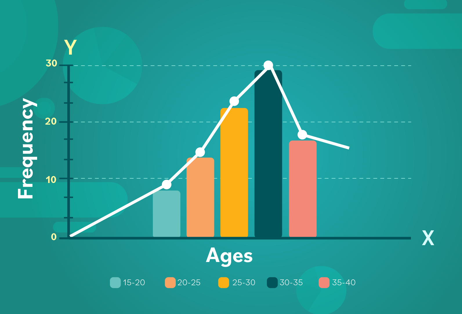
- Step 4: Remove the bars and copy your value increments onto the x-axis. Since we don't have the bars to represent each bin, make sure you're clear about what values are being shown on the x-axis. In this case, each point represents an age range.
- Step 5: Now you have your frequency polygon!
Comparing two data sets
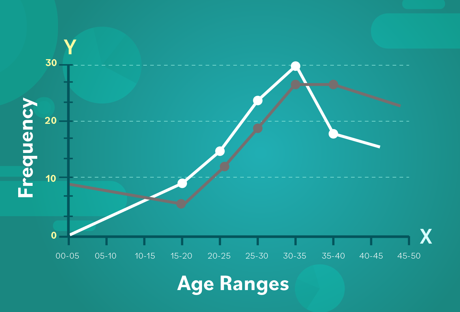
Usually a frequency polygon is compared to a different frequency polygon on the same graph. The second frequency polygon comes from another data set.
For example, if you wanted to compare the age range of the band’s members from 10 years ago with the current band, you could do two things:
- Use frequency tables for your two data sets to plot the points of your frequency polygons.
- Make histograms for each set of data, and then create frequency polygons from your histograms.
You would plot your frequency polygons on the same graph. Let’s use a gray line to represent the data set from 10 years ago, which we can compare with the white line representing the current band’s ages:
On the whole, the trends in the data appear quite similar. The conductor can see that there’s been a dip (or decline) in the 35-40 year age range.
Characteristics of a frequency polygon
Here’s a quick recap…
- Frequency polygons can be made from a histogram or a frequency table. If you are creating one using a histogram, plot the midpoints at the top of each bar. Then connect the midpoints and remove each bar.
- Generally frequency polygons are used to reflect quantitative data. If you have “bins” like age ranges, these can be plotted on the x-axis. The y-axis is often used to reflect frequency.
- They’re useful for comparing/contrasting two (or more) data sets reflected on the same graph. Take a look at the overall distribution, and see what conclusions you can draw about the data.
In the next section of the tutorial, we’ll start diving into some other fundamentals that will help you in statistics.
/en/statistics-basic-concepts/mean-median-and-mode/content/