
PowerPoint 2013 -
Charts

PowerPoint 2013
Charts

search
menu
/en/powerpoint2013/tables/content/
A chart is a tool you can use to communicate data graphically. Including a chart in a presentation allows your audience to see the meaning behind the numbers, which makes it easy to visualize comparisons and trends.
Optional: Download our practice presentation for this lesson.
PowerPoint has many different types of charts, allowing you to choose the one that best fits your data. In order to use charts effectively, you'll need to understand how different charts are used.
Click the arrows in the slideshow below to learn more about the types of charts in PowerPoint.
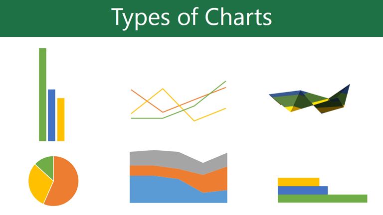
PowerPoint has a variety of chart types, each with its own advantages. Click the arrows to see some of the different types of charts available in PowerPoint.
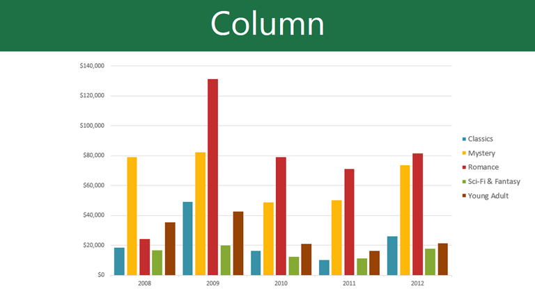
Column charts use vertical bars to represent data. They can work with many different types of data, but they're most frequently used for comparing information.

Line charts are ideal for showing trends. The data points are connected with lines, making it easy to see whether values are increasing or decreasing over time.

Pie charts make it easy to compare proportions. Each value is shown as a slice of the pie, so it's easy to see which values make up the percentage of a whole.
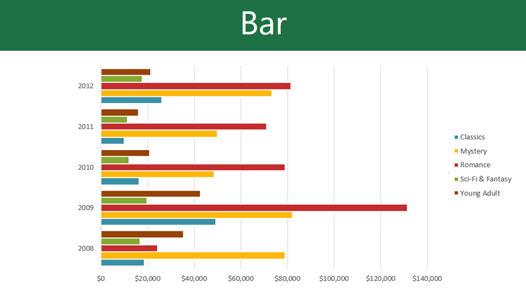
Bar charts work just like column charts, but they use horizontal bars instead of vertical bars.
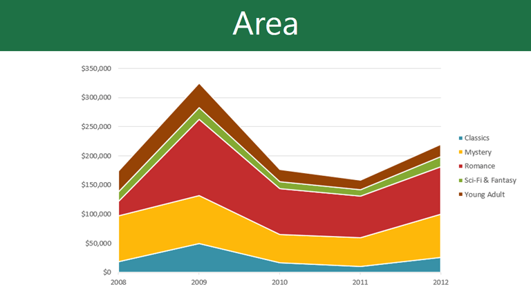
Area charts are similar to line charts, except that the areas under the lines are filled in.

Surface charts allow you to display data across a 3D landscape. They work best with large data sets, allowing you to see a variety of information at the same time.

Click the buttons in the interactive below to learn about the different parts of a chart.
PowerPoint uses a spreadsheet as a placeholder for entering chart data, much like Excel. The process of entering data is fairly simple, but if you are unfamiliar with Excel you might want to review our Excel 2013 Cell Basics lesson.
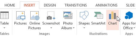 Clicking the Chart command
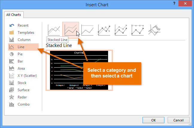 Choosing a chart type
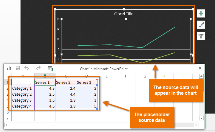 The placeholder source data and the corresponding chart
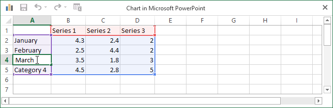 Entering data into the worksheet
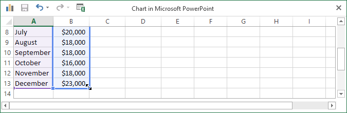 Dragging the blue line to decrease the data range
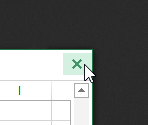 Closing the worksheet
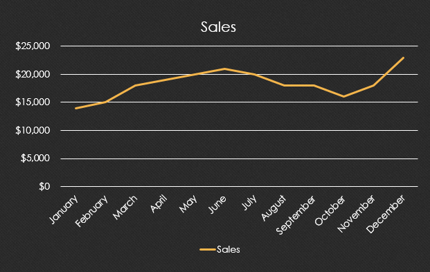 The completed chart
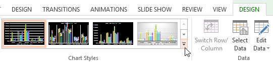
You can edit the chart data at any time by selecting your chart and clicking the Edit Data command on the Design tab.
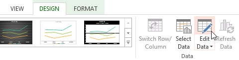 Clicking the Edit Data command
You can also click the Insert Chart command in a placeholder to insert a new chart.
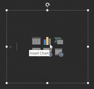 Insering a chart from a placeholder
If you already have data in an existing Excel file you want to use for a chart, you can transfer the data by copying and pasting it. Just open the spreadsheet in Excel, select and copy the desired data, and paste it into the source data area for your chart.
You can also embed an existing Excel chart into your PowerPoint presentation. This may be useful when you know you'll need to update the data in your Excel file and want the chart to automatically update whenever the Excel data is changed.
Read our guide on Embedding an Excel Chart for more information.
There are many other ways to customize and organize your charts. For example, PowerPoint allows you to change the chart type, rearrange a chart's data, and even change the layout and style of a chart.
If you find that your data isn't well-suited to a certain chart, it's easy to switch to a new chart type. In our example, we'll change our chart from a line chart to a column chart.
 Selecting a chart
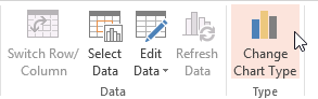 Clicking the Change Chart Type command
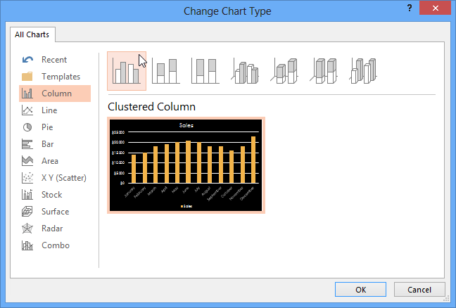 Choosing a new chart type
 The new chart type
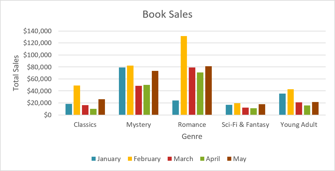
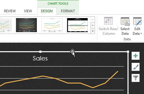
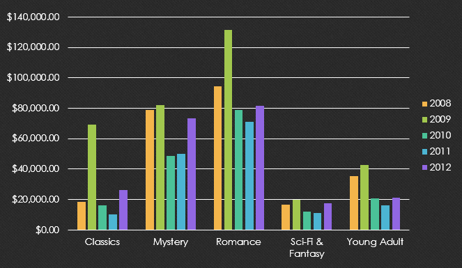
Sometimes you may want to change the way charts group your data. For example, in the chart below the book sales data is grouped by genre, with columns for each year. However, we could switch the rows and columns so the chart will group the data by year, with columns for each genre. In both cases, the chart contains the same data; it's just organized differently.
 The data grouped by genre, with columns for each year
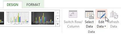 Clicking the Edit Data command
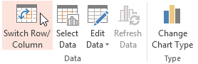 Clicking the Switch Row/Column command
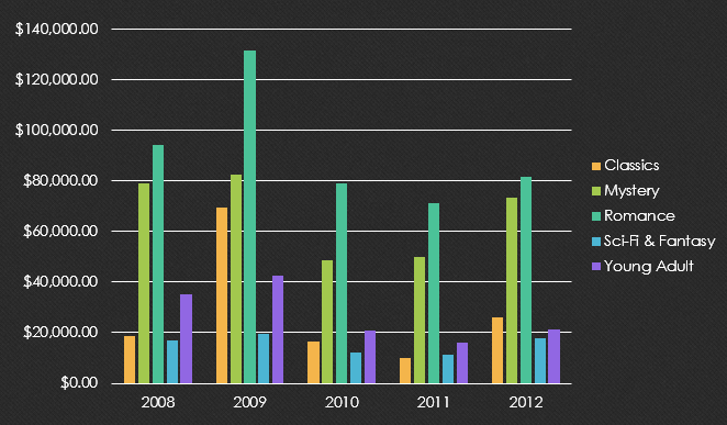
We've noticed that when numerical data has been entered in the first column of the spreadsheet, switching rows and columns may cause unexpected results. One solution is to type an apostrophe before each number, which tells the spreadsheet to format it as text instead of a numerical value. For example, the year 2013 would be entered as '2013.
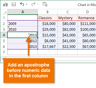 Adding an apostrophe before numeric data
Predefined chart layouts allow you to modify chart elements—including chart titles, legends, and data labels—to make your chart easier to read.
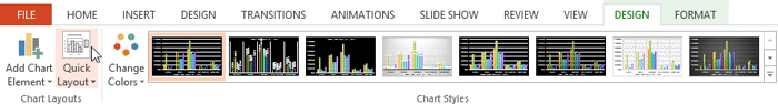 Clicking the Quick Layout command
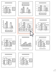 Selecting a layout
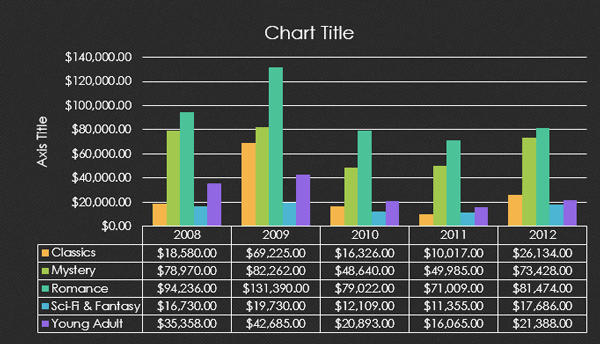 The new chart layout
To change a chart element (such as the chart title), click the element and begin typing.
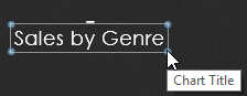 Changing the chart title
Chart styles allow you to quickly modify the look and feel of your chart.
 Clicking the More drop-down arrow
 Choosing a new chart style
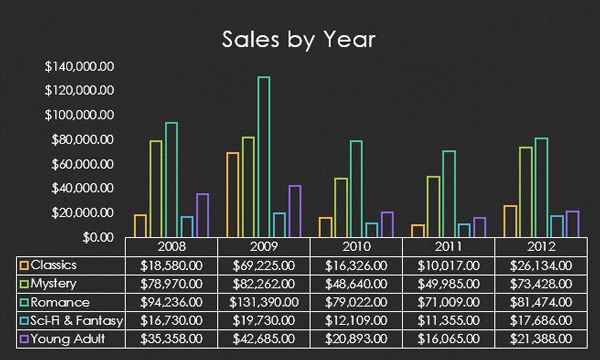 The new chart style
You can also use the chart formatting shortcut buttons to quickly add chart elements, change the chart style, and filter the chart data.
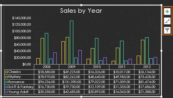 Chart formatting shortcuts
/en/powerpoint2013/smartart-graphics/content/