In many ways, layout and composition are the building blocks of design. They give your work structure and make it easier to navigate, from the margins on the sides to the content in between.
Why is composition so important? In short, it's the way your content is arranged. It doesn't matter if you're working with text, images, or elements in a graphic; without a thoughtful, well-composed layout, your work would basically fall apart.
Watch the video below to learn more about layout and composition.
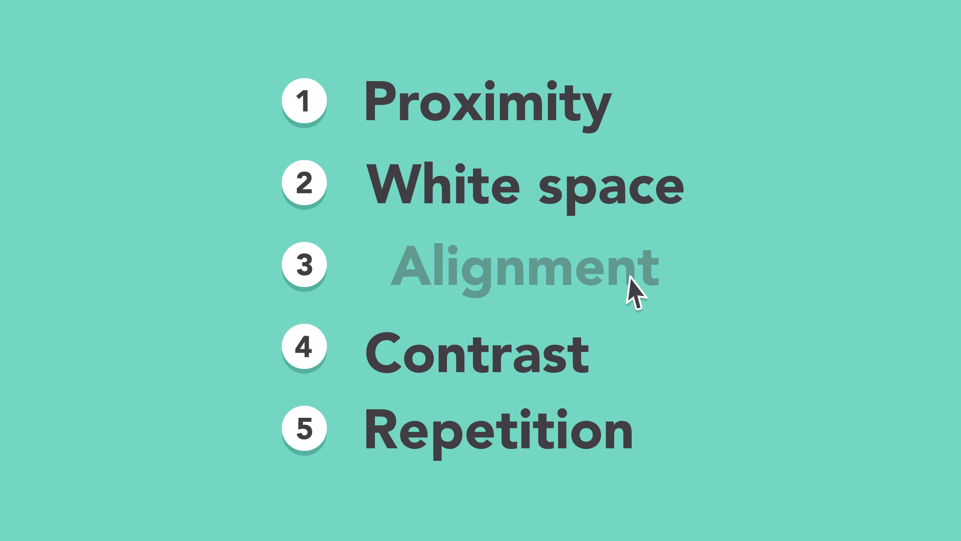
Five basic principles
The key to mastering layout and composition is to think like a designer. Luckily, it's easier than it sounds. There are five basic principles that can help you transform your work and sharpen your eye for design. Keep them in mind during your next project, and look for ways to apply them.
Proximity
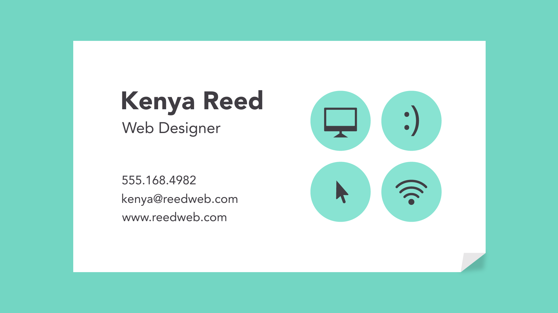
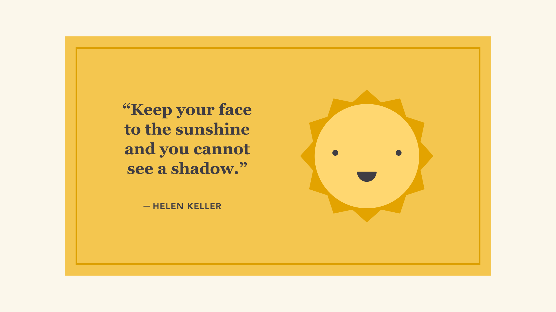
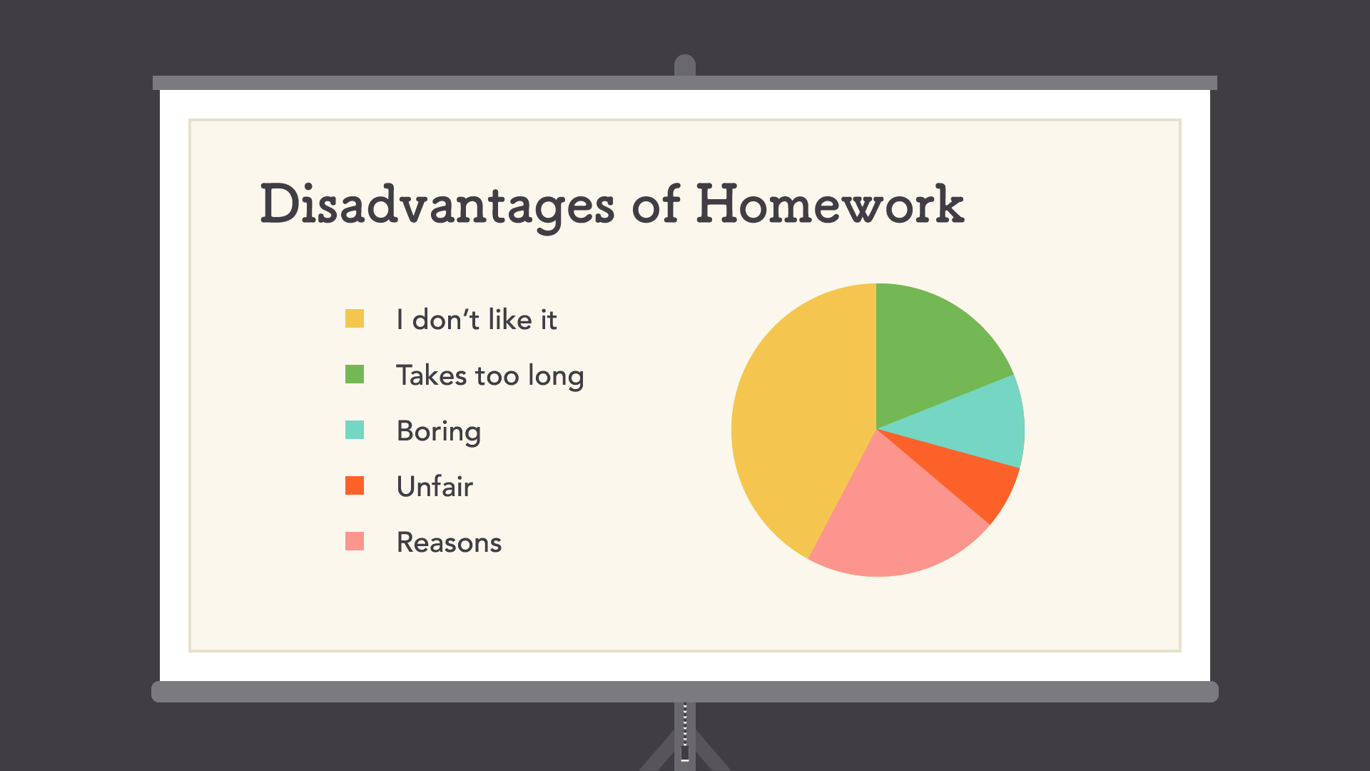
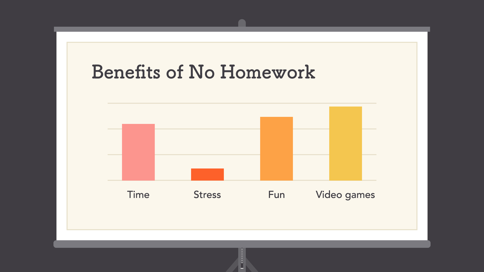
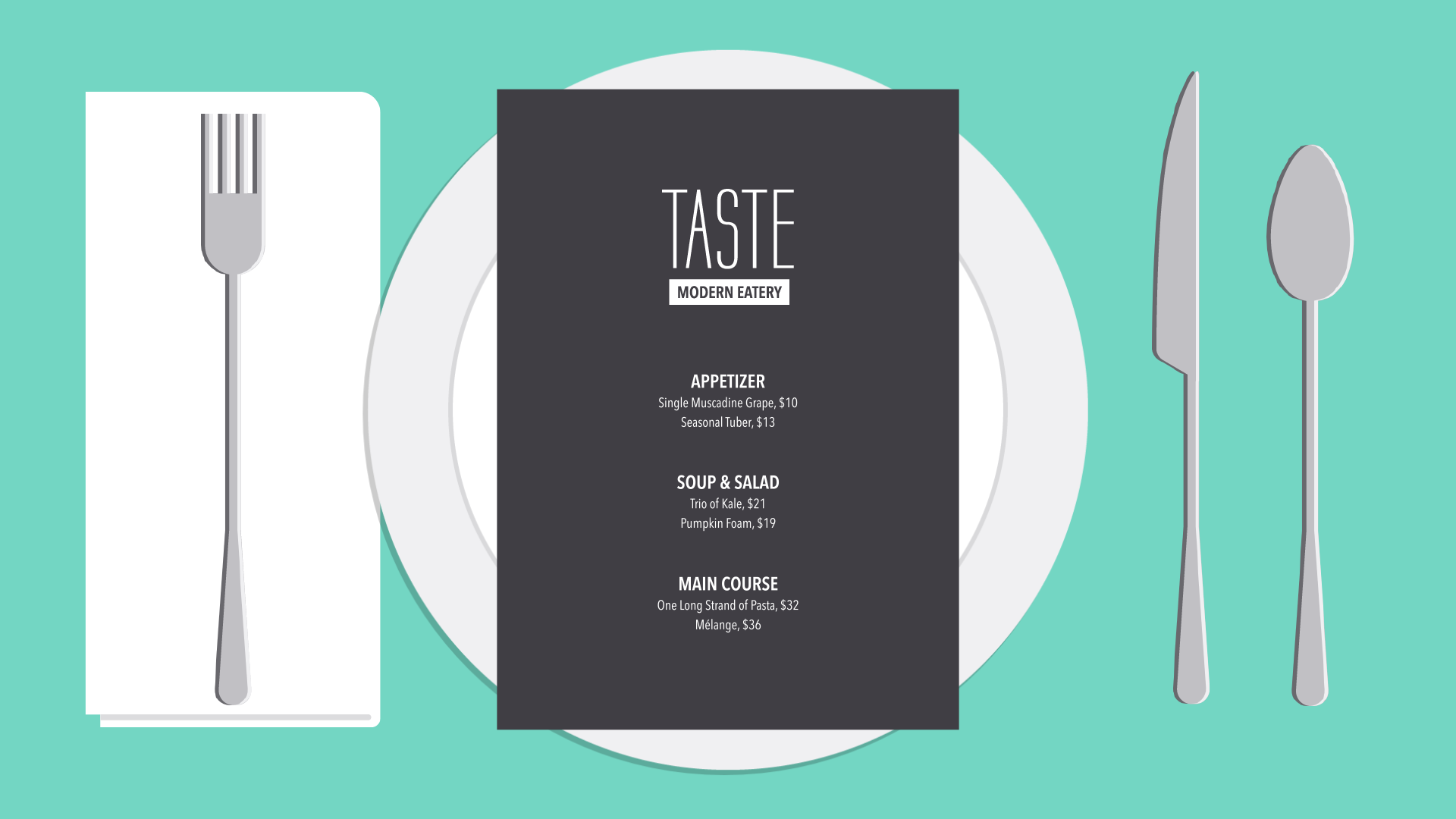
Proximity is all about using visual space to show relationships in your content. In practice, it's pretty simple—all you have to do is make sure related items are grouped together (for instance, blocks of text or elements in a graphic, as in the example below).
Groups that are NOT related to each other should be separated to visually emphasize their lack of a relationship. All in all, this makes your work easier to understand at a glance, whether it's purely text or something more visual.
White space
White space is an important part of every composition. Now, this doesn't mean literal white space; it just means negative space, like the spaces between your content, between lines, and even the outer margins.
There's no one way to use white space correctly, but it's good to understand its purpose. White space helps you define and separatedifferent sections; it gives your content room to breathe. If your work ever starts to feel cluttered or uncomfortable, a little white space might be just what the doctor ordered.
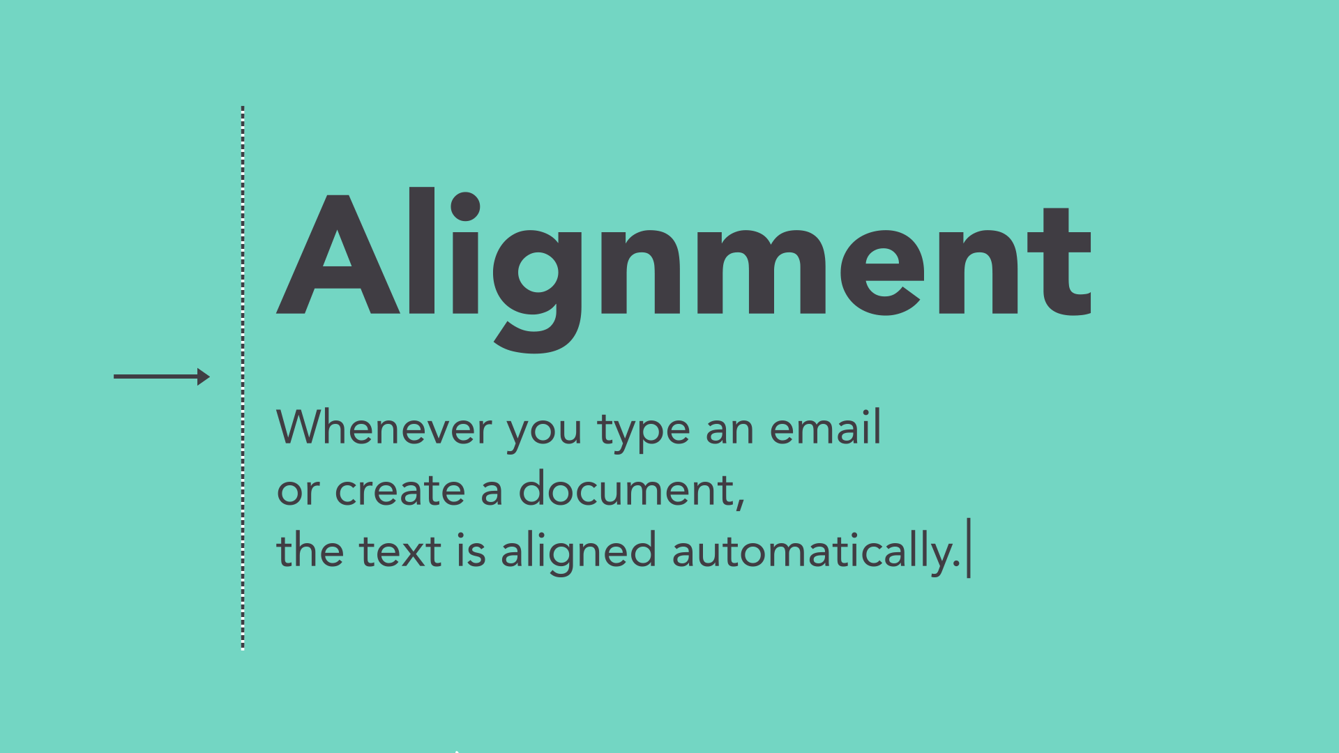
Alignment
Alignment is something you deal with all the time, even if you don't realize it. Whenever you type an email or create a document, the text is aligned automatically.
When aligning objects by yourself (for instance, images or separate text boxes), getting it right can be tricky. The most important thing is to be consistent.
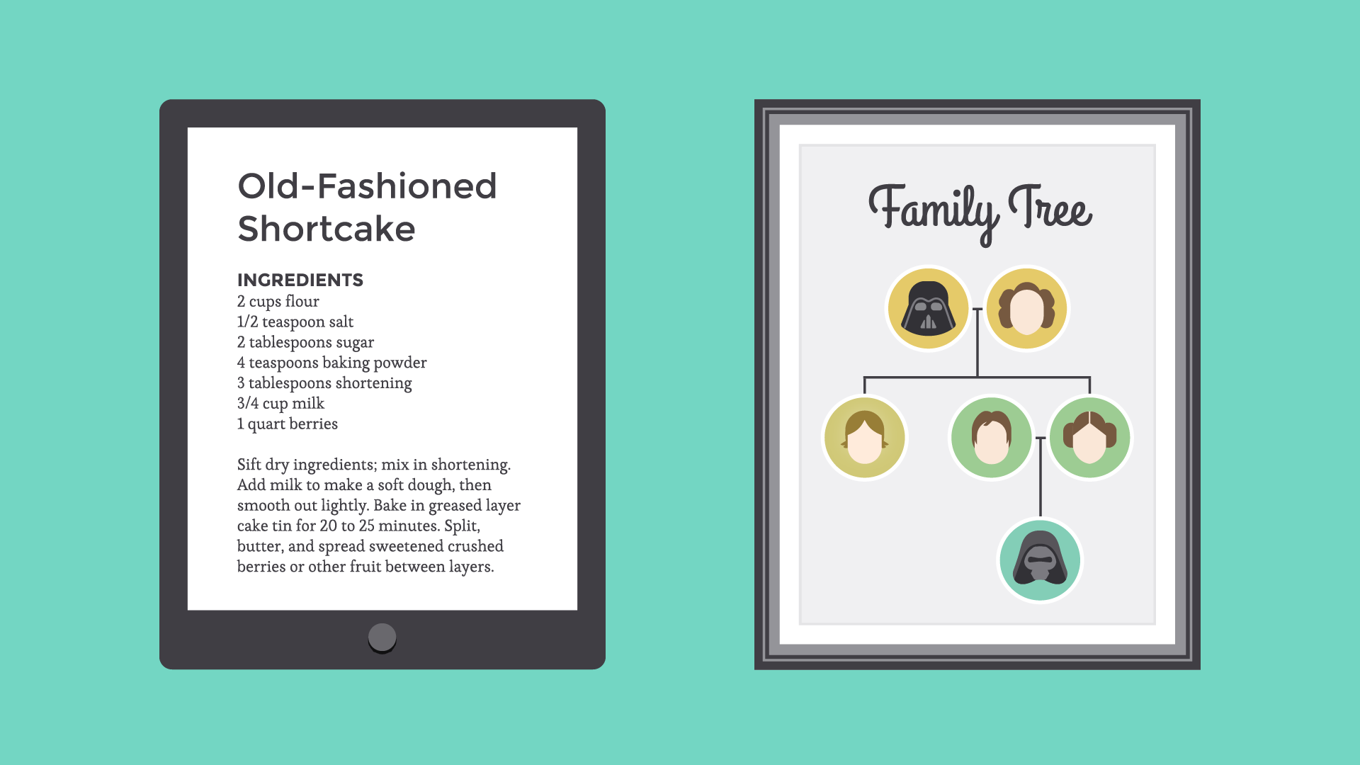
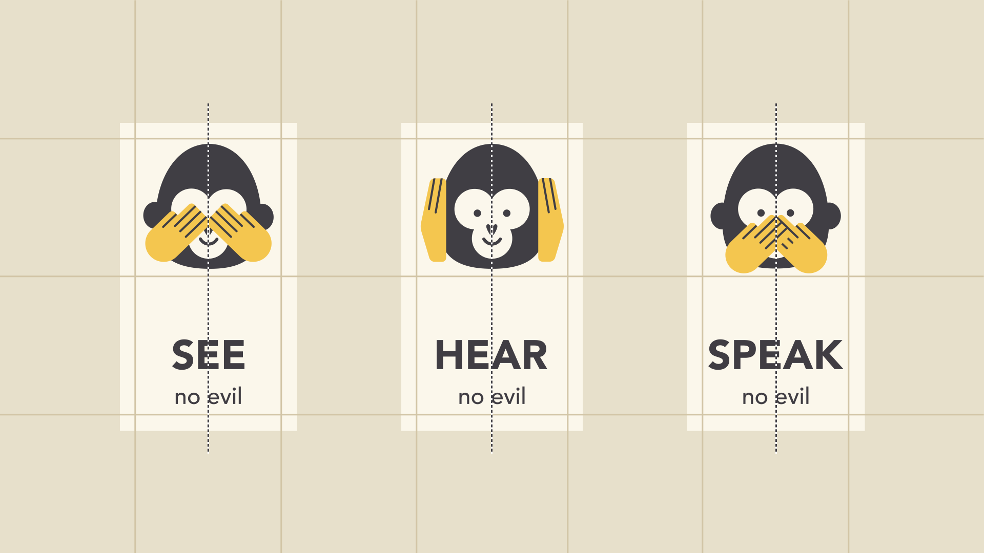
It might help to imagine your content arranged inside of a grid, just like the example below. Notice how there's an invisible line centering each image to the text? Each grouping is also evenly spaced and aligned, with equal-sized margins.
It's this attention to detail that makes the composition easier to navigate. Without consistent alignment, your work could start to feel disorganized.
Contrast
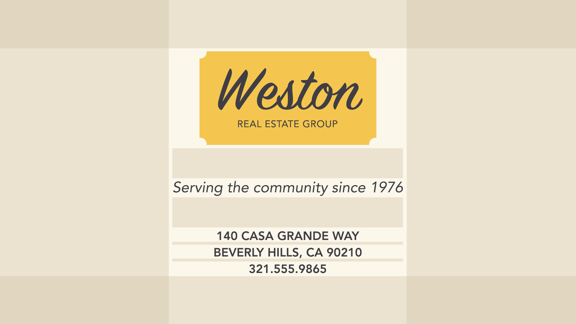
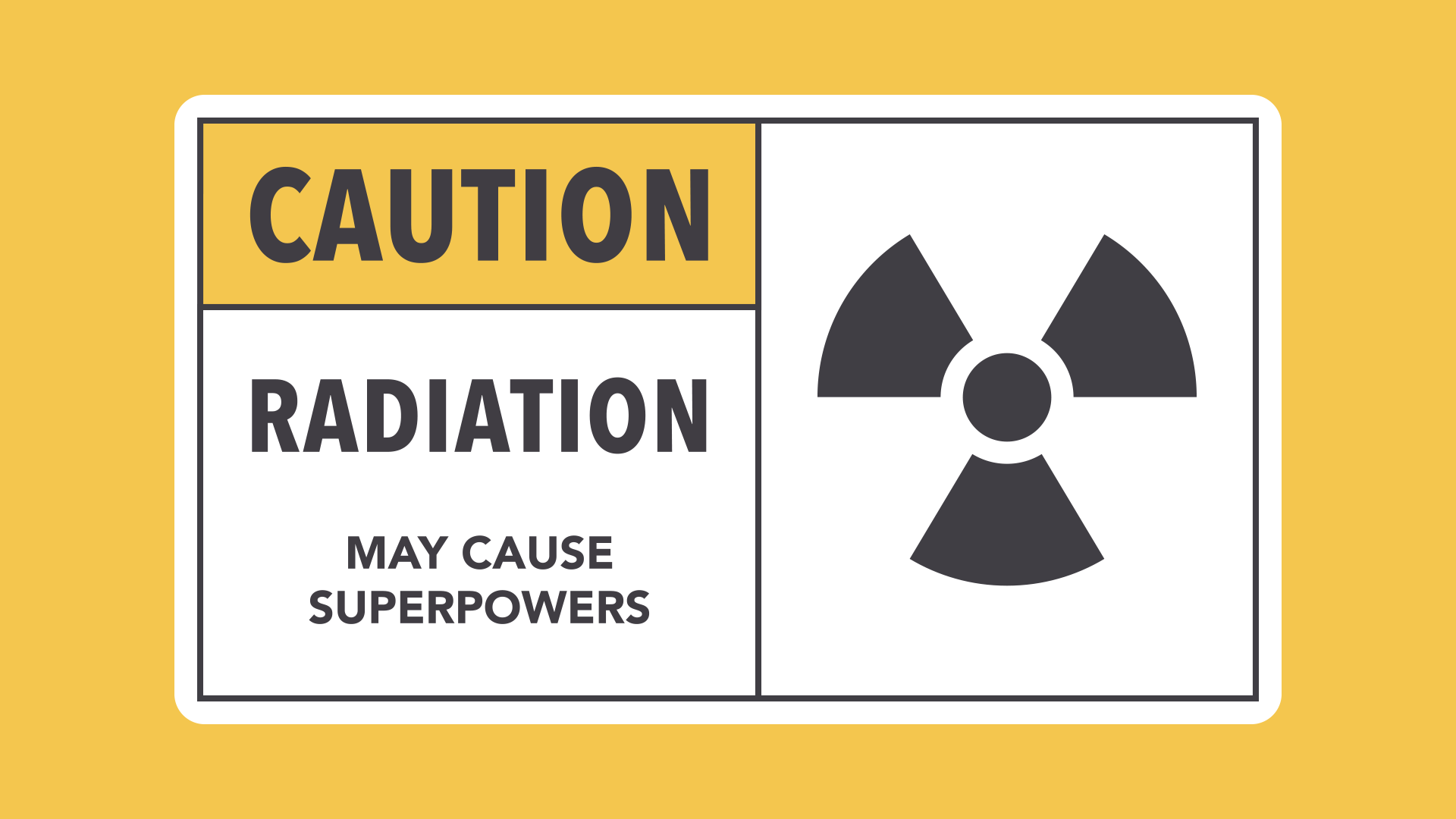
Contrast simply means that one item is different from another. In layout and composition, contrast can help you do many things, like catch the reader's eye, create emphasis, or call attention to something important.
To create contrast in the example below, we've used color, more than one style of text, and objects of differing sizes. This makes the design more dynamic and, therefore, more effective at communicating its message.
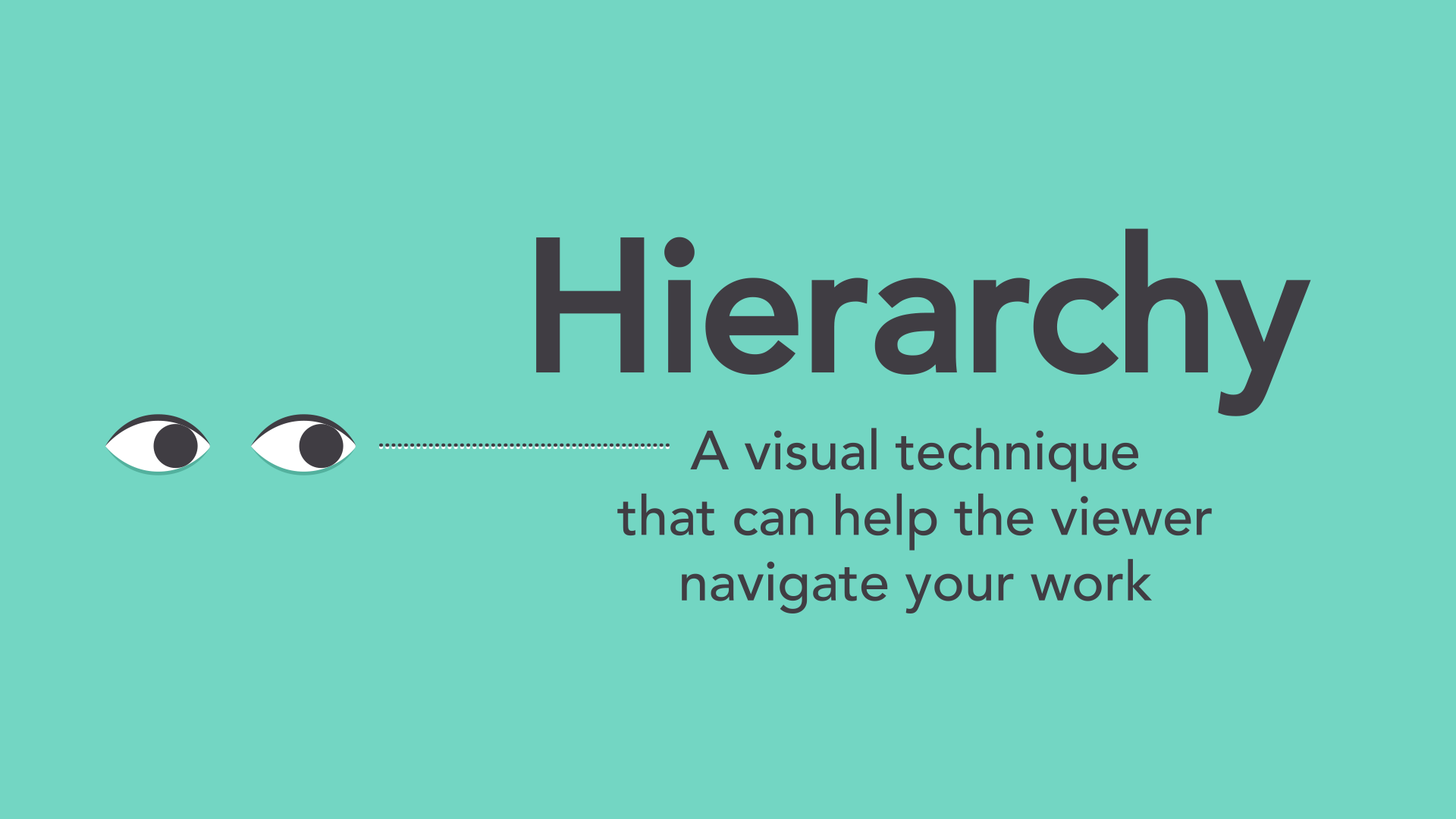
Hierarchy
Contrast is also closely tied to hierarchy, which is a visual technique that can help the viewer navigate your work. In other words, it shows them where to begin and where to go next using different levels of emphasis.
Establishing hierarchy is simple: Just decide which elements you want the reader to notice first, then make them stand out. High-level or important items are usually larger, bolder, or more eye-catching in some way.
Repetition
Repetition is a reminder that every project should have a consistent look and feel. This means finding ways to reinforce your design by repeating or echoing certain elements.
For instance, if you have a specific color palette, look for ways to carry it through. If you've chosen a special header style, use it every time.
It's not just for aesthetic reasons—being consistent can also make your work easier to read. When viewers know what to expect, they can relax and focus on the content.
Putting it all together
You might say layout and composition are the unsung heroes of design. It's easy to overlook their role, but they're part of everything you do.
The principles you just learned can help you elevate any project. All it takes is a little attention to detail and you can create beautiful, professional-looking compositions.
We hope you enjoyed learning the basics of composition!
Be sure to check out the rest of our graphic design topics, including: