The fundamentals of design are the foundation of every visual medium, from fine art to modern web design. They're even present in seemingly unimportant details, like the fonts that make up most compositions.
What do these examples have in common? Some very basic elements, including line, shape, form, texture, and balance. They might not seem like much on their own, but together, they're part of almost everything we see and create.
The fundamentals can be intimidating at first, especially if you don't consider yourself an artist. But keep an open mind—there's a lot they can teach you about working with different assets and creating simple visuals from scratch.
Watch the video to learn more about the fundamentals of design.
Line
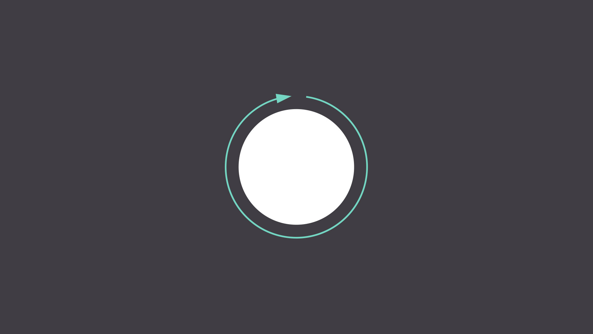
A line is a shape that connects two or more points. It can be fat, thin, wavy, or jagged—the list goes on. Every possibility gives the line a slightly different feel.
Lines appear frequently in design; for example, in drawings and illustrations. They're also common in graphic elements, like textures, patterns, and backgrounds.
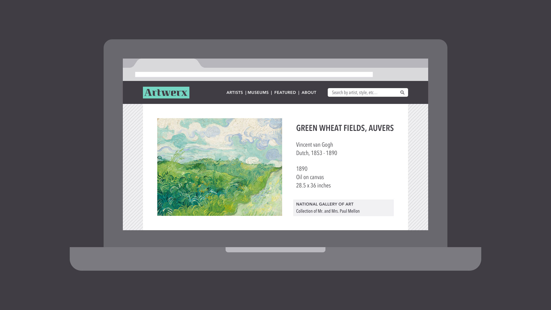
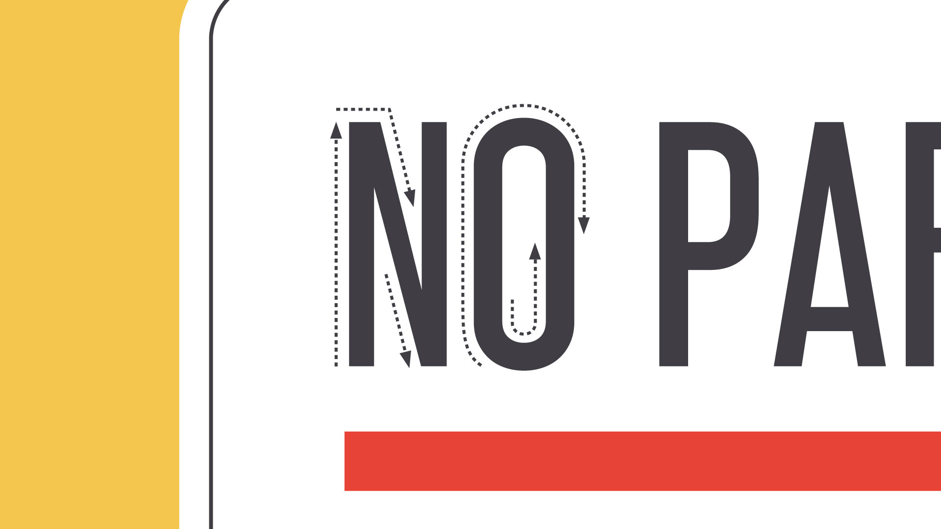
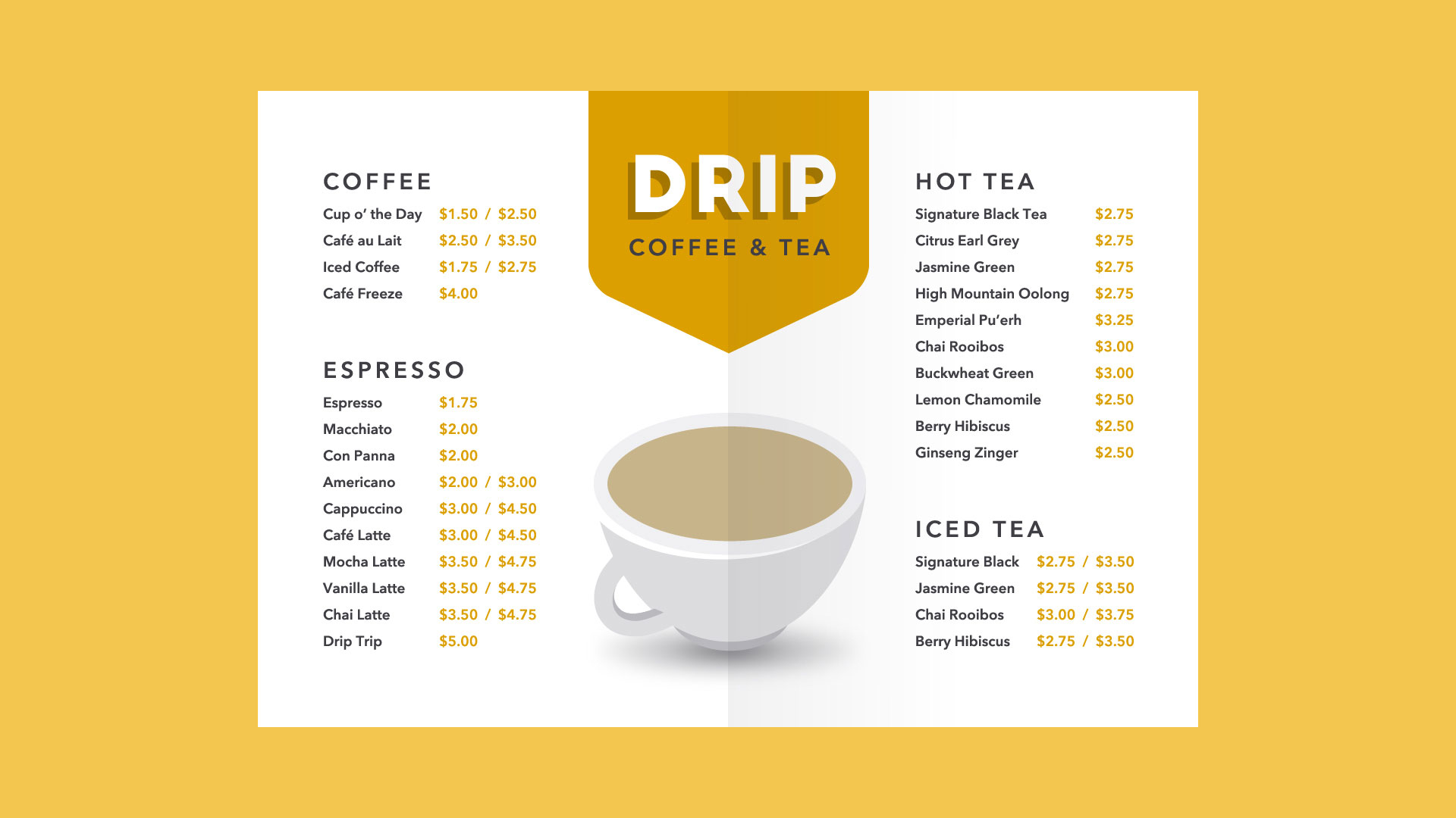
Lines can be used in more humble compositions,too—for organization, emphasis, or just decoration. In the example below, lines have been used to create a flow chart that guides the reader's eye from one element to the next.
When working with lines, pay attention to things like weight, color, texture, and style. These subtle qualities can have a big impact on the way your design is perceived.
Look for places where lines are hiding in plain sight; for example, in text. Even here, experimenting with different line qualities can give you very different results.
Shape
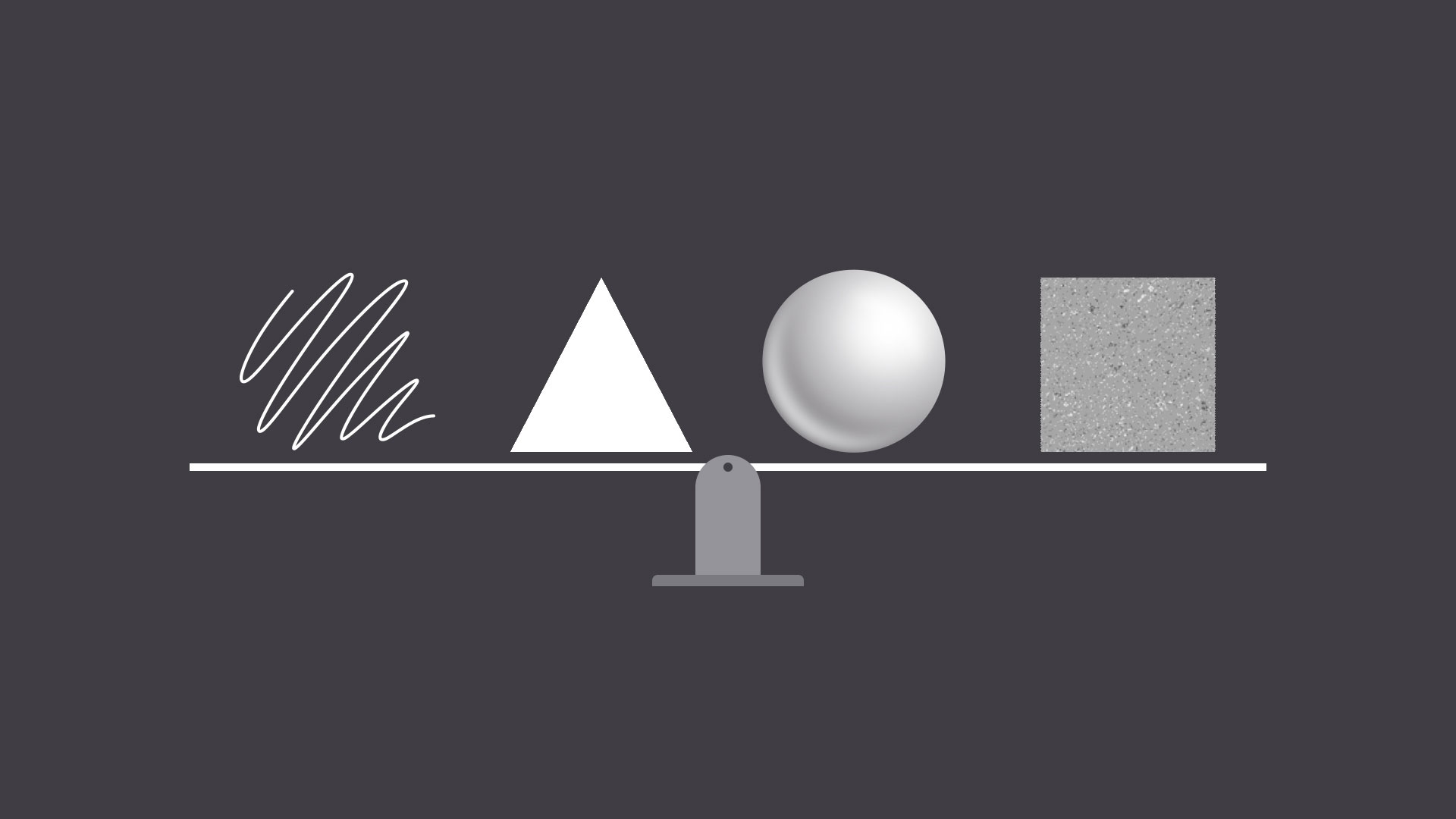
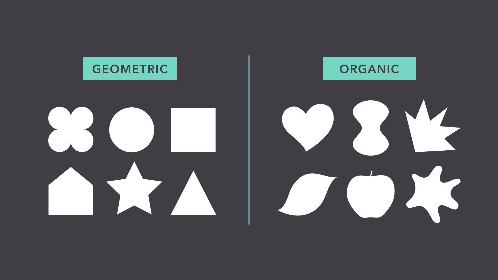
A shape is any two-dimensional area with a recognizable boundary. This includes circles, squares, triangles, and so on.
Shapes fall into two distinct categories: geometric (or regular) and organic (where the shapes are more free form).
Shapes are a vital part of communicating ideas visually. They give images heft and make them recognizable. We understand street signs, symbols, and even abstract art largely because of shapes.
Shapes have a surprising number of uses in everyday design. They can help you organize or separate content, create simple illustrations, or just add interest to your work. See if you can spot the many examples in the image below.
Shapes are important because they're the foundation of so many things. Learn to look for them in other designs, and soon you'll start seeing them everywhere.
Form
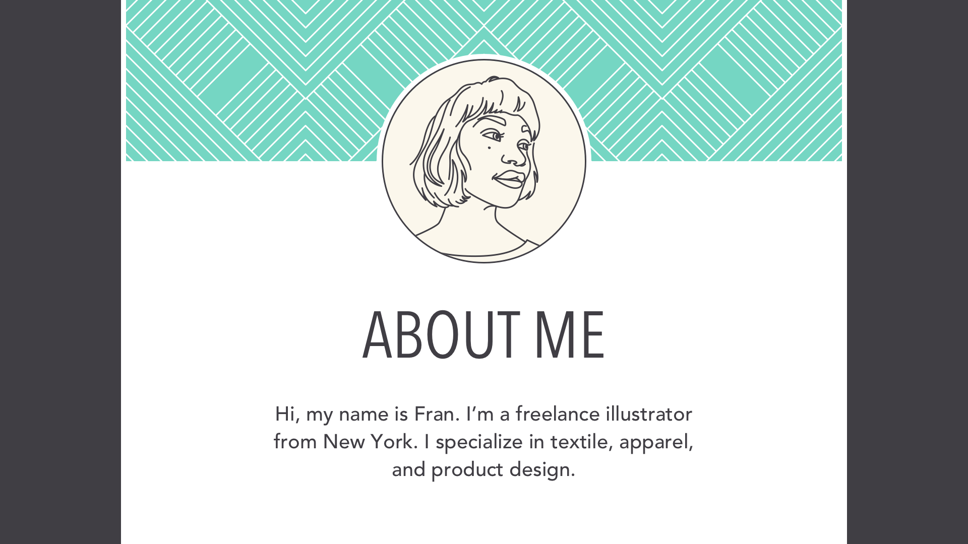
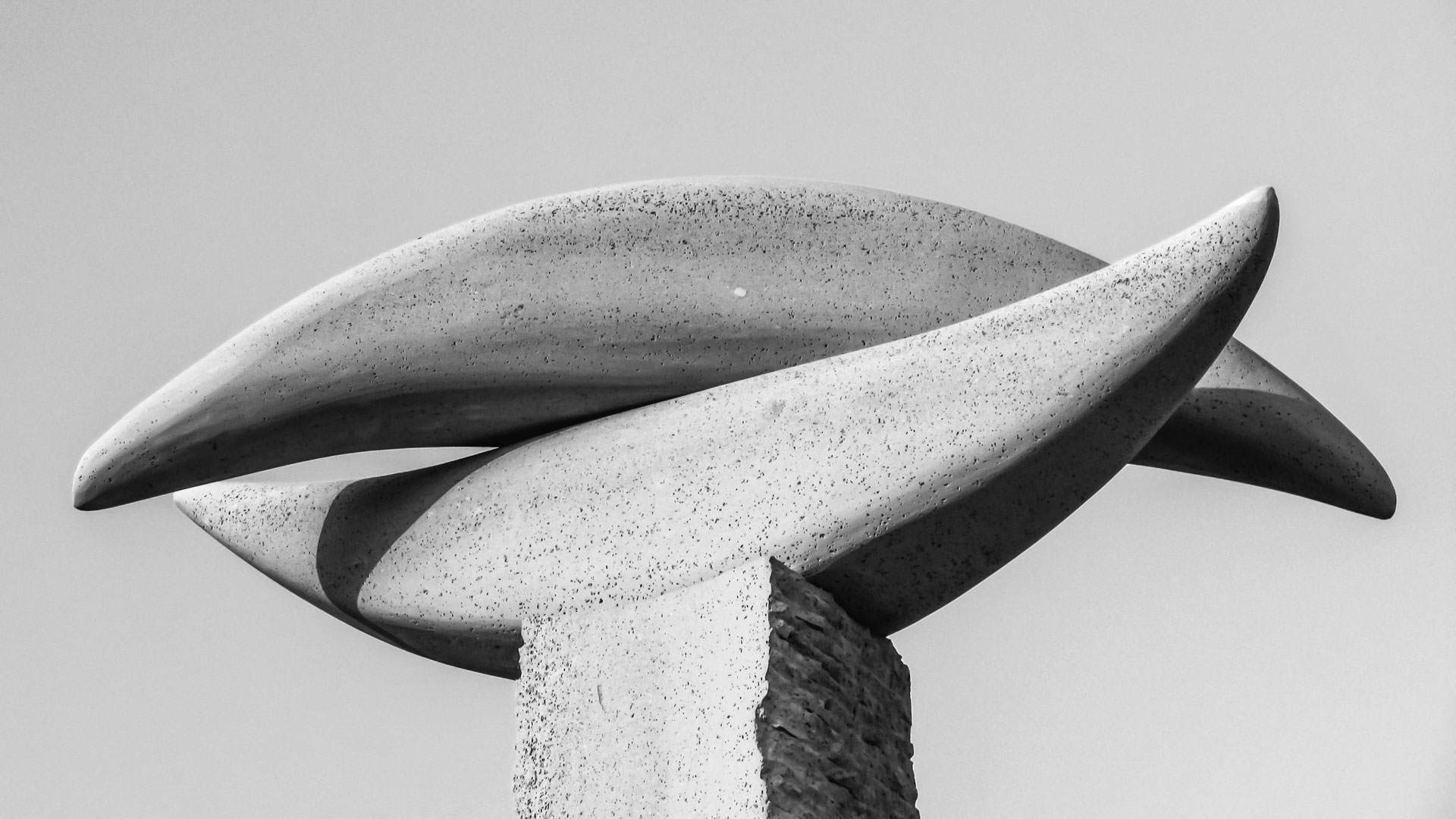
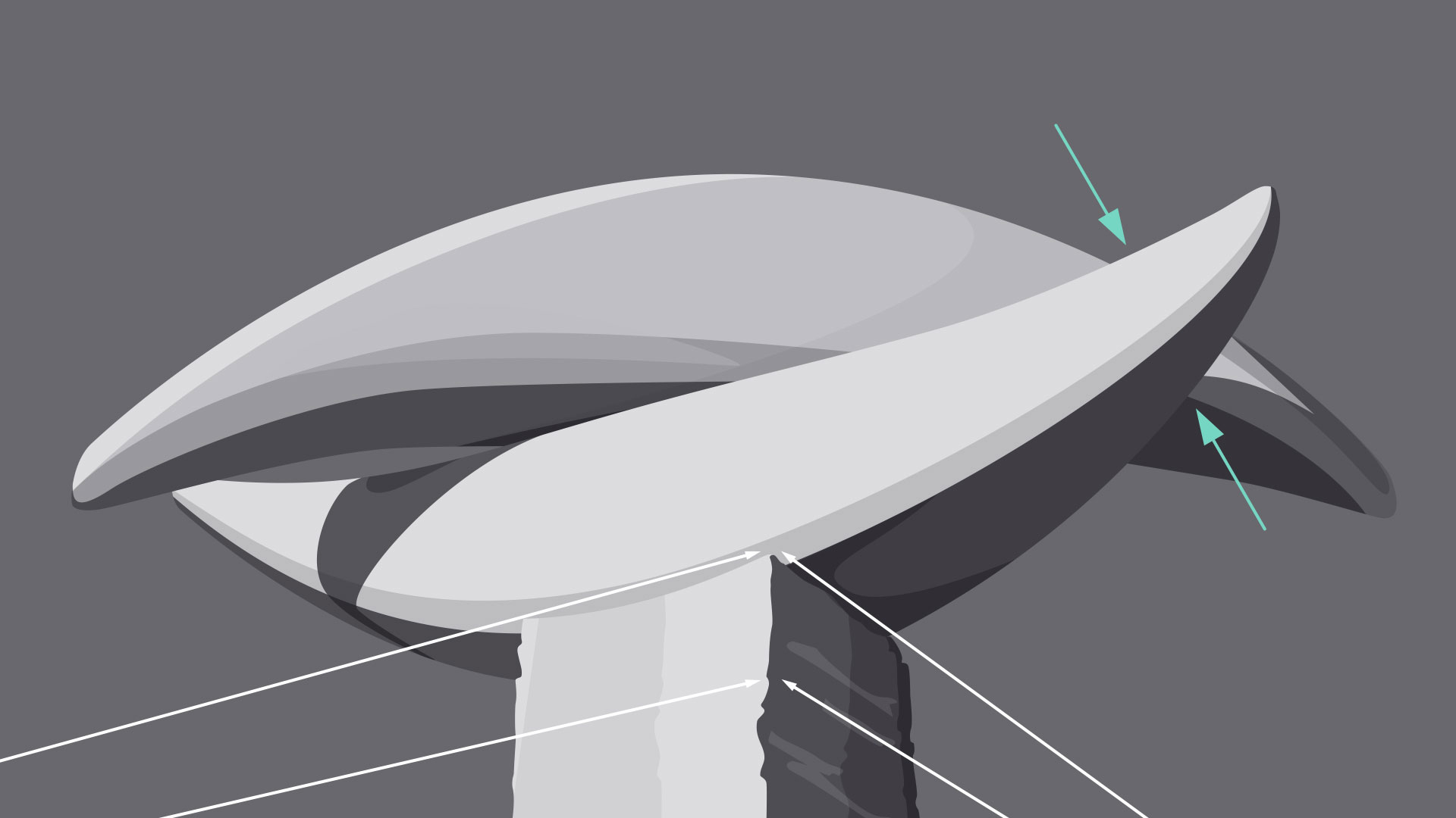
When a shape becomes 3D, we call it a form. Forms make up a variety of things in the real world, including sculptures, architecture, and other three-dimensional objects.
However, forms don't have to be three-dimensional shapes. They can also be implied through illustration, using techniques like light, shadow, and perspective to create the illusion ofdepth.
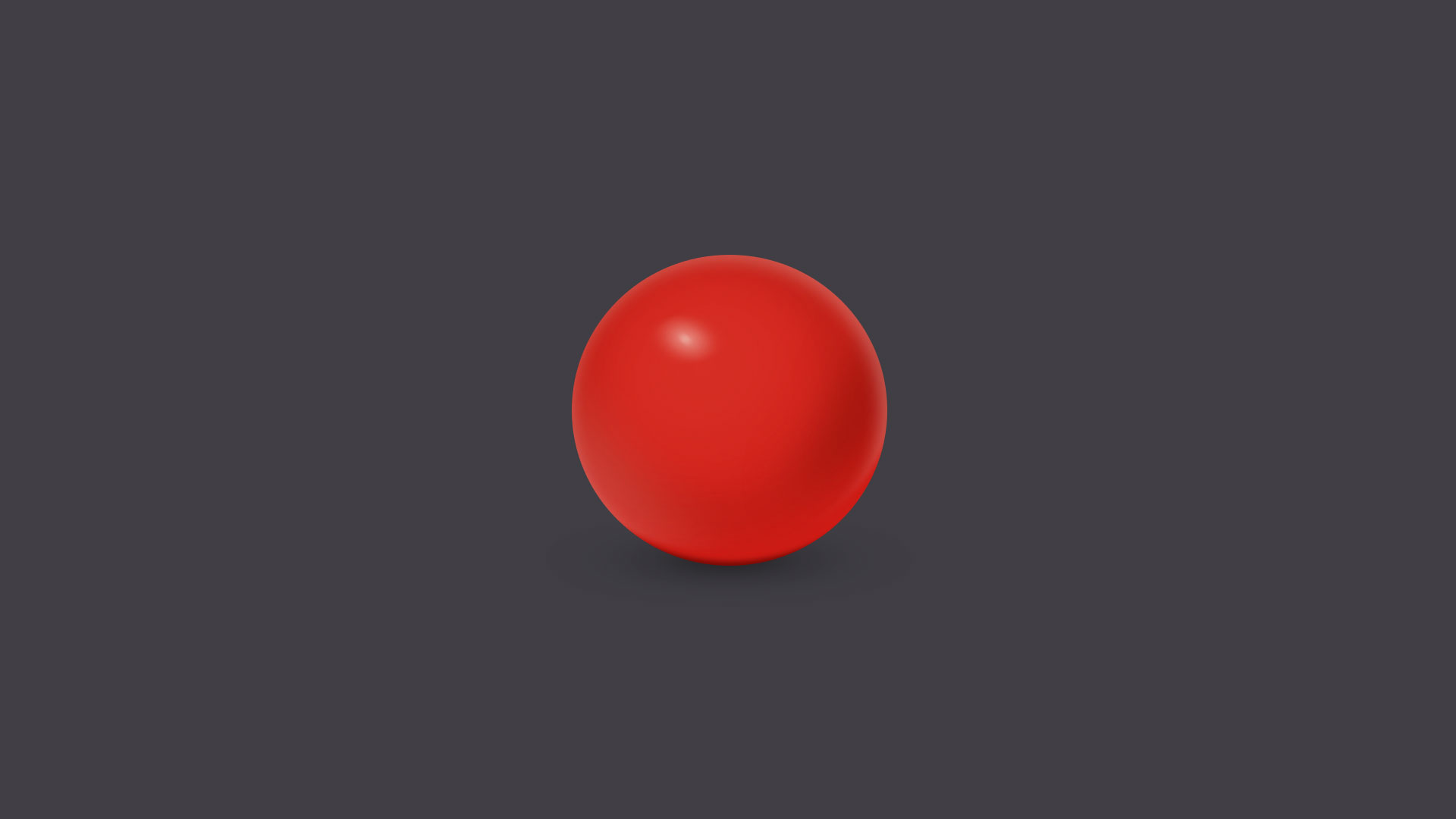
In two-dimensional design, form makes realism possible. Without it, renderings like the image below—a ball with highlights and shading—simply wouldn't be the same.
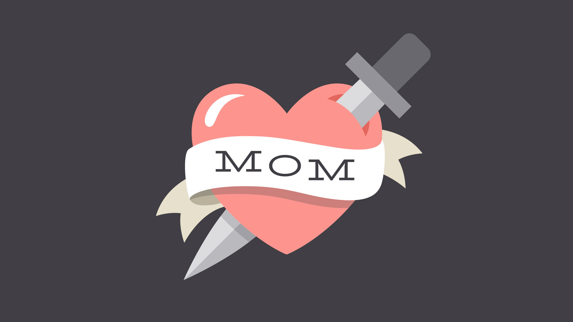
Even images that are less realistic use similar techniques to create dimension. Below, the lighting and shading are stylized, but still hint at form and depth.
In everyday composition, the purpose of form is the same, but on a smaller scale. For example, a simple shadow can create the illusion of layers or give an object a sense of place.
Basic forms can bring a touch of realism to your work, which is a powerful tool when used in moderation.
Texture
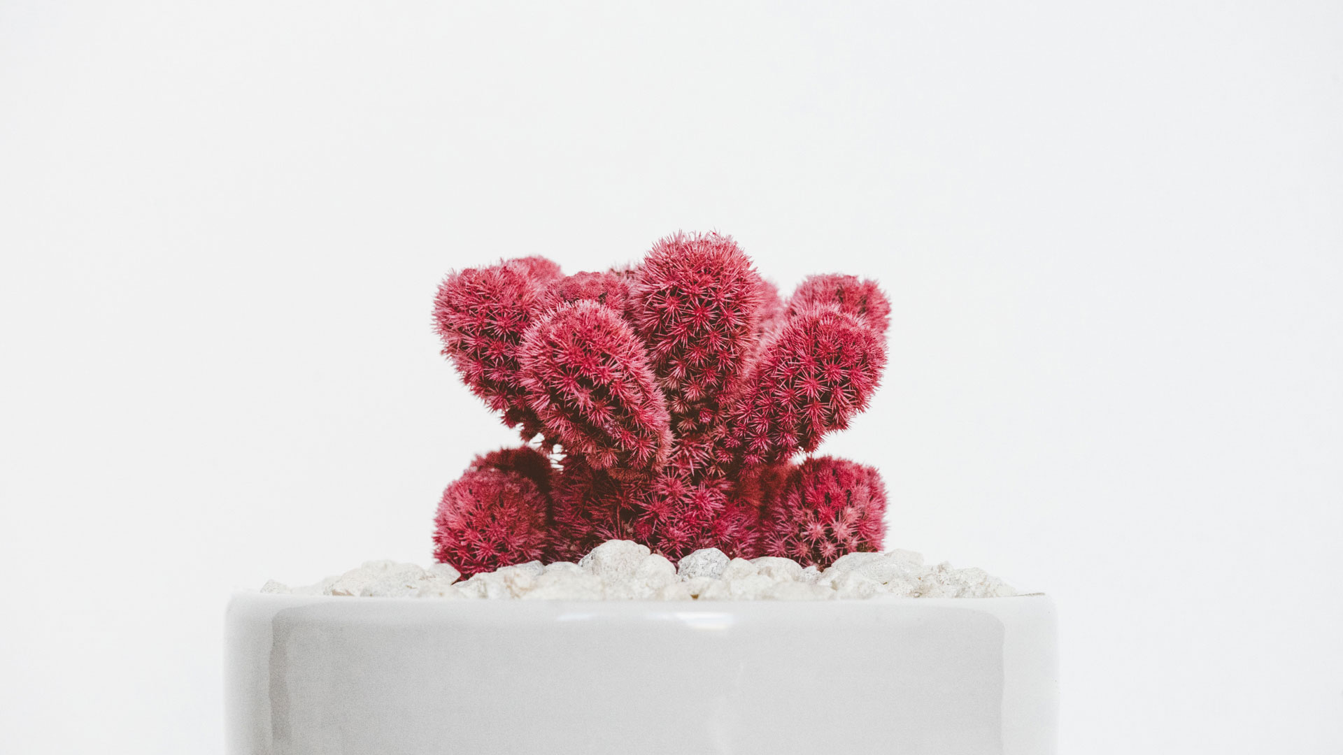
Texture is the physical quality of a surface. Like form, it can be part of a three-dimensional object, as in the example below (a small prickly cactus in a shiny ceramic pot).
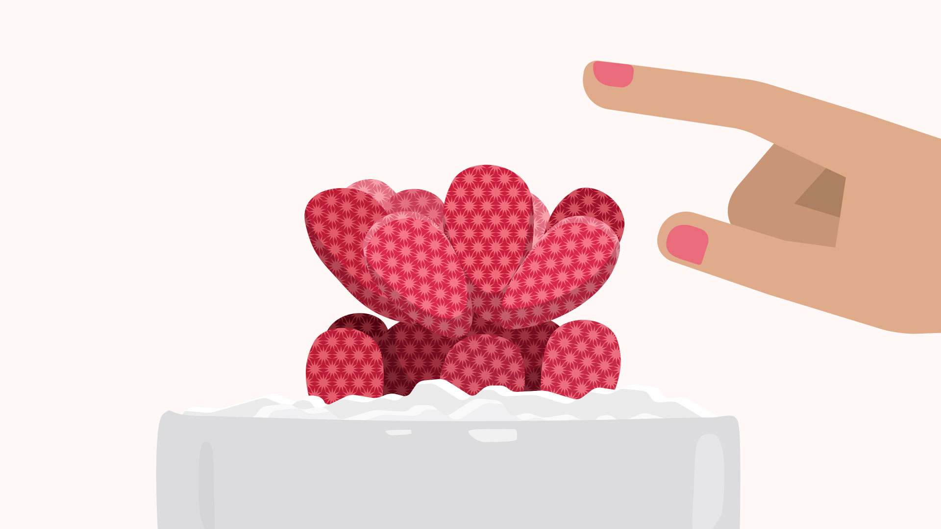
Or it can be implied through illustration, suggesting that it would have texture if it existed in real life.
In design, texture adds depth and tactility to otherwise flat images. Objects can appear smooth, rough, hard, or soft, depending on the elements at play.
For beginners, textures make great background images and can add a lot of interest to your work. Look closely, and you may find texture in unexpected places, like distressed fonts and smooth, glossy icons.
Just be careful not to go overboard—too much texture in a single design can quickly become overwhelming.
Balance
Balance is the equal distribution of visual weight (more specifically, how much any one element attracts the viewer's eye). Balance can be affected by many things, including color, size, number, and negative space.
Mastering balance can be tricky for beginners because it does take some intuition. Luckily, the design world is full of examples that can help you understand its different iterations.
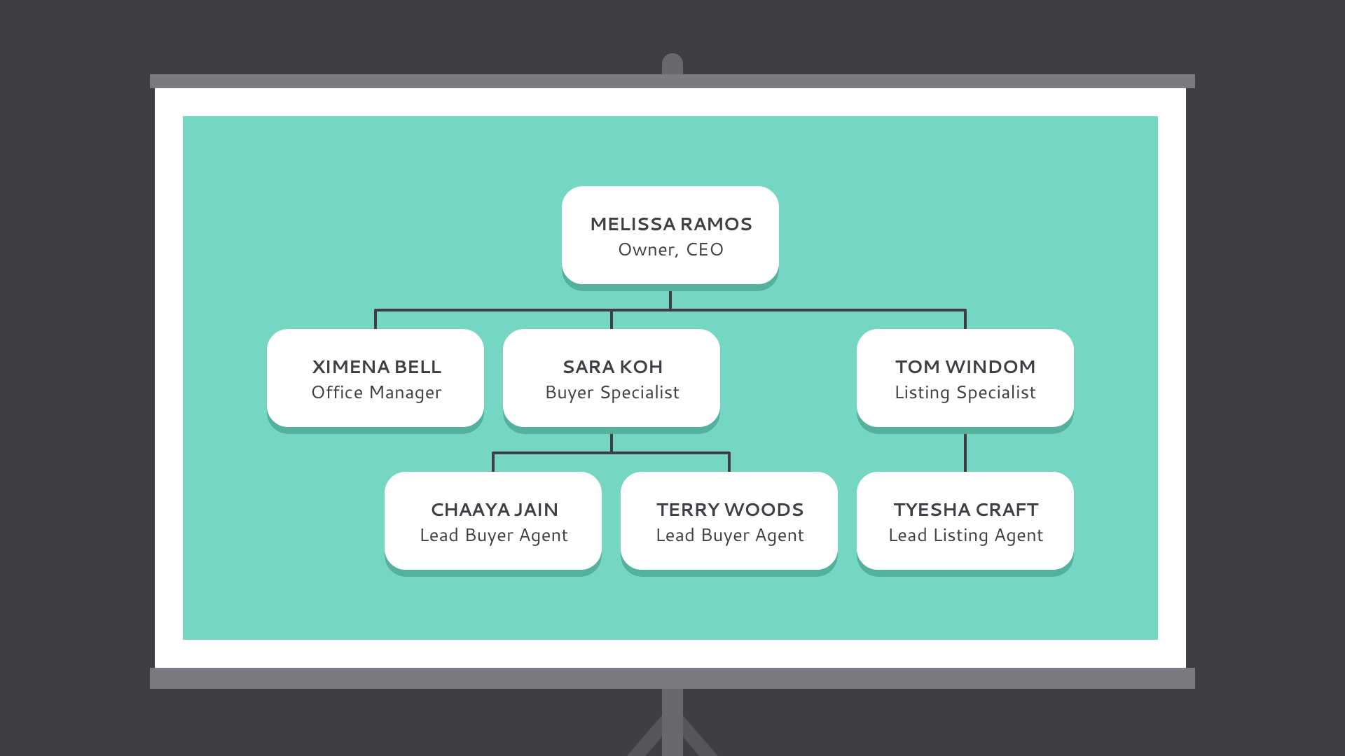
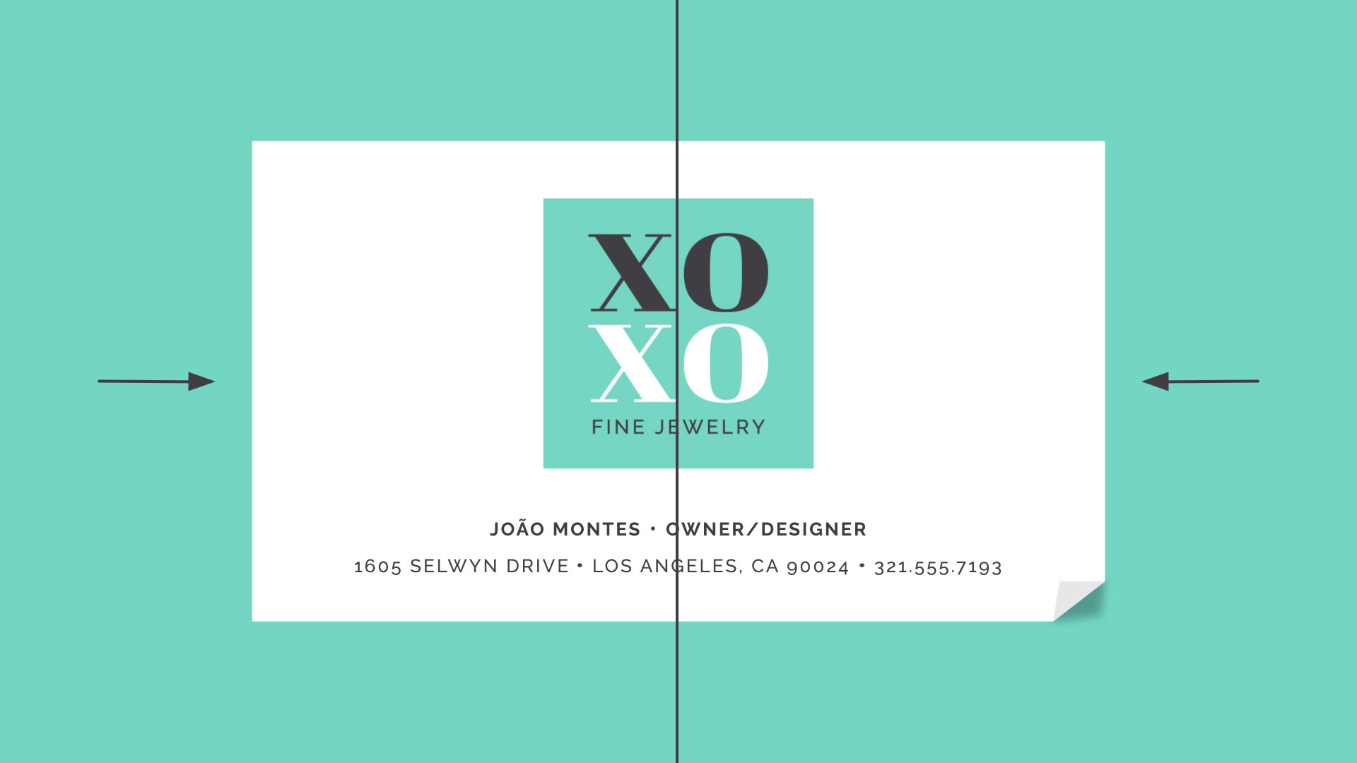
Symmetrical designs are the same or similar on both sides of an axis. They feel balanced because each side is effectively the same (if not identical).
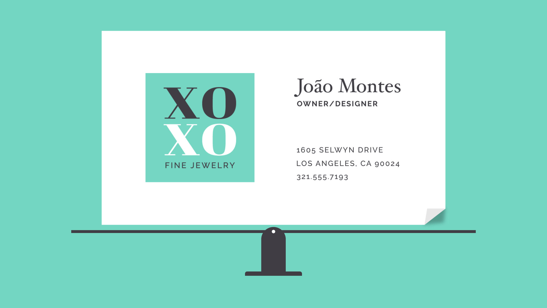
Asymmetrical designs are different, but the weight is still evenly distributed. The composition is balanced because it calls attention to the right things (in this example, the person's name and company logo).
The rule of thirds
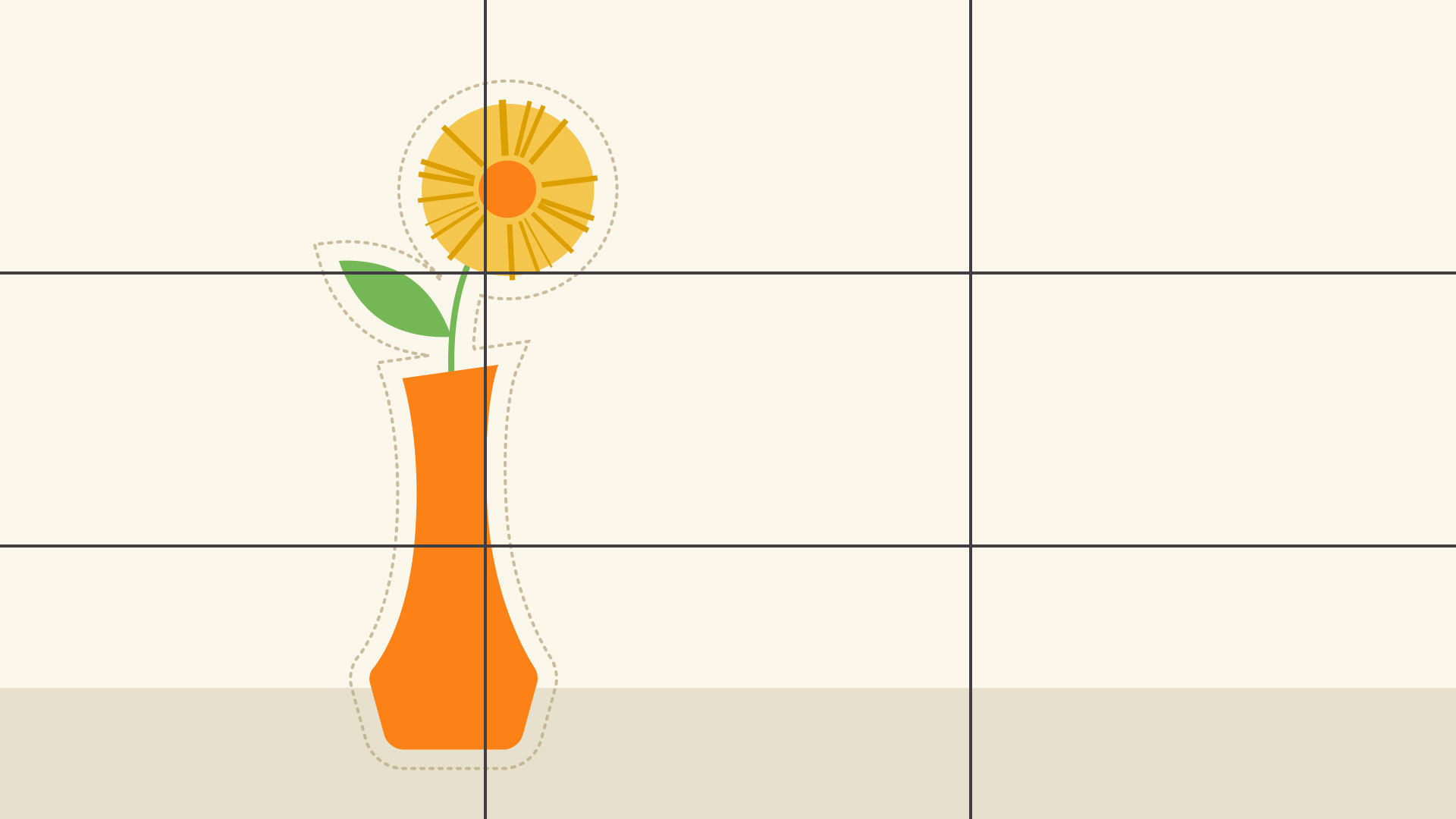
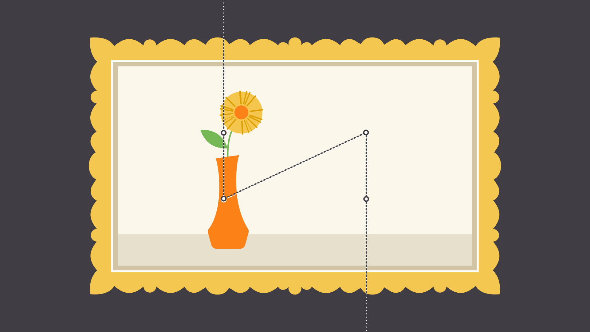
Many people, including designers and photographers, use a strategy called the rule of thirds. This imagines your work area divided into a 3x3 grid. The focal point of the image is placed on or near one of the grid lines, creating visual balance with the rest of the space.
We find this type of composition appealing because, according to studies, the human eye naturally follows this path when scanning a design.
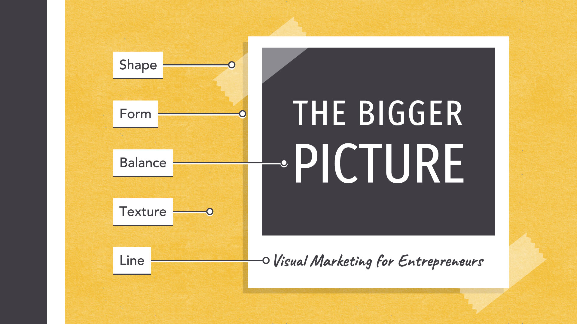
Putting it all together
The fundamentals of design are all about the bigger picture—in other words, learning to appreciate the many small details that make up every composition.
This insight can be applied to almost any type of project, whether you're creating your own graphics or just looking for simple ways to enhance your work.
We hope you enjoyed learning the fundamentals of design!
Be sure to check out the rest of our graphic design topics, including: