Lesson 10: Adding Charts, Diagrams, and Tables
/en/powerpointxp/adding-clip-art-and-pictures/content/
Introduction
By the end of this lesson, you should be able to:
- Insert a chart
- Insert a diagram
- Insert a table
Inserting a chart
PowerPoint allows you to insert charts into your slide presentation to display different types of information to your audience.
To insert a chart:
- Insert a new slide with a title and a chart icon.
- When the slide appears, click the Insert Chart icon.
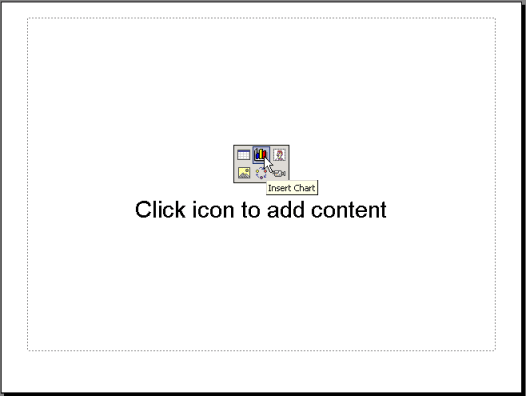
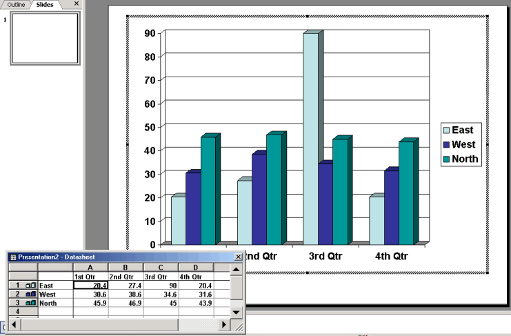
- A chart appears with a data sheet and sample data.
Setting a maximum value for a chart
As you enter numbers in your chart, a maximum value for your chart will automatically be set, or you can set a maximum value of your own. The top value will automatically round up from the top value of the data you are entering. Depending on your data, it will be rounded to the nearest ten, hundred, or thousand.
To set a maximum value:
- Double-click a value on the side of the chart.
- The Format Axis dialog box appears.
- Click the Scale tab.
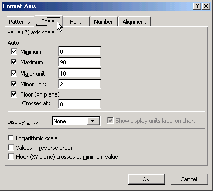
- Change the number for Maximum to the maximum number in your presentation.
Choosing a different chart type
If you don't want to use the chart that automatically appears when you double-click the chart icon in a slide, you can choose a different chart type.
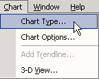
To choose a different chart option:
- Click Chart
 Chart Type.
- A list of charts appears, including Column, Bar, Line, Pie, and Pyramid.
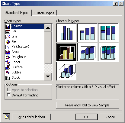
- Choose the best chart type for your presentation.
- Click OK.
Labeling a chart
You may also want to label your chart with such information as the title and what the X and Y axes represent. In the default chart, the X axis is the horizontal information, while the Y axis is the vertical information.
To label a chart:
- Click ChartChart Options.
- A dialog box appears.
- Click the Titles tab if it's not already selected.
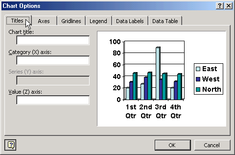
- In the box below Chart title, type the title.
- In the box below Category (X) axis, type the label for this information. It appears in the rows to the left of the datasheet and in a box to the right of the chart.
- In the box below Value (Y) axis, type the label for this information.
- Click OK.
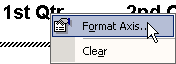
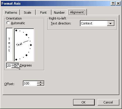
To change text alignment of label:
- Right-click the text and choose Format Axis title.
- Click the Alignment tab.
- Choose your text alignment and orientation options.
Inserting a diagram or organization chart
Does your presentation require a diagram or organization chart? An organization chart shows hierarchal relationships in a company or organization such as president, vice president, and directors. Diagrams are used to show relationships between various elements.
To insert a diagram or organization chart:
- Insert a new slide with a diagram or organization chart icon.
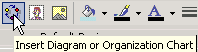
- Click the Insert Diagram or Organization Chart icon.
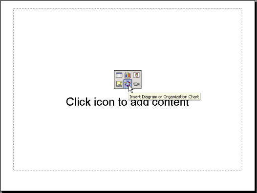
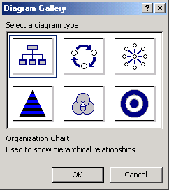
- When the Diagram Gallery dialog box appears, select a diagram or chart type.
OR
- If you're working in a blank slide, click the Insert Diagram or Organization Chart button on the Drawing toolbar.
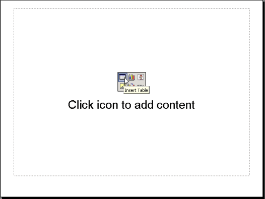
Inserting a table
PowerPoint also gives you the option of displaying information within your presentation in a table.
To insert a table:
- Insert a new slide with a table icon.
- Click the Insert Table icon.
- When the dialog box appears, set the number of columns and rows for your table.
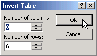
- Click OK.
- Enter the data for your table.
- To format the table, choose FormatTable.
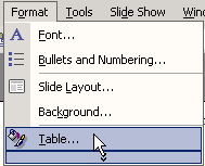
- Click the tabs and make any necessary changes.
- Click OK.
Challenge!
- Open the presentation Tips for Getting Organized.
- Insert a new slide that contains a chart icon.
- Insert a chart.
- Change the datasheet by typing in the following information:
- Under A, type 1st month; under B, type 2nd month; and under C type 3rd month
- Along the left side of the sheet, next to 1, type Work; next to 2, type Home
- In the Work row, type 35, 25, and 20 for 1st month, 2nd month, and 3rd month, respectively
- In the Home row, type 40, 35, and 30 for the 1st month, 2nd month, and 3rd month, respectively
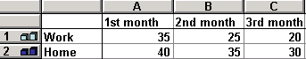
- Add a title to the chart Minutes per Day Spent Organizing.
- Insert a slide with a table.
- Format the table so it has 7 columns and 5 rows.
- Across the top of the table, type abbreviations for the days of the week in the separate cells.
- Close and save your presentation.
/en/powerpointxp/adding-autoshapes-wordart-and-hyperlinks/content/


 If the datasheet disappears, double-click the chart and choose View