
PowerPoint 2010 -
Working with Charts

PowerPoint 2010
Working with Charts

search
menu
/en/powerpoint2010/working-with-tables/content/
A chart is a tool you can use to communicate your data graphically. Displaying charts in PowerPoint allows your audience to see the meaning behind the numbers, and it makes showing comparisons and trends much easier. In this lesson, you will learn how to insert charts and modify them so they communicate information effectively.
In many ways, charts are an ideal way to present information in PowerPoint 2010. They give you an illustration of your data. A chart can help you show your audience what your data means and why it's important. Plus, they can add visual interest to slide shows that are otherwise filled with text. To use charts effectively, you'll need to know how to insert and modify them.
Optional: You can download this example for extra practice.
Click the arrows in the slideshow below to view examples of some of the types of charts available in PowerPoint.
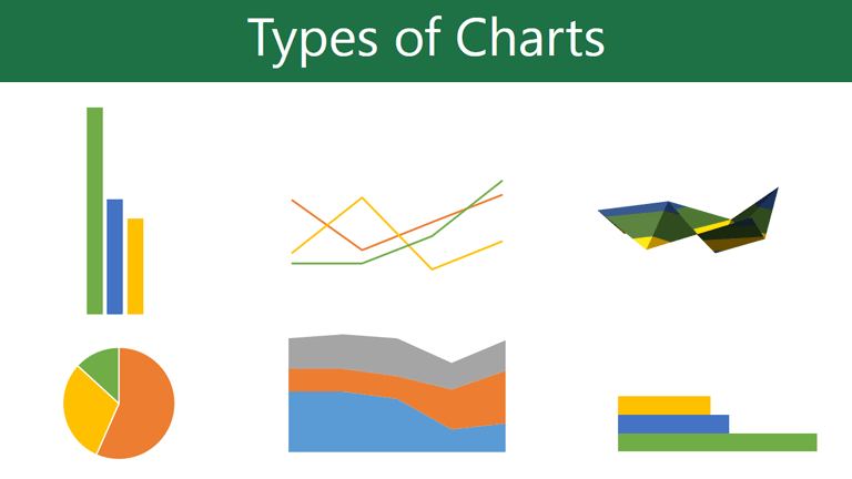
PowerPoint has a variety of chart types, each with its own advantages. Click the arrows to see some of the different types of charts available in PowerPoint.
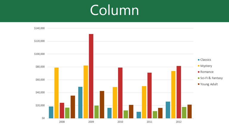
Column charts use vertical bars to represent data. They can work with many different types of data, but they're most frequently used for comparing information.

Line charts are ideal for showing trends. The data points are connected with lines, making it easy to see whether values are increasing or decreasing over time.

Pie charts make it easy to compare proportions. Each value is shown as a slice of the pie, so it's easy to see which values make up the percentage of a whole.
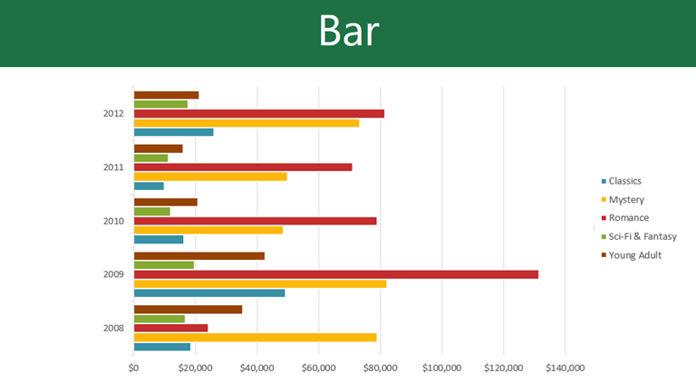
Bar charts work just like column charts, but they use horizontal bars instead of vertical bars.
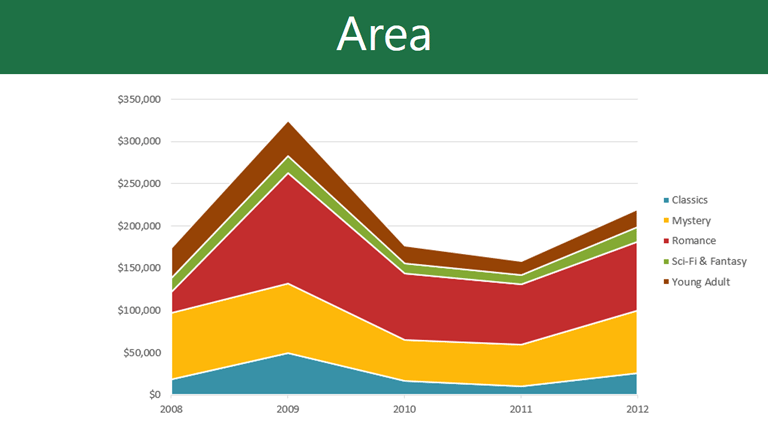
Area charts are similar to line charts, except the areas under the lines are filled in.

Surface charts allow you to display data across a 3-D landscape. They work best with large data sets, allowing you to see a variety of information at the same time.

Click the buttons in the interactive below to learn about the different parts of a chart.
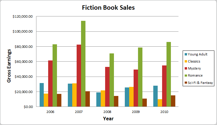
The horizontal axis, also known as the x axis, is the horizontal part of the chart.
In this example, the horizontal axis identifies the categories in the chart, so it is also called the category axis. However, in a bar chart, the vertical axis would be the category axis.
The legend identifies which data series each color on the chart represents. For many charts it is crucial, but for some charts it may not be necessary and can be deleted.
In this example, the legend allows viewers to identify the different book genres in the chart.
The data series consists of the related data points in a chart. If there are multiple data series in the chart, each will have a different color or style. Pie charts can only have one data series.
In this example, the green columns represent the Romance data series.
The title should clearly describe what the chart is illustrating.
The vertical axis, also known as the y axis, is the vertical part of the chart.
In this example, a column chart, the vertical axis measures the height—or value—of the columns, so it is also called the value axis. However, in a bar chart, the horizontal axis would be the value axis.
PowerPoint uses an Excel worksheet as a placeholder for entering chart data. Therefore, when you insert or edit a chart in PowerPoint, an Excel window will automatically open. The process is user-friendly, but if you are totally unfamiliar with Excel, you might want to review our Cell Basics lesson from our Excel 2010 tutorial.
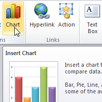
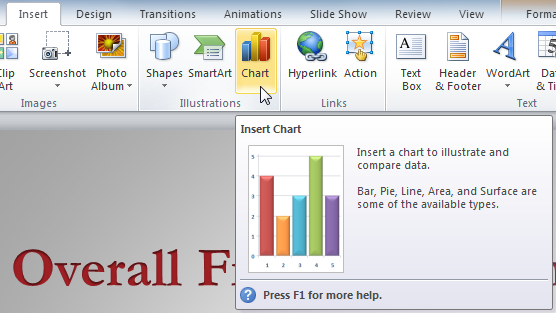 Inserting a chart
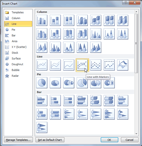 The Insert Chart dialog box
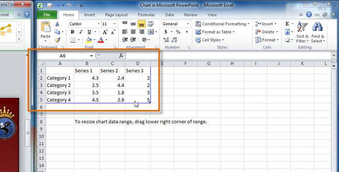 Excel window with the data placeholder
If a slide layout has a content placeholder, you can also click the Insert Chart command to insert a new chart.
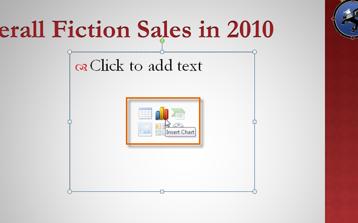 Inserting a chart in the placeholder
The data that appears in the Excel spreadsheet is placeholder source data that you will replace with your own information. The Excel source data is used to create the PowerPoint chart.
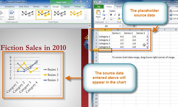 The placeholder source data and the corresponding chart
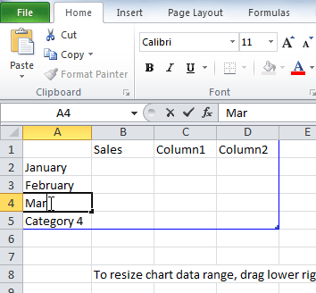 Entering data into the spreadsheet
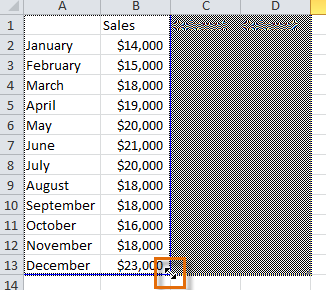 Dragging the blue line to decrease the data range
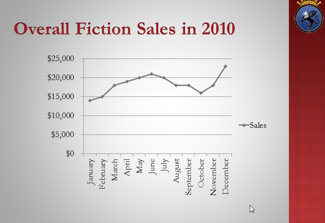 The completed chart
You can edit the chart data at any time by selecting your chart and clicking the Edit Data command in the Data group on the Chart Tools Design tab.
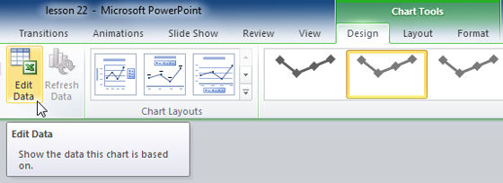 The Edit Data command
If you already have an Excel worksheet with data you want to use for a PowerPoint chart, you can transfer the data by copying and pasting it. When the Excel window opens, open your existing worksheet, select and copy the data, and paste it into the worksheet in place of the placeholder data. Be sure to drag the blue line to surround all the data you want to include in the chart.
If you have already created a chart in Excel, you can import and link it to your PowerPoint presentation. When you insert an Excel chart in PowerPoint, any updates you make to the original Excel chart will automatically update in your PowerPoint presentation, as long as the files remain in the same location. This can be a convenient and time-saving feature for presentations that require frequent updating.
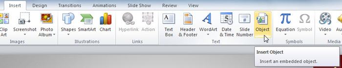 The Insert Object command
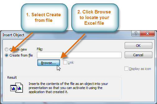 The Insert Object dialog box
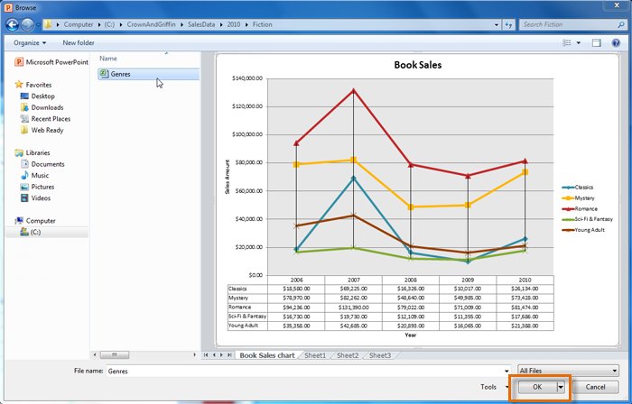 Selecting and previewing the desired file
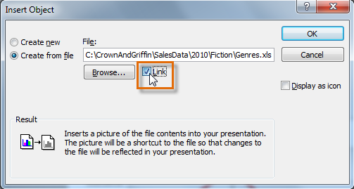 Linking the chart to the original Excel file
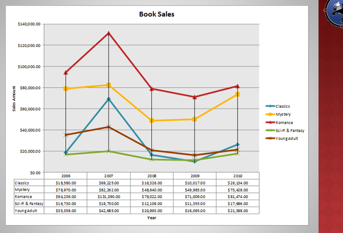 The inserted chart
To edit an imported chart, double-click it to open the Excel placeholder. After you have finished editing, be sure to save the chart in Excel.
Once you have imported a chart, be careful not to delete or move the original Excel file. If the location of either the PowerPoint presentation or the Excel file changes, you may have to insert the chart again in order for it to display correctly.
There are many ways to customize and organize your charts. For example, PowerPoint allows you to change the chart type, rearrange a chart's data, and even change the layout and style.
Once you insert a chart, a set of chart tools will appear on the Ribbon. These are only visible when the chart is selected. You can use the three tabs grouped under Chart Tools to modify your chart.
 The Chart Tools tab
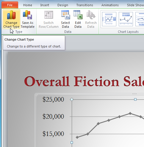 The Change Chart Type command
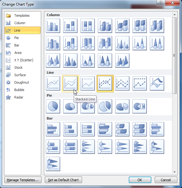 Choosing a new chart type
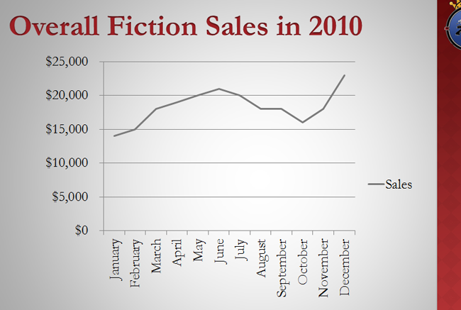 The modified chart
Sometimes when you create a chart, the data may not be grouped the way you want it to. In the clustered column chart below on the left, the Book Genre Sales statistics are grouped by genre, with a column for each year. However, you could also switch the row and column data so the chart will group the statistics by year, with columns for each genre, as in the chart on the right. In both cases, the chart contains the same data; it's just organized differently.
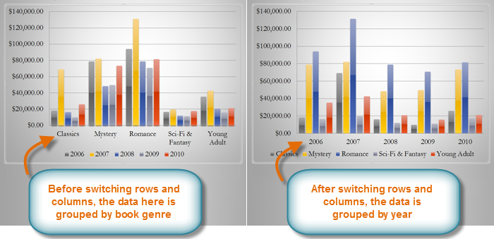 Sales Chart before and after switching row and column data
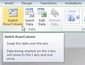 The Switch Row/Column Command
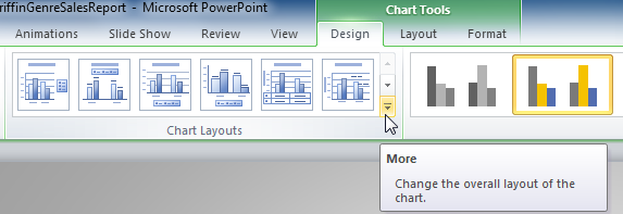 The More Layouts drop-down arrow
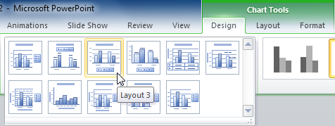 Selecting a new layout
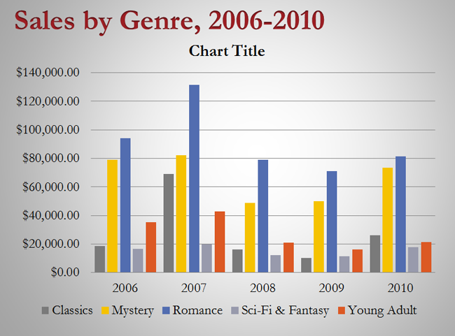 The modified chart
Some layouts include things like chart titles and legend labels. To change them, place the insertion point in the text and begin typing.
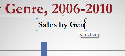 Changing the chart title
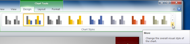 The Chart Styles group
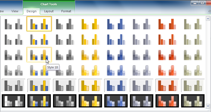 Selecting a new chart style
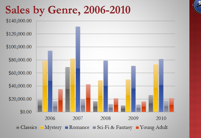 The modified chart
/en/powerpoint2010/reviewing-presentations/content/