Lesson 19: Theme and Transition Options
/en/powerpoint-tips/three-tips-for-beautiful-powerpoint-presentations/content/
Theme and transition options
In the past, we've written about general rules for making your PowerPoint presentations more readable and engaging. We've also covered tips for making beautiful, interesting-looking presentations.
All of this advice is pretty general and after all, if you follow good design practices, you can make great-looking presentations in any version of PowerPoint.
That said, if you've already upgraded to Microsoft 365, you'll find that making beautiful presentations is easier than ever. This is because PowerPoint for Microsoft 365 includes a handful of new theme and transition options. These options let you create professional-looking presentations quickly and without much customization.
The tips in this lesson only work for PowerPoint 2013 or newer versions.
Try bold themes
It's easy to fall into the habit of making the same type of presentation over and over again—for years, I always used very basic layouts and color schemes for PowerPoint simply because trying anything different felt like too much work.
Using a well-designed theme can take a lot of the guesswork out of creating slides. It can also help you break out of your comfort zone and create a presentation that looks much different from anything you might have created on your own.
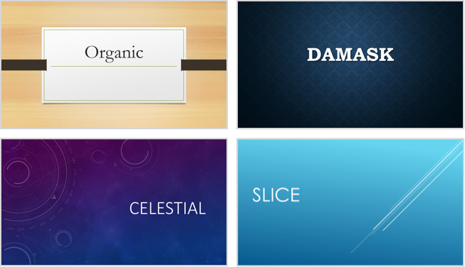
PowerPoint includes many themes that use bright colors, bold shapes, and textured backgrounds. Instead of sticking with the same layouts you've been using for years, why not experiment with some of these themes? Every theme won't be appropriate for every presentation, but you can probably find one that suits your content well. Here are a few of the best ones:
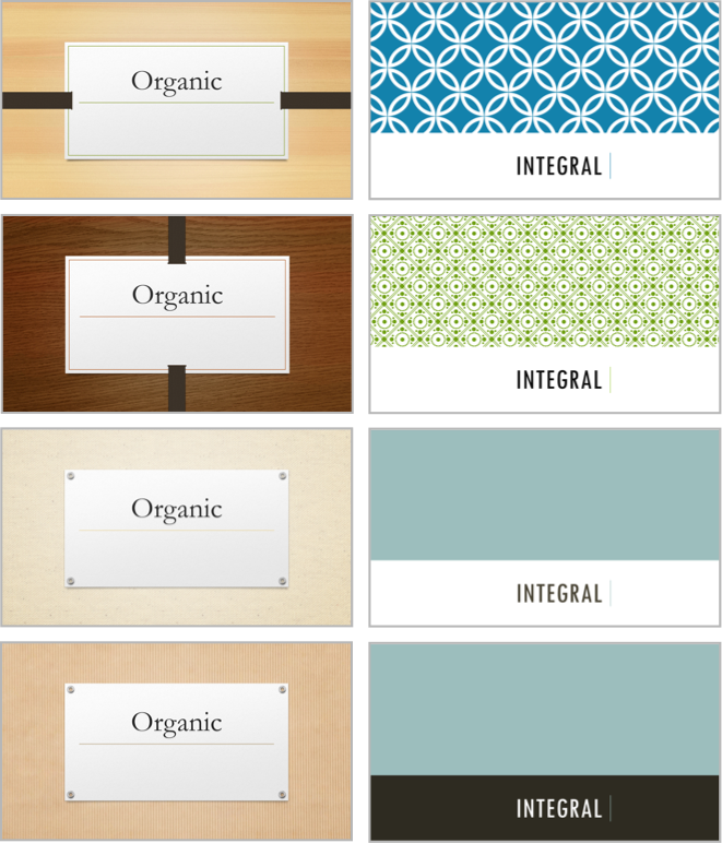
Use theme variants
If you've found a theme you like but want something a little different, try applying a theme variant. Applying a theme variant changes a few minor aspects of your theme's appearance. Some themes have variants that are only subtly different from the original, while other themes include variants with totally different color schemes and background images. In any case, it can be a great way to customize a presentation without a lot of work.
Use a transition that works with your presentation
As we've said before, you should avoid using excessively complicated transitions. For instance, anything that makes it look like your presentation is shattering, blowing in the wind, or zooming around the screen is probably a bad idea. However, there are some transition effects that work especially well with certain themes.
For instance, try downloading and playing this presentation that uses the Organic theme with a Push transition from right. Notice how the slides seem to all be connected? What about this one? It uses the Vapor Trail theme with the Pan transition. The text seems to move while the background stays the same.
There's no hard and fast rule for picking transitions—just play around with them until you find one that highlights your content and layout.
/en/powerpoint-tips/using-the-format-painter-in-powerpoint-and-word/content/