Lesson 5: Organizing and Analyzing Responses
/en/google-forms/sending-forms/content/
Organizing and analyzing responses
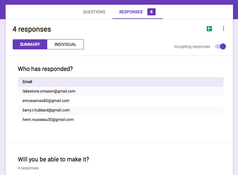
After you've sent your form, it's only a matter of time before people start responding. To access these responses, simply open your form and click the Responses tab. Here, you'll find the results from everyone who's responded so far, along with several options.
Click the buttons in the interactive below to learn more about the Responses screen.
Using Google Sheets to organize your results
Although all of your responses can be accessed within the form itself, there may be times when it's difficult to sort through and analyze everything. Luckily, Google Forms gives you the ability to store and organize your results in a spreadsheet with Google Sheets.
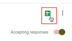
To do so, click the Create Spreadsheet icon.
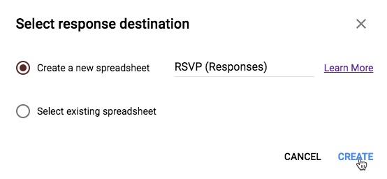
This will bring up a menu where you can choose to either Create a new spreadsheet or Select existing spreadsheet. For this example, we'll create a new one.
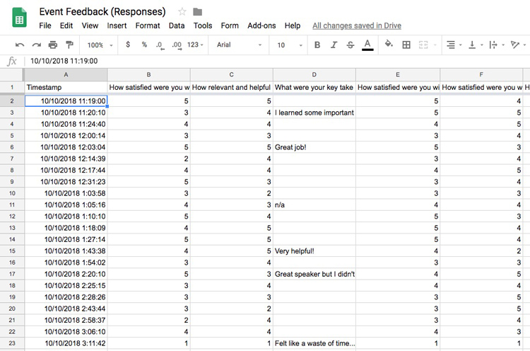
This automatically creates a spreadsheet and opens it in a new tab. Each row features the responses from each respondent, and each column features a question from your form.
Analyzing your results in Google Sheets
At first the spreadsheet may seem overwhelming, but luckily Google Sheets has tools to make things more manageable. We'll go over a few useful features you can use to analyze your data.
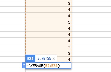
Formulas perform simple calculations like adding and subtracting, while functions perform more complex ones like averages and counts. Let's say you wanted to know the average rating given by employees for an event you held. You could use the AVERAGE function to calculate all of the ratings from one column.
If you're expecting to receive additional responses, it's best to place your formulas in a separate sheet. Any new responses will be added to the end of your current sheet, which could make it difficult to find and edit your formulas.
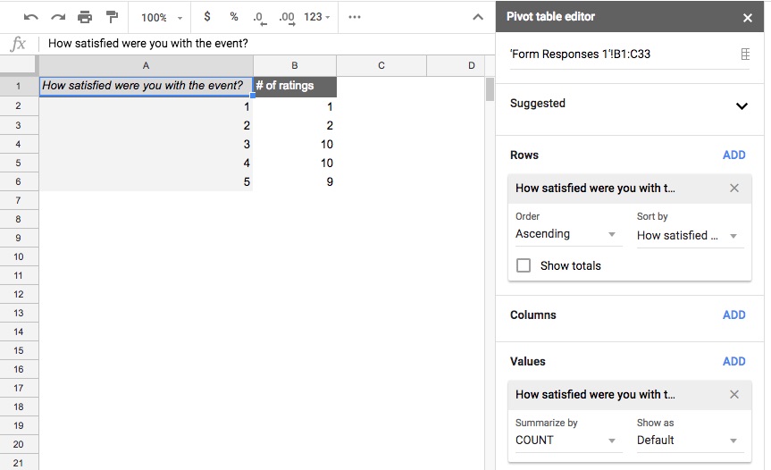
If your form has a large number of responses, pivot tables can help you summarize the data and make it easier to manipulate. You can go to Data > Pivot table to create one. In our example, we created a pivot table showing how many times each number was chosen for a certain question.
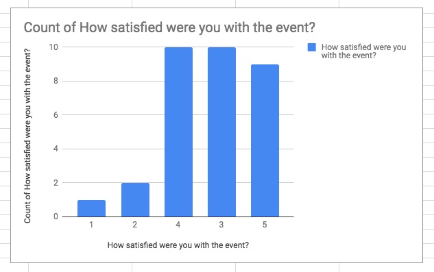
Histogram charts and pivot charts can also be helpful for giving you an overview of your responses. To create a chart, click Insert > Chart and select the chart you'd like to use from the Chart type drop-down list. In the example below, we made a pivot chart showing the distribution of how satisfied people were with the event.
The method you choose will depend on several factors, but all of the features mentioned above should cover most of your basic analyzing needs.
/en/google-forms/using-forms-with-google-classroom/content/