
Excel 2013 -
Sparklines

Excel 2013
Sparklines

search
menu
/en/excel2013/charts/content/
Sometimes you may want to analyze and view trends in your data without creating an entire chart. Sparklines are miniature charts that fit into a single cell. Because they're so compact, it's easy to include several sparklines in a workbook.
Optional: Download our practice workbook.
There are three different types of sparklines: Line, Column, and Win/Loss. Line and Column work the same as line and column charts. Win/Loss is similar to Column, except it only shows whether each value is positive or negative instead of how high or low the values are. All three types can display markers at important points, such as the highest and lowest points, to make them easier to read.
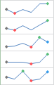 Line
Line Column
 Win/Loss
Sparklines have certain advantages over charts. For example, let's say you have 1,000 rows of data. A traditional chart would have 1,000 data series to represent all of the rows, making relevant data difficult to find. But if you placed a sparkline on each row, it will be right next to its source data, making it easy to see relationships and trends for multiple data series at the same time.
In the image below, the chart is extremely cluttered and difficult to follow, but the sparklines allow you to clearly follow each salesperson's data.
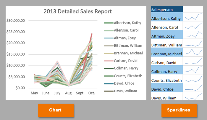 The same data visualized in a chart and in sparklines
Sparklines are ideal for situations when you need a clear overview of the data at a glance and when you don't need all of the features of a full chart. On the other hand, charts are ideal for situations when you want to represent the data in greater detail, and they are often better for comparing different data series.
Generally, you will have one sparkline for each row, but you can create as many as you want in any location. Just like formulas, it's usually easiest to create a single sparkline and then use the fill handle to create sparklines for the adjacent rows. In our example, we'll create sparklines to help visualize trends in sales over time for each salesperson.
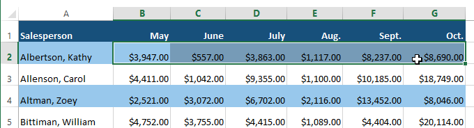 Selecting cells B2:G2
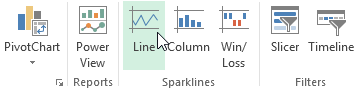 Clicking the Line command
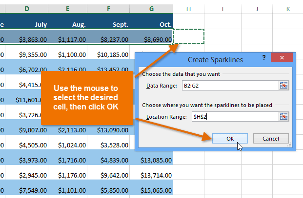 Selecting a location for the sparkline and clicking OK
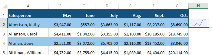 A sparkline
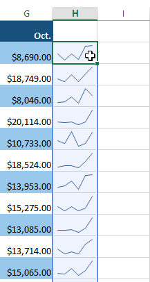
 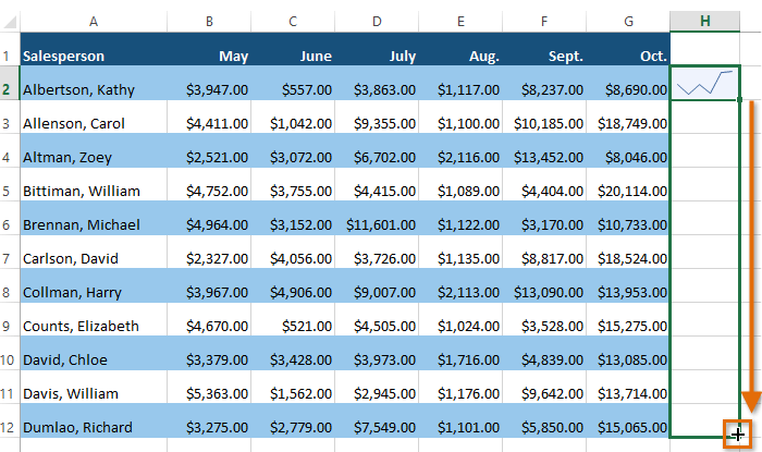 Dragging the fill handle to create sparklines in adjacent cells
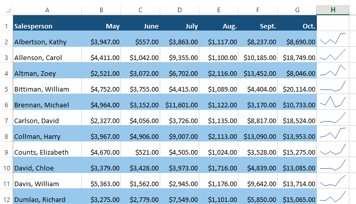 Sparklines filled to multiple rows
It's easy to change the way sparklines appear in your worksheet. Excel allows you to customize a sparkline's markers, style, type, and more.
Certain points on a sparkline can be emphasized with markers, or dots, making the sparkline more readable. For example, in a line with a lot of ups and downs, it might be difficult to tell which values are the highest and lowest points. Showing the high point and low point will make them easier to identify.
 Selecting a group of sparklines
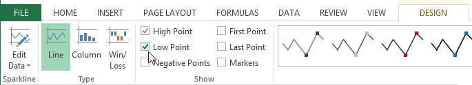 Showing the High and Low points on the sparklines
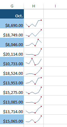 The sparklines with high and low markers
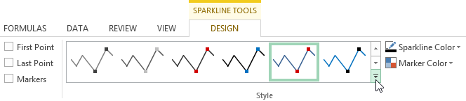 Clicking the More drop-down arrow
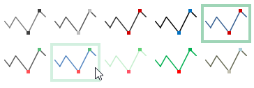 Choosing a sparkline style
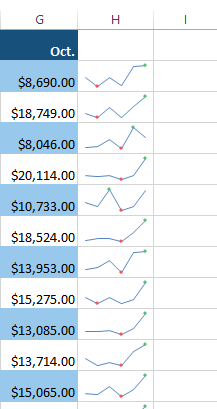 The new sparkline style
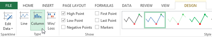 Choosing a new sparkline type
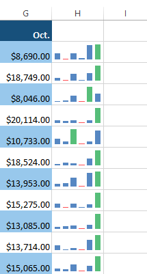 The new sparkline type
Some sparkline types will be better suited for certain types of data. For example, Win/Loss is best suited for data where there could be positive and negative values (such as net earnings).
By default, each sparkline is scaled to fit the maximum and minimum values of its own data source: The maximum value will go to the top of the cell, while the minimum will go to the bottom. However, this doesn't show how high or low the values are when compared to the other sparklines. Excel allows you to modify the sparkline display range, which makes it easier to compare sparklines.
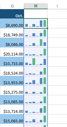 Selecting a group of sparklines
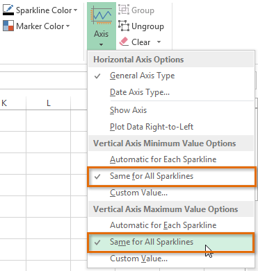 Modifying the sparklines' display range
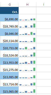 The updated display range
/en/excel2013/track-changes-and-comments/content/