
Excel 2013 -
PivotTables

Excel 2013
PivotTables

search
menu
/en/excel2013/conditional-formatting/content/
When you have a lot of data, it can sometimes be difficult to analyze all of the information in your worksheet. PivotTables can help make your worksheets more manageable by summarizing data and allowing you to manipulate it in different ways.
Optional: Download our practice workbook.
Let's say we wanted to answer the question: What is the amount sold by each salesperson? for the sales data in the example below. Answering this question could be time consuming and difficult—each salesperson appears on multiple rows, and we would need to total all of their different orders individually. We could use the Subtotal command to help find the total for each salesperson, but we would still have a lot of data to work with.
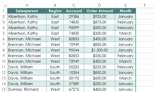 A worksheet containing sales data
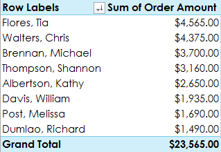
Fortunately, a PivotTable can instantly calculate and summarize the data in a way that's both easy to read and manipulate. When we're done, the PivotTable will look something like this:
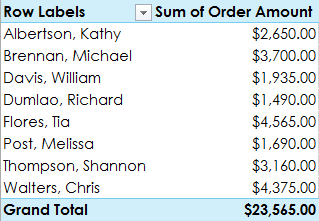 A completed PivotTable
Once you've created a PivotTable, you can use it to answer different questions by rearranging—or pivoting—the data. For example, if we wanted to answer the question: What is the total amount sold in each month? we could modify our PivotTable to look like this:
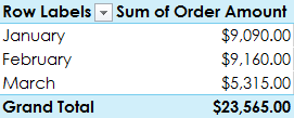 Pivoting data to answer different questions
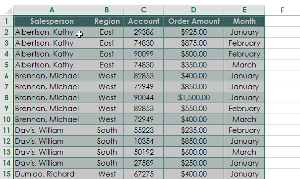 Selecting cells for a PivotTable
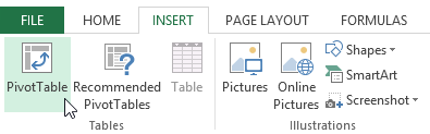 Clicking the PivotTable command
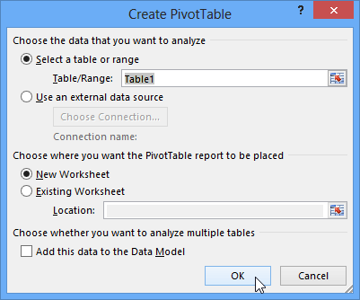 Creating a PivotTable
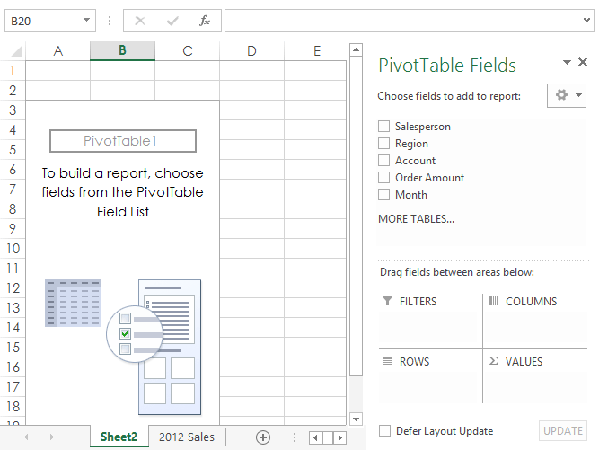 A blank PivotTable on its own worksheet
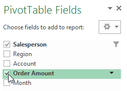 Checking the desired fields
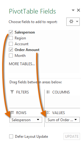 Adding fields to the PivotTable
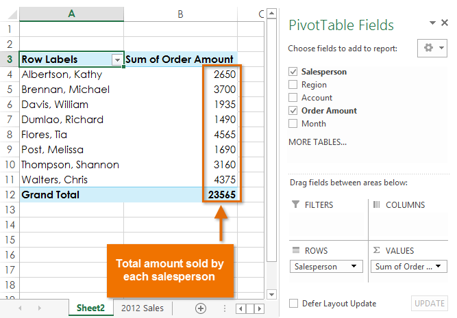 The PivotTable calculating the selecting fields
Just like with normal spreadsheet data, you can sort the data in a PivotTable using the Sort & Filter command in the Home tab. You can also apply any type of number formatting you want. For example, you may want to change the Number Format to Currency. However, be aware that some types of formatting may disappear when you modify the PivotTable.
 A sorted and formatted PivotTable
If you change any of the data in your source worksheet, the PivotTable will not update automatically. To manually update it, select the PivotTable and then go to Analyze > Refresh.
One of the best things about PivotTables is that they can quickly pivot—or reorganize—data, allowing you to look at your worksheet data in different ways. Pivoting data can help you answer different questions and even experiment with the data to discover new trends and patterns.
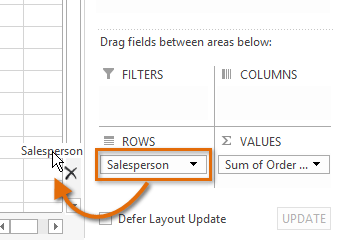
In our example, we used the PivotTable to answer the question: What is the total amount sold by each salesperson? But now we'd like to answer a new question: What is the total amount sold in each month? We can do this by simply changing the field in the Rows area.
 Removing a field
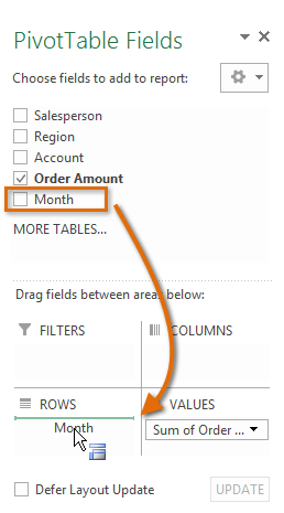 Adding a field
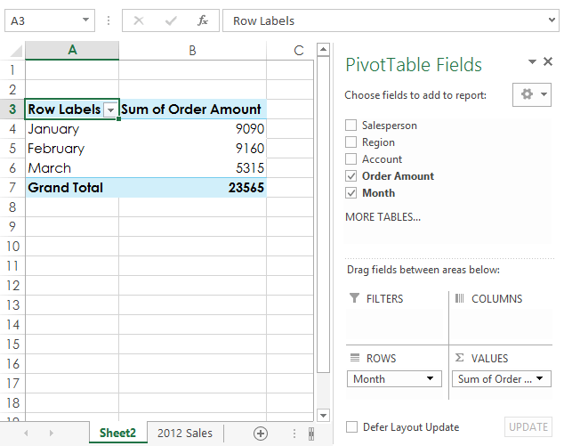 The updated PivotTable
So far, our PivotTable has only shown one column of data at a time. In order to show multiple columns, you'll need to add a field to the Columns area.
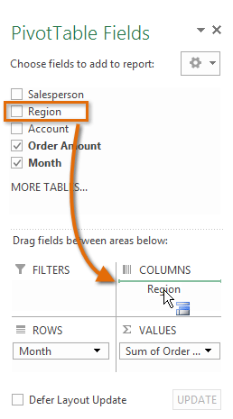 Adding a field to the Column area
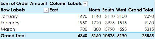 The PivotTable with columns
Sometimes you may want focus on just a certain section of your data. Filters can be used to narrow down the data in your PivotTable, allowing you to view only the information you need.
In our example, we'll filter out certain salespeople to determine how they affect the total sales.
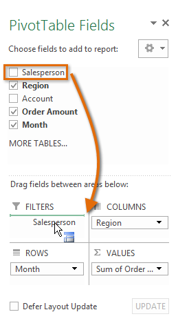 Adding a field to the Filters area
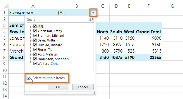 Checking the box for Select Multiple Items
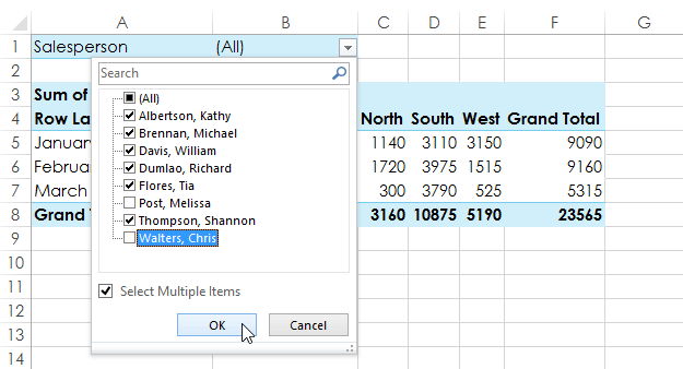 Choosing data to filter and clicking OK
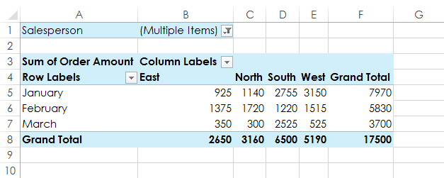 The updated PivotTable
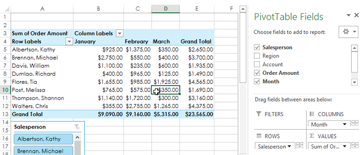
Slicers make filtering data in PivotTables even easier. Slicers are basically just filters, but they're easier and faster to use, allowing you to instantly pivot your data. If you frequently filter your PivotTables, you may want to consider using slicers instead of filters.
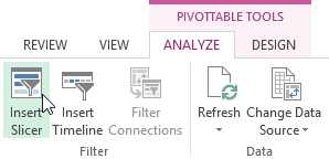 Clicking the Insert Slicer command
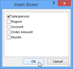 Choosing a field and clicking OK
 The inserted slicer
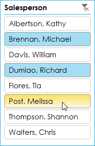 Selecting items from the slicer
You can also click the Filter icon in the top-right corner to select all items from the slicer at once.
PivotCharts are like regular charts, except they display data from a PivotTable. Just like regular charts, you'll be able to select a chart type, layout, and style that will best represent the data.
In this example, our PivotTable is showing each person's total sales per month. We'll use a PivotChart so we can see the information more clearly.
 Clicking a cell in the PivotTable
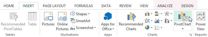 Clicking the PivotChart command
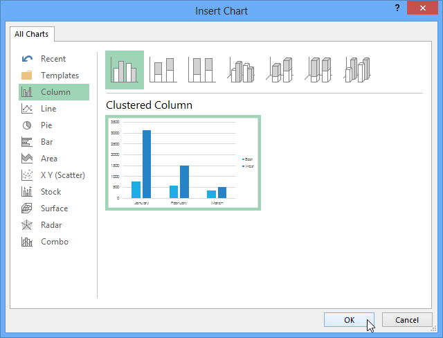 Choosing a chart type and clicking OK
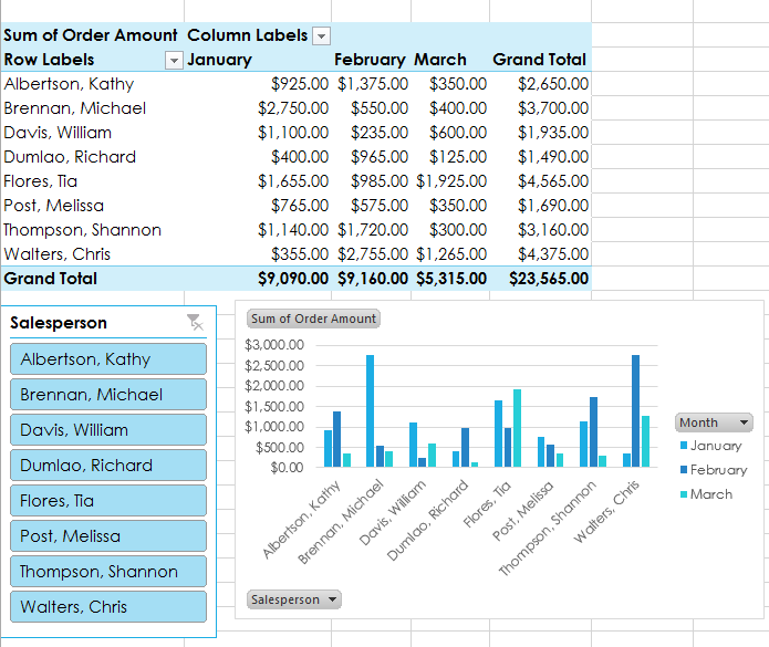 The inserted PivotChart
Try using slicers or filters to change the data that is displayed. The PivotChart will automatically adjust to show the new data.
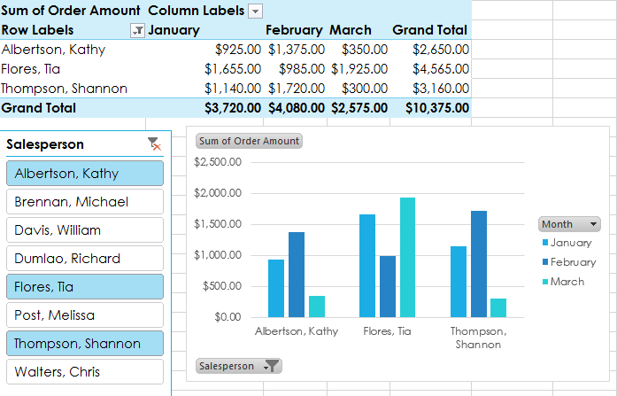 Manipulating a PivotChart
/en/excel2013/whatif-analysis/content/