Excel 2013 -
Charts

Excel 2013
Charts


/en/excel2013/tables/content/
It can often be difficult to interpret Excel workbooks that contain a lot of data. Charts allow you to illustrate your workbook data graphically, which makes it easy to visualize comparisons and trends.
Optional: Download our practice workbook.
Excel has several different types of charts, allowing you to choose the one that best fits your data. In order to use charts effectively, you'll need to understand how different charts are used.
Click the arrows in the slideshow below to learn more about the types of charts in Excel.
In addition to chart types, you'll need to understand how to read a chart. Charts contain several different elements, or parts, that can help you interpret the data.
Click the buttons in the interactive below to learn about the different parts of a chart.
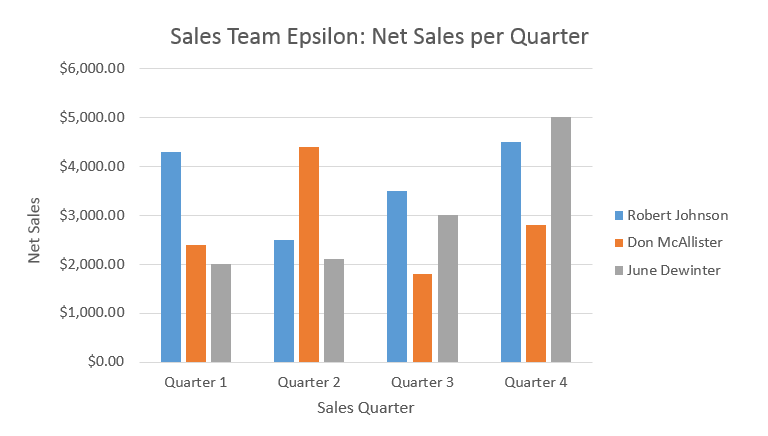
The legend identifies which data series each color on the chart represents.
In this example, the legend identifies the different salespeople in the chart.
The title should clearly describe what the chart is illustrating.
The vertical axis (also known as the y axis) is the vertical part of the chart.
Here, the vertical axis measures the value of the columns, so it is also called the value axis. In this example, the measured value is each salesperson's net sales.
The horizontal axis (also known as the x axis) is the horizontal part of the chart.
Here, the horizontal axis identifies the categories in the chart. In this example, each sales quarter is placed in its own group.
The data series consists of the related data points in a chart.
In this example, the blue columns represent net sales by Robert Johnson. We know his data is blue because of the legend on the right.
Reading the data series, we can see that Robert was the top salesperson in quarters 1 and 3, while he was the second highest in quarters 2 and 4.
 Selecting cells A1:F6
 Clicking the Column chart command
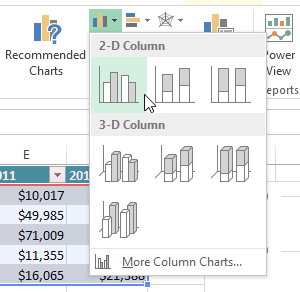 Choosing a chart type
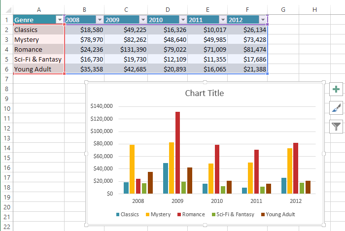 The inserted chart
If you're not sure which type of chart to use, the Recommended Charts command will suggest several different charts based on the source data.  Clicking the Recommended Charts command
After inserting a chart, there are several things you may want to change about the way your data is displayed. It's easy to edit a chart's layout and style from the Design tab.
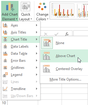
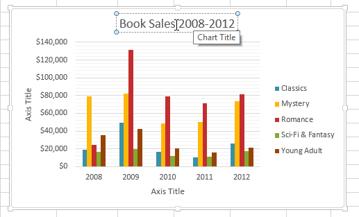 Editing the chart title placeholder text
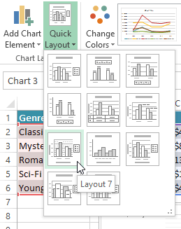 Choosing a chart layout
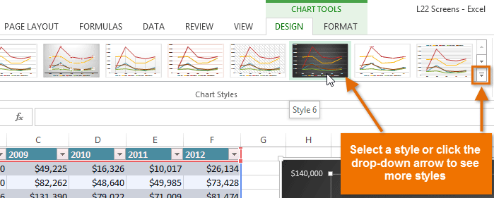 Choosing a new chart style
You can also use the chart formatting shortcut buttons to quickly add chart elements, change the chart style, and filter the chart data.
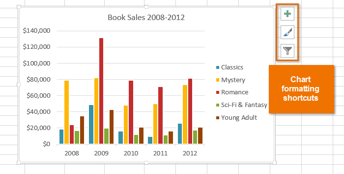 Chart formatting shortcuts
There are many other ways to customize and organize your charts. For example, Excel allows you to rearrange a chart's data, change the chart type, and even move the chart to a different location in the workbook.
Sometimes you may want to change the way charts group your data. For example, in the chart below, the Book Sales data are grouped by year, with columns for each genre. However, we could switch the rows and columns so the chart will group the data by genre, with columns for each year. In both cases, the chart contains the same data—it's just organized differently.
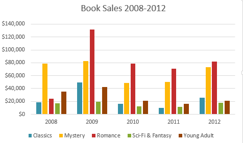 The data grouped by year, with columns for each genre
 Clicking the Switch Rows/Columns command
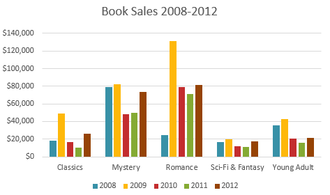 The switched row and column data
If you find that your data isn't well suited to a certain chart, it's easy to switch to a new chart type. In our example, we'll change our chart from a Column chart to a Line chart.
 Clicking the Change Chart Type command
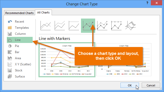 Choosing a new chart type
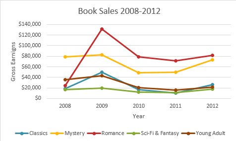 The new chart type
Whenever you insert a new chart, it will appear as an object on the same worksheet that contains its source data. Alternatively, you can move the chart to a new worksheet to help keep your data organized.
 Clicking the Move Chart command
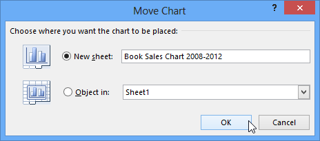 Moving the chart to a new worksheet
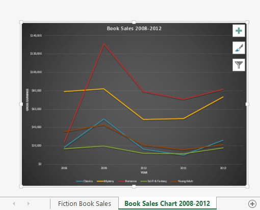 The chart on its own worksheet
By default, when you add more data to your spreadsheet, the chart may not include the new data. To fix this, you can adjust the data range. Simply click the chart, and it will highlight the data range in your spreadsheet. You can then click and drag the handle in the lower-right corner to change the data range.

If you frequently add more data to your spreadsheet, it may become tedious to update the data range. Luckily, there is an easier way. Simply format your source data as a table, then create a chart based on that table. When you add more data below the table, it will automatically be included in both the table and the chart, keeping everything consistent and up to date.
Watch the video below to learn how to use tables to keep charts up to date.
/en/excel2013/sparklines/content/