Excel 2003: Formatting a Chart

Lesson 18: Formatting a Chart

/en/excel2003/editing-charts/content/

Introduction

By the end of this lesson, you should be able to:

  • Format the chart title
  • Format the chart legend
  • Format the axis

Formatting the chart title

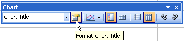
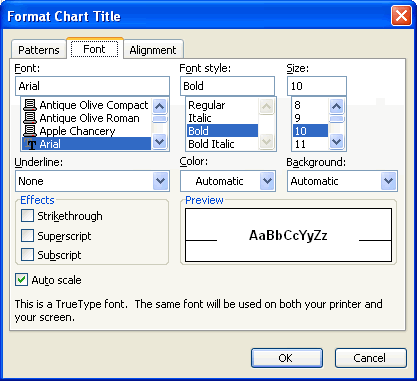
The chart title can be formatted to change color, pattern, typeface, size, and alignment using the Format Chart Title dialog box.

To format the chart title:

  • Select the chart title.

    Select the Chart Title
  • Click the Format button on the Chart toolbar (or double-click the chart title).

    Chart Toolbar
  • The Format Chart Title dialog box contains three different tabs—Patterns, Font, and Alignment—that can be used to format the chart title.
  • The Patterns tab lets you define borders and fill colors (see lesson 13).
  • The Font tab lets you define font, font style, size, and color (see lesson 11).
  • The Alignment tab lets you define horizontal and vertical cell placement, as well as text orientation (see lesson 11).

    Format Chart Title Dialog Box
  • Click the OK button to accept the chart title format changes.

Formatting the chart legend

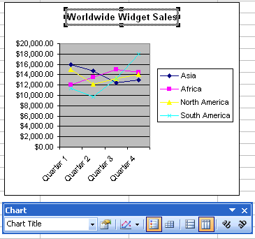
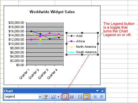
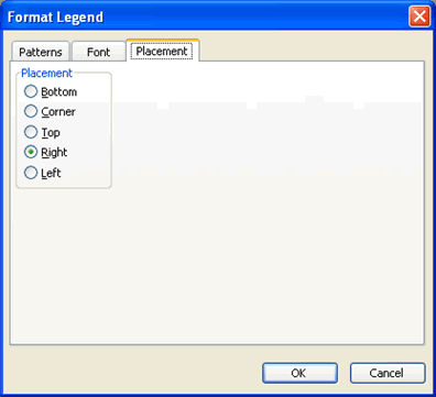
The chart legend displays useful information about the chart. Like a roadmap, the legend identifies what different colors or objects represent in the chart. The chart legend, like the chart title and category axis labels, can be formatted to your liking.

To format the chart legend:

  • Press the show/hide legend button on the Chart toolbar to turn on the legend display. (This button acts like a toggle by turning the display on or off.)

    The Legend Button on the Chart Toolbar
  • Click to select the chart legend.
  • Click the Format button on the Chart toolbar (or double-click the chart legend).

    Chart Toolbar
  • The Format Legend dialog box contains three different tabs—Patterns, Font, and Alignment—that can be used to format the chart title.
  • The Patterns tab lets you define borders and fill colors.
  • The Font tab lets you define font, font style, size, and color.
  • The Placement tab lets you define the location where the legend will appear on the chart.

    Format Legend Dialog Box
  • Click the OK button to accept the chart legend format changes.

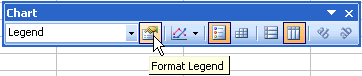
The only way to change the actual text that appears in the chart legend is to change the source data in the worksheet.

Formatting the axis labels

We've previously made reference to a Y axis and an X axis in Excel. In Excel, a graph represents a data in two dimensions. The number of items sold in January is data on two dimensions: number of items and month. The number of items might be plotted on the Y axis, while the month may be plotted on the X axis. The Y axis runs up and down on the graph, while the X axis runs left to right.

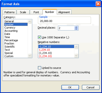
When formatting the axis labels in your chart, you can adjust the numbers on the scale of the chart, as well as change font, color, and style.

To format an axis:

  • Click anywhere in the axis label you want to edit:

    Chart X-Axis

    Chart Y-Axis
  • Click the Format button on the Chart toolbar (or double-click the chart axis).

    Chart Toolbar
  • The Format Axis dialog box contains five different tabs—Patterns, Scale, Font, Number, and Alignment—that can be used to format the axis.
  • The Patterns tab lets you define borders and tick marks.
  • The Scale tab lets you define numeric intervals on the value (Y) axis scale.
  • The Font tab lets you define font, font style, size, and color.
  • The Number tab lets you define the format of numbers displayed in the axis (see lesson 12).
  • The Alignment tabs let you define text orientation (see lesson 11).

    Format Axis Dialog Box
  • Click the OK button to accept the axis format changes.

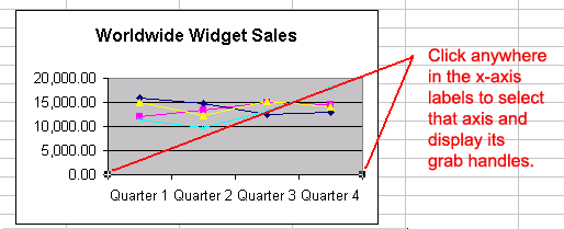
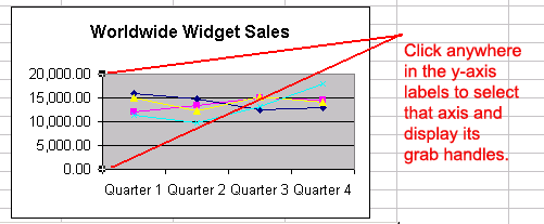
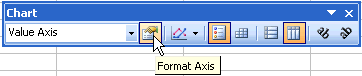
You can also use the angle axis buttons on the chart toolbar to change the angle of the value and category axis.

Changing the data series color

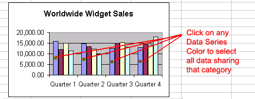
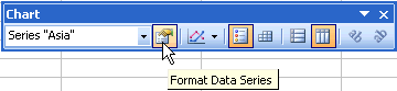
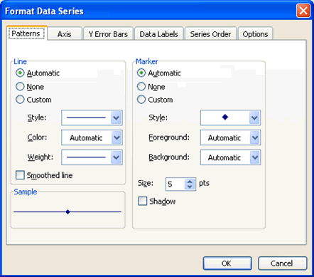
When a chart is created in Excel 2003, you'll notice that color is automatically applied to the data series. You can keep this format or change it for each data series in the chart. Many different aspects of each data series can be changed, but you'll probably change the color of bars, columns, pie slices, and areas most often.

To change the color of a data series:

  • Select the data series you wish to edit.

    Data Series Color Selection
  • Click the Format button on the Chart toolbar (or double-click the data series).

    Chart Toolbar
  • Use the Format Data Series dialog box to pick a new color.

    Format Data Series Dialog Box
  • Click the OK button to accept the Data Series color changes.

Challenge!

  • Open your Monthly Budget file.
  • Format the chart title to Verdana, size 12 font.
  • Select the show/hide legend button until the legend is visible on the chart.
  • Format the legend placement so it is to the left of the chart.
  • Format the Y axis so the currency amount has a dollar symbol ($) in front of it.
  • Modify the color of the January data series so the January column appears GREEN.
  • Save and close the document.

/en/excel2003/defining-page-setup-options/content/