
Excel -
Charts

Excel
Charts

search
menu
/en/excel/tables/content/
It can be difficult to interpret Excel workbooks that contain a lot of data. Charts allow you to illustrate your workbook data graphically, which makes it easy to visualize comparisons and trends.
Optional: Download our practice workbook.
Watch the video below to learn more about charts.
Excel has several types of charts, allowing you to choose the one that best fits your data. To use charts effectively, you'll need to understand how different charts are used.
Click the arrows in the slideshow below to learn more about the types of charts in Excel.
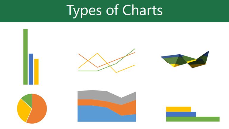
Excel has a variety of chart types, each with its own advantages. Click the arrows to see some of the different types of charts available in Excel.
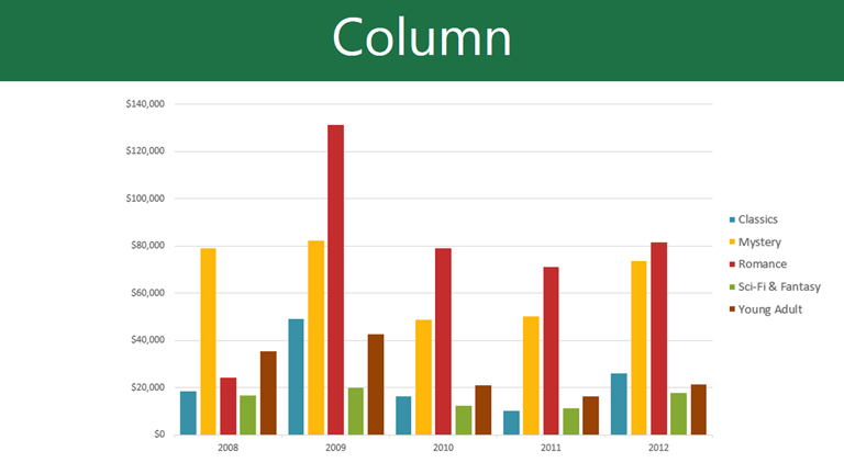
Column charts use vertical bars to represent data. They can work with many different types of data, but they're most frequently used for comparing information.

Line charts are ideal for showing trends. The data points are connected with lines, making it easy to see whether values are increasing or decreasing over time.

Pie charts make it easy to compare proportions. Each value is shown as a slice of the pie, so it's easy to see which values make up the percentage of a whole.
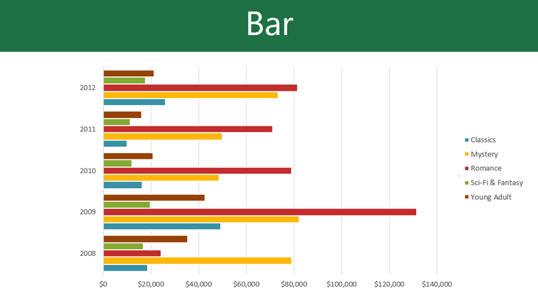
Bar charts work just like column charts, but they use horizontal rather than vertical bars.
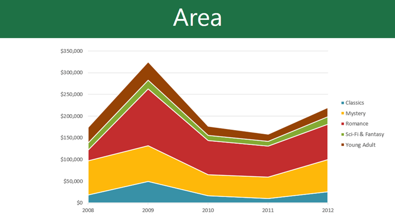
Area charts are similar to line charts, except the areas under the lines are filled in.

Surface charts allow you to display data across a 3D landscape. They work best with large data sets, allowing you to see a variety of information at the same time.

In addition to chart types, you'll need to understand how to read a chart. Charts contain several elements, or parts, that can help you interpret data.
Click the buttons in the interactive below to learn about the different parts of a chart.
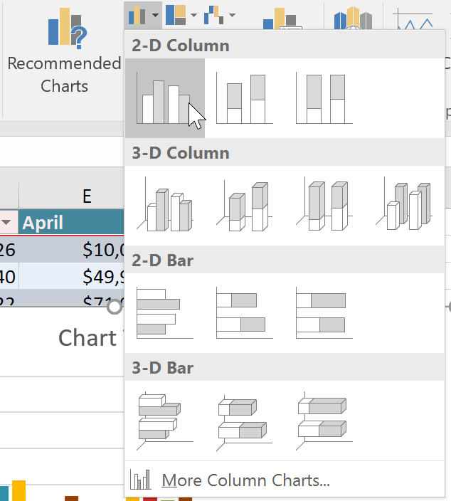
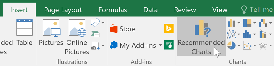
If you're not sure which type of chart to use, the Recommended Charts command will suggest several charts based on the source data.
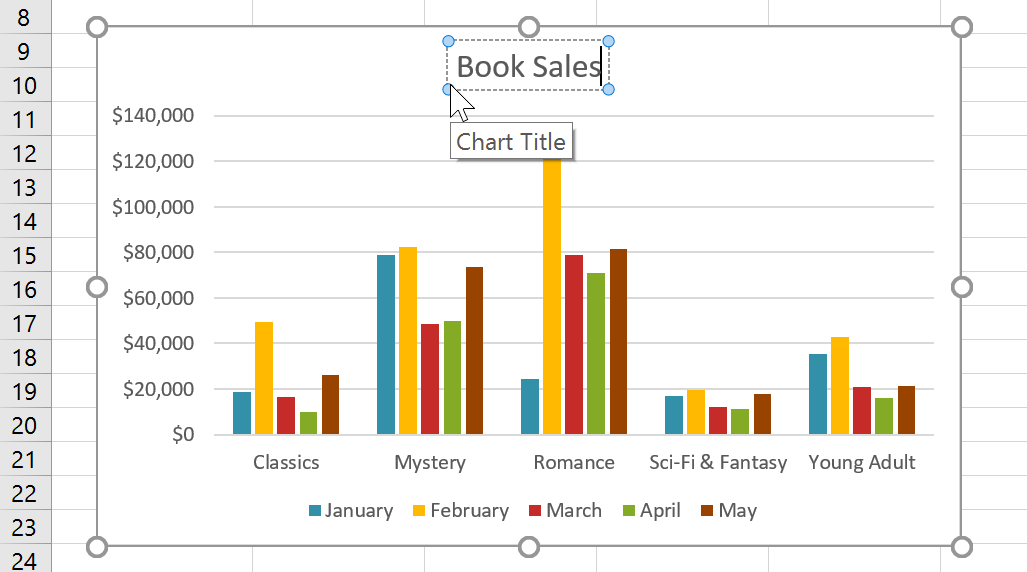
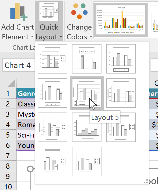
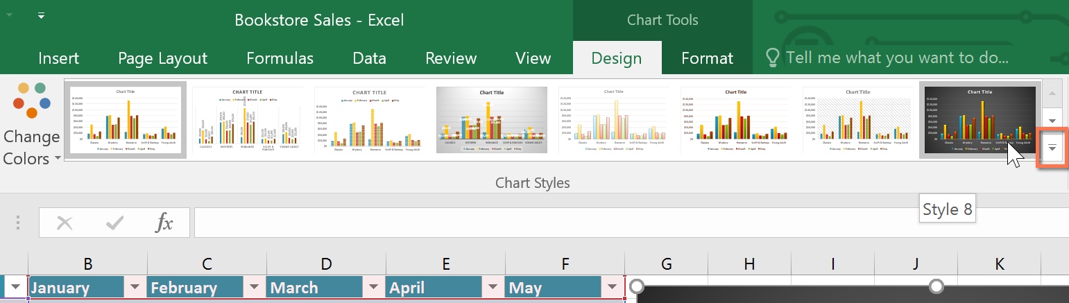
After inserting a chart, there are several things you may want to change about the way your data is displayed. It's easy to edit a chart's layout and style from the Design tab.
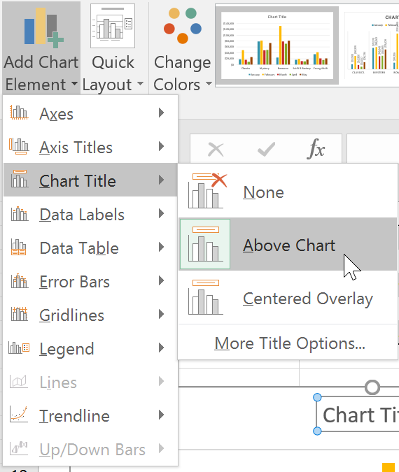
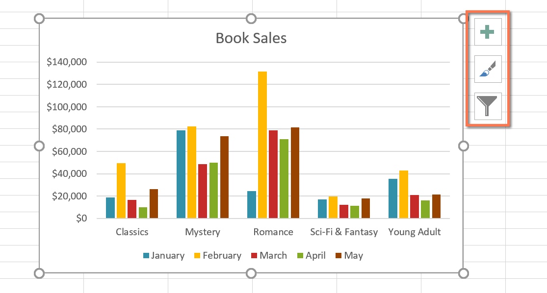
You can also use the chart formatting shortcut buttons to quickly add chart elements, change the chart style, and filter chart data.
edit hotspots
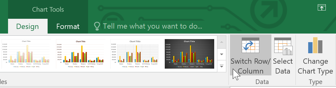
There are many other ways to customize and organize your charts. For example, Excel allows you to rearrange a chart's data, change the chart type, and even move the chart to a different location in a workbook.
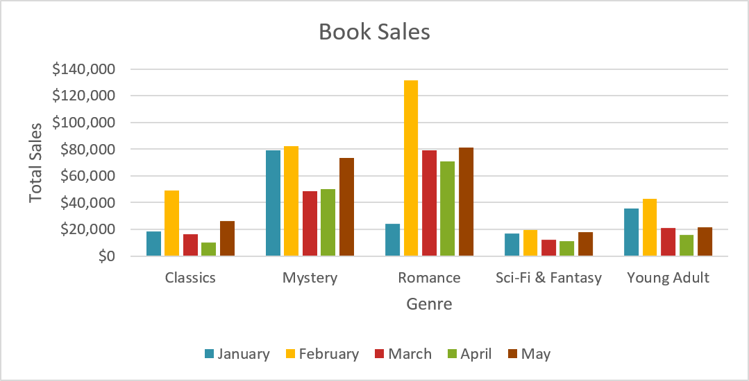
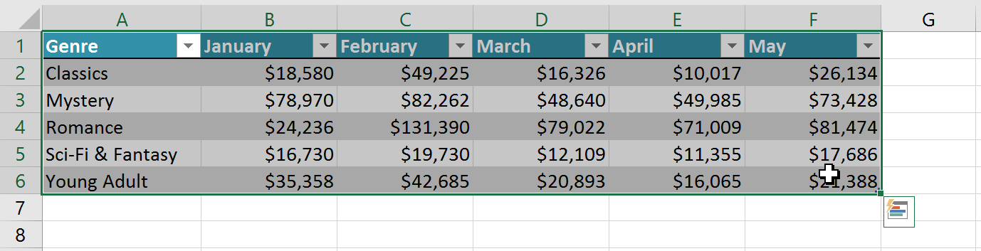
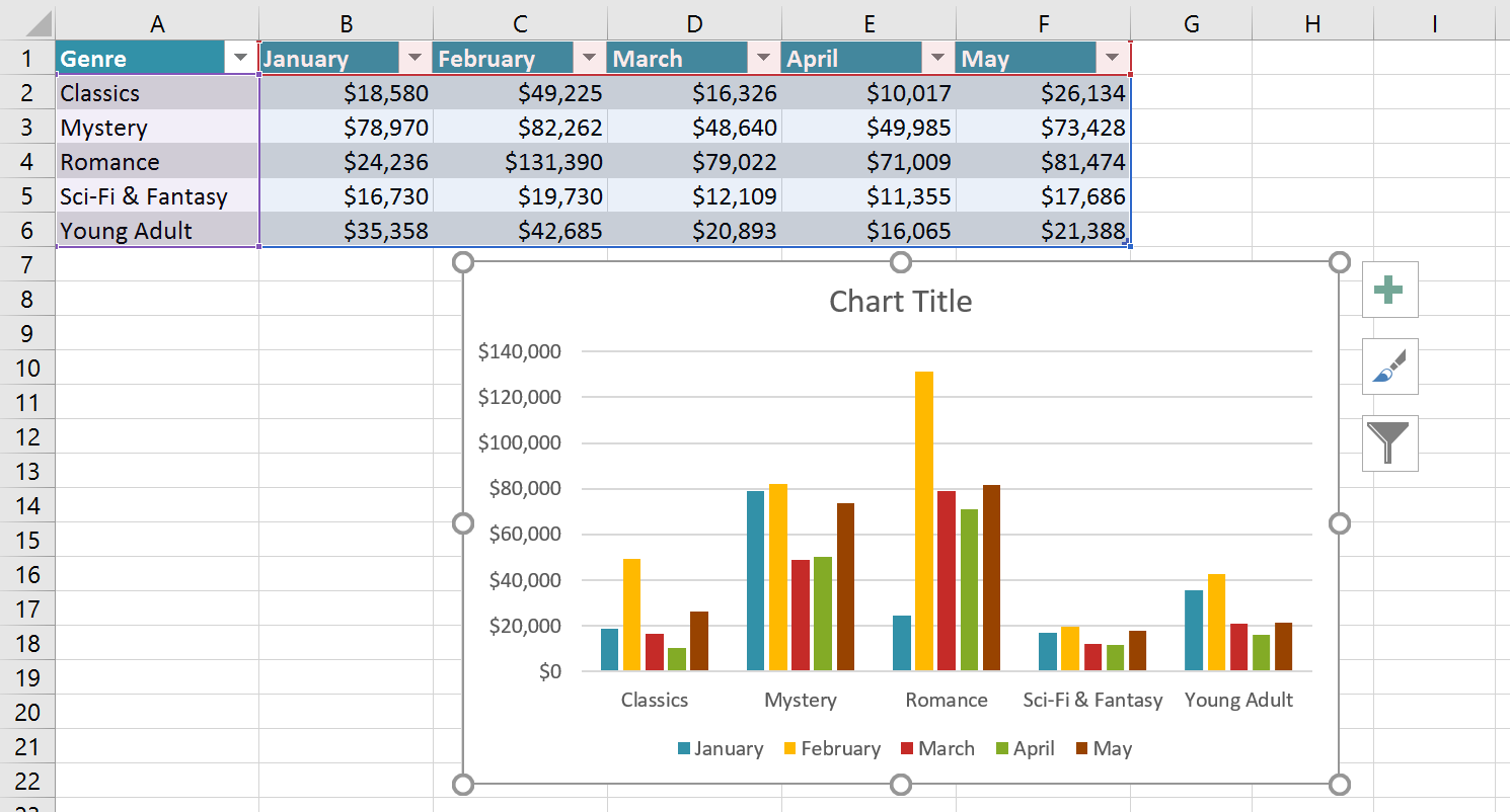
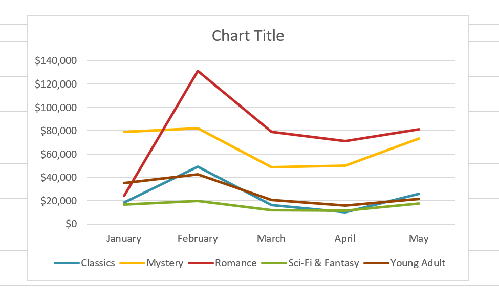
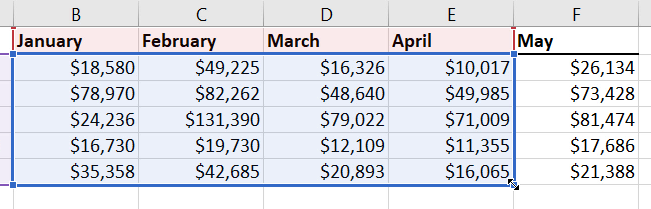
Sometimes you may want to change the way charts group your data. For example, in the chart below Book Sales data is grouped by genre, with columns for each month. However, we could switch the rows and columns so the chart will group the data by month, with columns for each genre. In both cases, the chart contains the same data—it's just organized differently.


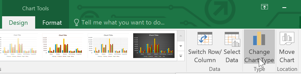
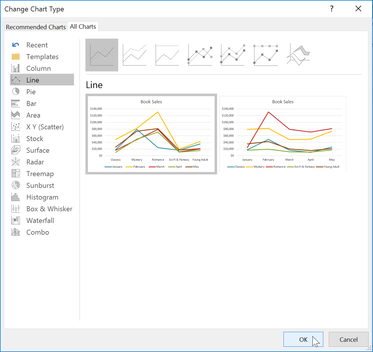
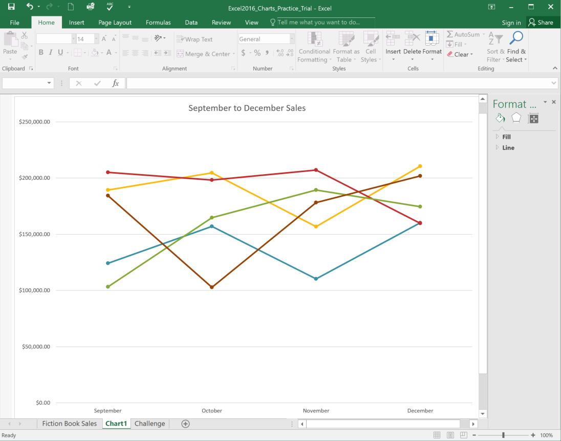
If you find that your data isn't working well in a certain chart, it's easy to switch to a new chart type. In our example, we'll change our chart from a column chart to a line chart.
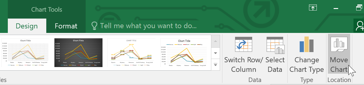
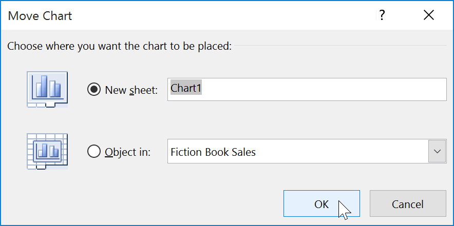
Whenever you insert a new chart, it will appear as an object on the same worksheet that contains its source data. You can easily move the chart to a new worksheet to help keep your data organized.

By default, when you add more data to your spreadsheet, the chart may not include the new data. To fix this, you can adjust the data range. Simply click the chart, and it will highlight the data range in your spreadsheet. You can then click and drag the handle in the lower-right corner to change the data range.
If you frequently add more data to your spreadsheet, it may become tedious to update the data range. Luckily, there is an easier way. Simply format your source data as a table, then create a chart based on that table. When you add more data below the table, it will automatically be included in both the table and the chart, keeping everything consistent and up to date.
Watch the video below to learn how to use tables to keep charts up to date.
/en/excel/conditional-formatting/content/