In order for your content to be the focus of your document, your text needs to be professional and easy to read. This is why choosing the right font is such a crucial part of business writing.
Fonts are a key part of typography, which is the art of arranging text in a legible and appealing way. It’s helpful to know some background on typography, so watch the video below to learn more.
As you can see in the video, typography offers a lot of creative possibilities. However, the business world usually prefers more professional fonts. Throughout this lesson, we'll focus on fonts commonly used in business documents.
Your company may use its own style to format its documents, such as using a particular font or color scheme. If so, your company's style should always take priority over the tips in this lesson.
Serif and sans serif
Choosing the right font depends on how you want your document to look. Do you want it to look classic and traditional, or do you need something more modern? No matter what you're searching for, it can be found within one of the two font types: serif and sans serif.
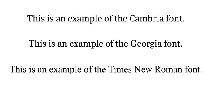
Serif fonts have small strokes attached to the main part of the letter, which gives the font a more traditional look. Recommended serif fonts include Cambria, Georgia, and Times New Roman.
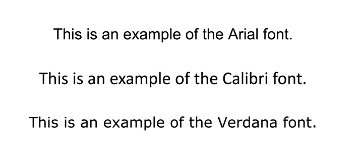
Sans serif fonts don't have small strokes attached to their letters, giving them a cleaner and more modern style. Some recommended sans serif fonts include Arial, Calibri, and Verdana.
Many typography experts believe serif fonts are more legible in print and sans serif fonts are easier to read on computer screens. However, others believe that either font type can be legible no matter where you use it. Ultimately, you should choose the font that best fits your message and desired look.
Font size
An effective font size is big enough to easily read but doesn't take up too much space. This means your body text should be a 10-point to a 12-point font, depending on the look you want and your company's preferred style. If you can't decide between sizes, a 12-point font is usually the reliable choice because it's incredibly common in the business world.
Headings, on the other hand, can be larger than a 12-point font if you need to add emphasis. Increasing the heading size to a 14-point or 16-point font is usually more than enough to make your heading stand out.
Keeping it simple
As we discussed in our lesson on how to format a business document, your writing is most effective when the formatting is simple. One way to keep it simple is to only use one or two fonts per document. This will help make it look more cohesive and professional.
A font should also never take the focus away from your content, so avoid fonts that are goofy or decorative. If a font is distracting or undermines your message in any way, it needs to be changed.
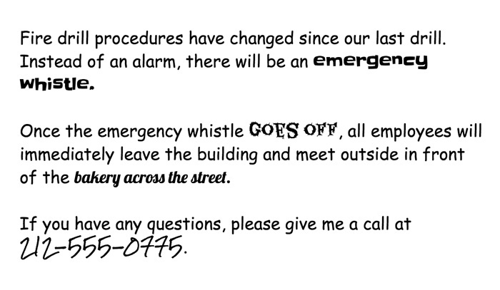
Let's take a look at an example of a document with unprofessional fonts.
Decorative fonts have weakened the example above. The primary font simply isn't appropriate for a business document. Also, the example contains several unprofessional fonts, which are distracting and inconsistent with the serious tone of the message.
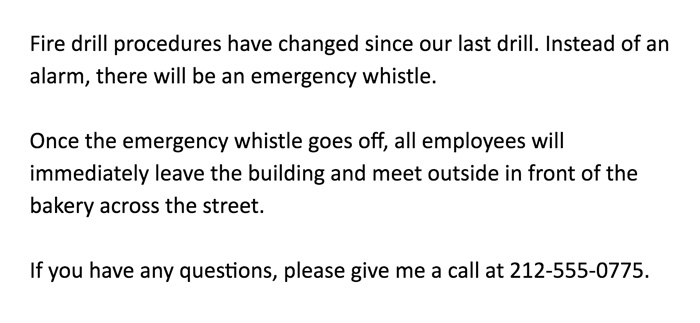
Now let's look at a more polished example.
This example is a big improvement! By using a professional font throughout the memo, the author's content is clear and free of distraction.
The font you use can make or break your business writing. Choose a font that best fits the purpose and style of your message, and you'll have a document that's professional and easy to read.