Basic CSS -
Padding in CSS

Basic CSS
Padding in CSS


/en/basic-css/margins-in-css/content/

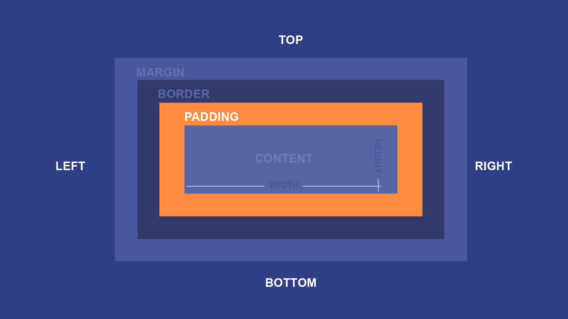
While margins allow you to add space around the outside of an element, sometimes you may need to add space inside the element to give the content more room to breathe. You can do this by adding padding on one or more sides.
A simple padding declaration might look something like this:
padding: 10px;
That declaration means that the padding box should extend 10px in all four directions—left, right, up, and down—beyond the size of the content box. Background styles that apply to the content also apply to the padding, unlike the border and margin, so the end result is generally that the content and padding look like one cohesive whole.
For example, consider a <p> element with some text and color declarations. Loaded on a webpage, it might look like this:

The background color makes the boxy nature of the paragraph easy to see. However, a simple padding declaration like the one above—padding: 10px;—fills it out:

You also don't have to keep the padding box the same in all four directions. The padding declaration is a shorthand to do the same thing in every direction, but you can also use individual declarations for each one to accomplish the same thing. For example, this would be the same as the padding declaration you saw before:
padding-top: 10px;
padding-bottom: 10px;
padding-left: 10px;
padding-right: 10px;
Or you can define each side on a single line. Just remember that the four values represent the top, right, bottom, and left sides, in that order:
padding: 10px 10px 10px 10px;
For example, you might like the amount of padding on the left and right in the example above, but wish it had a bit more on the top and bottom. To accomplish that, you might use a declaration like this:
padding: 25px 10px 25px 10px;
And the end result would have even more top and bottom padding:

As with margins, you may sometimes want the padding to be symmetrical. For example, in the section above we added 25px of padding to the top and bottom, and 10px of padding to the left and right.
We can reduce the repetition by only including two values:
padding: 25px 10px;
This will have the exact same effect as padding: 25px 10px 25px 10px; but in a more compact format that's easier to read and edit.
Try adding each of these declarations to the input below:
background-color: #15AAD7;
color: white;
padding: 10px;
The selector for the ruleset is already defined for you, and targets the paragraph to its right. Once you've tried those declarations, try changing some of the values yourself. In particular, try using different values for the padding value.
Open the styles.css file in your GCF Programming Tutorials project in your text editor, and let's add some padding. For the best understanding, be sure to actually type this code in, rather than copying and pasting it.
#header ruleset you already created and add this: padding: 30px;
padding declaration. Find the the .review ruleset you already created and let's add some padding: padding: 50px;
button ruleset: padding: 10px 200px;
If you load your index.html file in your browser or refresh the page, you should now see a webpage that looks much less cramped. It should look something like this.
Congratulations, you've added padding to your webpage!
/en/basic-css/borders-in-css/content/