Basic CSS -
Margins in CSS

Basic CSS
Margins in CSS


/en/basic-css/the-css-box-model/content/

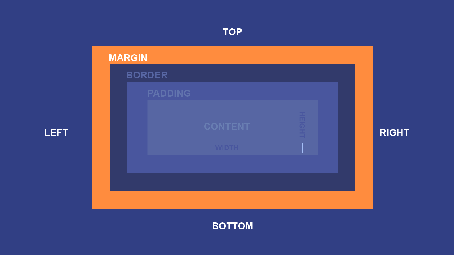
In order to make a nice looking webpage, it's important to add space in between HTML elements. One way to do this is to add margins, which will create space around one or more sides of the element.
A simple margin declaration might look like this:
margin: 10px;
That declaration means that the margin box should extend 10px in all four directions—left, right, up, and down—beyond the size of the border box. For example, consider a <p> element with some text, some color declarations, a padding declaration, and a border declaration. Loaded on a webpage, it might look like this:

Because the margin creates an invisible box around an HTML element, it might not be apparent just by looking at it that there's anything there. However, if you were to add a second <p> element, it becomes much clearer:

The white space all around your paragraphs is the margin, but the space between your two paragraphs shows you exactly how far it extends. By default, browsers apply a margin of around 16px to every <p> element, but you can override that with your own CSS. For example, if you added a margin: 50px; declaration, your two paragraphs would look more like this:

Notice that there is more white space on the left and right as well. You can also change the margin to reduce white space, or even eliminate it. For example, a margin: 0; declaration would look more like this:

When adding a margin value of 0, you can omit the px.
You could even add a negative margin, like margin: -15px;, to make them overlap:

Like many of the other declarations in this lesson, the margin declaration is also a shorthand. It can be split into each of its individual directions, like so:
margin-top: 10px;
margin-bottom: 10px;
margin-left: 10px;
margin-right: 10px;
Or you can define each side on a single line. Just remember that the four values represent the top, right, bottom, and left sides, in that order:
margin: 10px 10px 10px 10px;
Another common and useful way to use to the margin declaration is to let the browser figure out the margin on its own. That declaration would look something like this:
margin: auto;
The auto value has different effects in different contexts, but the most common use is to center a block-level element. For example, if you were to give one of the example paragraphs you saw before a width: 150px; declaration, it would no longer take all the horizontal space available to it. Instead, it would look like this:

Let's try adding a margin declarations like this, though:
margin: 0 auto 0 auto;
Remember that this shorthand defines each side separately—top, right, bottom and left—which we're doing because only the left and right sides need the "auto" value to center something. The end result would be centered, like this:
Let's say you want 10px margin on both the top and bottom, as well as 20px margin on the left and right. You could declare all four values like so:
margin: 10px 20px 10px 20px;
You may notice that this is a bit repetitive. Since the vertical and horizontal margins are symmetrical, we can simplify this by only including two values:
margin: 10px 20px;
This will give exactly the same result: The 10px margins will be applied to both the top and bottom, and the 20px margins will be applied to both the left and right. But since there's less repetition, it's visually cleaner and easier to make adjustments.
This technique also works with auto margins. As you learned above, setting the left and right margins to auto will center the element horizontally. So you can do something like this to center it horizontally, while also setting the top and bottom margins to 0:
margin: 0 auto;
Open the styles.css file in your GCF Programming Tutorials project in your text editor, and let's add some margins. For the best understanding, be sure to actually type this code in, rather than copying and pasting it.
<h1> element a margin value by default, but we can override that with our own CSS. Find the #header ruleset you already created and add this: margin: 0;
8px to the main body element. Let's override that, too, by adding this to the body ruleset you already made: margin: 0;
.review ruleset:margin: 0 auto;
margin: auto; declaration, it wouldn't work just yet. That's because a button element is not a block-level element, and margin: auto; only works on block-level elements. Luckily, you have a way to change that, too. Add this to to your button ruleset as well: display: block; margin: 40px auto;
If you load your index.html file in your browser or refresh the page, you should now see a webpage that looks much less cramped. The content will also be centered, thanks to the auto margins. It should look something like this.
Congratulations, you've just added margins to your webpage!
/en/basic-css/padding-in-css/content/