Basic CSS -
Borders in CSS

Basic CSS
Borders in CSS


/en/basic-css/padding-in-css/content/

If you want to add emphasis to an element, one option is to add borders. You can adjust the border style, width, and color to get a variety of different looks.
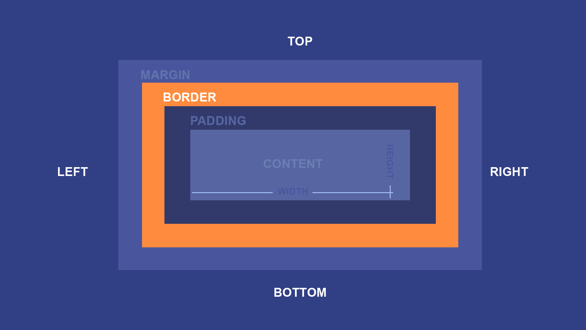
The border box directly surrounds the padding box, and is usually used to represent the outer boundary of your content. A simple border declaration might look like this:
border: solid 3px black;
That declaration means that the padding box should be surrounded by a solid black border that is 3px thick. For example, consider a <p> element with some text, some color declarations, and a padding declaration. On a webpage, it might look like this:
If you were to add a simple border declaration like the one above, you'd see this:
Like the padding declaration, the border declaration is actually a shorthand to summarize a number of separate declarations that could also be used individually. It defines three basic elements of an element's border:
solid, but CSS can create other styles such as dashed and dotted borders. The border-style declaration can define it individually.
border-width declaration can define it individually.
color or background-color declarations. The border-color declaration can define it individually. So far, all of our elements have been rectangular. But you can also create rounded rectangles and other shapes using the border-radius property.
For example, you could round the corners slightly with border-radius: 10px;:

Or you could use a larger radius such as border-radius: 100px; to create a pill shape:

When working with square elements, you can use border-radius: 50%; to create a circle:

Despite the name, border-radius can also be used when there is no border:

Try adding each of these declarations, one by one, to the input below:
background-color: #15AAD7;
color: white;
padding: 10px;
border: solid 3px #0F7391;
The selector for the ruleset is already defined for you, and targets the paragraph to its right. Once you've tried those declarations, try changing some of the values yourself. For example, try changing the "solid" value in your border declaration to "dashed" or "dotted," or try changing the width value.
Open the styles.css file in your GCF Programming Tutorials project in your text editor, and let's add some borders. For the best understanding, be sure to actually type this code in, rather than copying and pasting it.
button ruleset: border: solid 2px #1B7530; border-radius: 50px;
If you load your index.html file in your browser or refresh the page, you should now see a webpage that looks much less cramped. It should look something like this.
Congratulations, you've explored the box model on your webpage!
/en/basic-css/more-css-resources/content/